Been a while i dropped this here,
still on UIUX Part 6/6
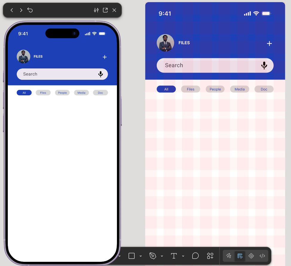
Layout grid is something very important one must look into when arranging elements and co.
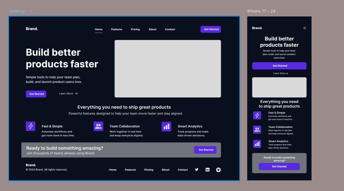
Below is a dekstop and mobile screen design of the same page.
Module 6 part 5 on UIUX
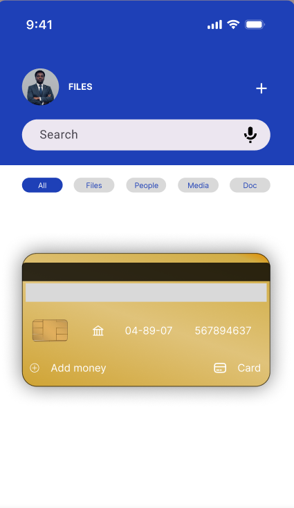
Here we looked into constraints, how to apply constraints on elements to aviod ultration in our designs during resizing of frame, as it can be seen in the card design below.
This also can't be explained through pictorial text, hence the need for video
Still on Module 6 Part 4 on UIUX
This leeson is about padding and spacing. Padding here refers to the spacing within an element; frame or co, while spacing refers to the spacing used between two or more elements.
Used spacing for the white and black boxes, while padding was...
Module 6 part 3 on UIUX
Wanted to drop a pictorial image of autolayout but then I won't be able to show you all the effect.
So here, I learnt about the importance of auto layout and it's funtionality in alignment of text, shapes, buttons, and many other. It aid design outlook.
Merging is the process of combining related design elements into one unit for better organization, while padding is the space around content that improves readability and appearance; always merge only related items and use consistent, balanced padding to create a clean design
Module 6 Ep 2 on UIUX.
Here we looked into merging and padding, and importance of alignment in placing or placement of elements.
Check in the comment section for a full brief on merging and padding.
3/3 Project of Module 5.
Completed the third project on UiUX feeling confident to move to next modules.
Stay tuned, stay glued.
#UIUX#ProductDesigner#Opentoconnect
Project 2 on Module 5 UIUX
The usage of white and different shade of green brings out the simplicity of this design.
Note that this took over two hours, getting the elements, logos, and other stuff needed just to bring out this beautiful piece, so do well to appreciate the art
Had to redesign this so as to capture it within a specific time frame, and also wanted you all to follow the process, though some part were skipped along the line, but more than 90% of the process was captured.
So while you enjoy the 3 combo songs attached, appreciate D design
While Celebrating my little design I noticed a bit of flaw which is the breathing space of text, i have made corrections to that here. When text are properly aligned and are being giving space to breaTHE they become easily accessible by end users.
Great product are easy to use
Will be dropping the video creation of the product design, i must confess this isn't anywhere perfect, but it certainly is worth staring at.
Follow through with my journey on UI/UX
Project 1 on UI/UX
I attempted to create a fintech product using some of the lessons learnt from module 1 to module 5, it felt tasky at first, as i was not sure on where to start, but as i start to draw the idea bit by bit, i then start to see the beauty in the product.
Module 6 Episode 1 on UI/UX
Here we looked into Layout and Responsive designs, this is essential for good presentation of a product, when layout are done properly, if gives the product a cool look, even when the designer isn't with all designs.