@diywebofficial "Guessing twice" is a great way to put it. A "starting from $X" line under a clear headline answers both questions before the visitor has to scroll. For home-service sites especially, that alone cuts a lot of bounces.
You land on a small business website. What makes you close the tab within 5 seconds?
1. Slow to load
2. Pop-up before you've read anything
3. No prices anywhere
4. Headline that says nothing
Pick one, or tell me what I missed 👇
Building a demo dashboard today from a practice job sheet, set up the way a real home-service business keeps one.
Before a single chart: 4 date formats, "N/A" in price cells, the same client spelled 3 ways.
Dashboards are mostly cleanup. Charts are the easy part.
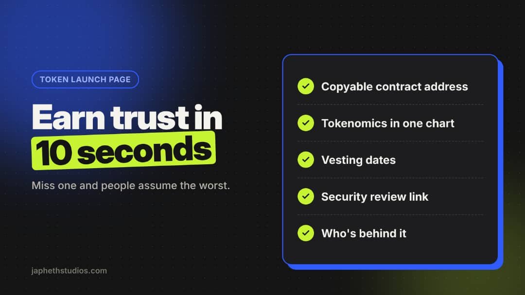
A token launch page has one job: earn a stranger's trust in 10 seconds.
Copyable contract address. Tokenomics in one chart. Vesting dates. Security review link. Who's behind it.
Leave any out and people assume the worst.
DMs open for Web3 launch pages and project sites.
Google says AI Mode will now show website links more often and higher up.
Good news, with a catch: whoever clicks has already read the summary.
So your landing page can't repeat the basics. It has to answer the next question and make the next step obvious.
Before: someone fills your contact form at 9pm. It lands in an inbox you check tomorrow. By then they've booked someone else.
After: the form auto-replies in seconds, logs the lead to a Sheet, and pings your phone.
Same form. Same traffic. Faster follow-up.
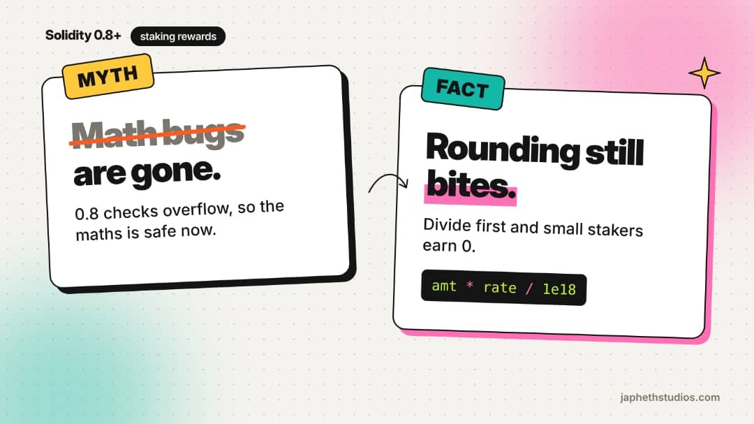
Myth: Solidity 0.8+ killed math bugs.
Reality: it stops overflow. It doesn't stop rounding.
Divide before you multiply in staking rewards and small stakers quietly earn 0.
Multiply first, scale by 1e18, and write a test with a tiny stake.
#web3
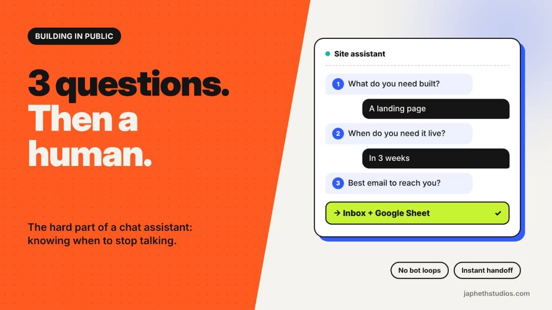
Building a chat assistant for my own site this week.
The AI part isn't the hard bit. Deciding when it should stop talking is.
Rule so far: 3 questions max, then your answers land in my inbox + a Google Sheet. No bot loops.
Chat or form: which do you actually use?
What you get:
→ Custom design (no templates)
→ Mobile-first, fast-loading
→ Built to convert: clear CTA, trust signals, speed
→ Delivered in days, not months
Drop your site below 👇 and I'll tell you the #1 thing costing you customers. Free.
Plumbers, roofers, HVAC pros: your visitors are on a phone, often mid-emergency.
Put a tap-to-call button in a sticky header. Not in the footer. Not behind a form.
<a href="tel:+15551234567">Call now</a>
Pipe bursts? They call whoever's easiest to reach.
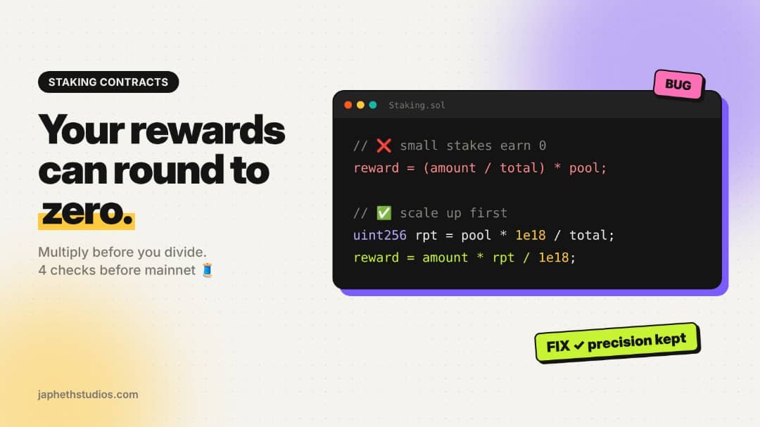
Staking reward bug I keep seeing:
reward = amount / totalStaked * pool;
Solidity has no decimals. If amount < totalStaked, that division is 0. Small stakers earn nothing.
Fix: multiply first, divide last (or use a 1e18-scaled accumulator). Then test tiny stakes on testnet.
Nobody wants to "submit."
Your form button should name what they get:
"Submit" → "Get my free quote"
"Sign up" → "Start my free trial"
"Contact us" → "Book my call"
First person + the outcome. A 10-second edit, and it's the last thing they read before they decide.
Before: someone fills your form at 9pm. It sits in your inbox till morning. By then they've hired whoever replied first.
After: instant reply, 2 quick questions to qualify them, lead logged in your Sheet, and a ping for the serious ones.
Same form. Different ending.