📢 After some paperwork and the implementation meeting, I’m pleased to kick off my newly funded Royal Society project🚀: UAV-assisted thermal Digital Twins (Thermal DT) for microscale climate change adaptation 🌍📡#RoyalSociety#ClimateChange#GIS#UAV
From the booming growth in Tibet (+21.5%) to the stark decline in Heilongjiang (-16.9%), this map dives deep into provincial population changes from 2010 to 2020. #China#Population#GIS#DataVisualization
#30DayMapChallenge, Day 16 (Choropleth): I feel it’s a great chance to reflect on how populations are shifting across China. Where does your region stand? 🧐 Explore the changing population dynamics of China! 📊🌏
#30DayMapChallenge, Day 15 (My Data): Exploring Lijiang’s vibrant vegetation! 🌱This NDVI map, created with Sentinel-2 data in Google Earth Engine (GEE), highlights the lush greenery from Yulong to Huaping. A ‘review’ of a green journey through the highlands! #NDVI#Mapping#GEE
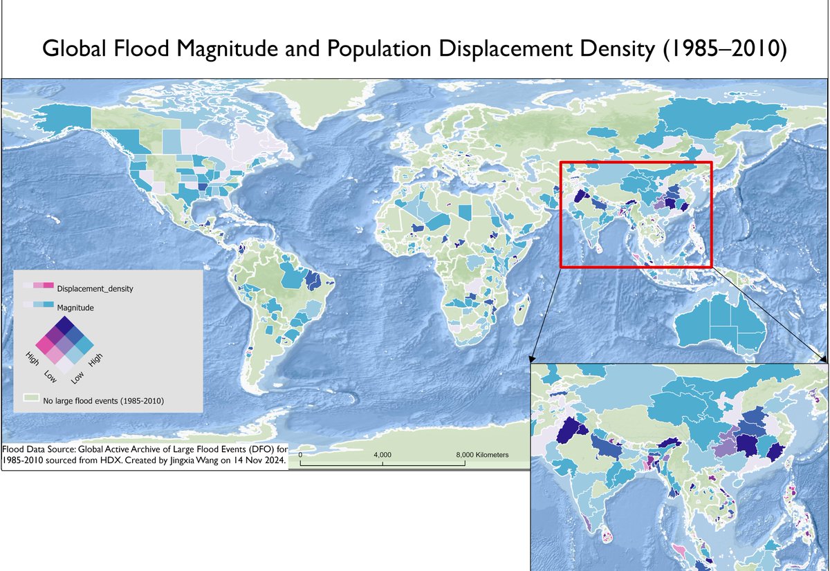
#30DayMapChallenge. Day 14 (A world map): Following the map from Day 8, here’s an updated global view with normalised data. This map shows flood magnitude and population displacement density 1985���2010, with an inset highlighting high-impact areas in South Asia. #Flood #mapping
Alternatively, I explored GoogleEarthPro and found it offers faster 3D visualisation when data is available, as demonstrated with examples in Sheffield and HK. #Digitalisierung#3Dmap#visualisation
#30DayMapChallenge—Day 13 (A New Tool):
3D visualisation in QGIS. This is Rotterdam, where our @USPSheffield L2 UG students will have the privilege of site visits to explore various Nature-Based Solutions for flood mitigation.
While 3D tiled images in QGIS produce effective results, performance can depend on internet speed and server responsiveness, with occasional frame drops. @qgis@earth@Google#Google#earth Pro
#30DayMapChallenge Day 12 (Time and Space): A 30-second ‘drunk�� bird’s-eye fly-through of a 3D campus, capturing your familiar routine spaces and routes. Made in ArcPro— though some buildings aren’t fully visualised due to the intense computational demands.
It gives a glimpse of the Time-Space experience—I wish my CPU/GPU could handle more! Not sure, but it seems ArcScene might handle this kind of visualisation with less demand on the PC performance.
Fascinating to learn the Lena River Delta is the largest in the Arctic, and it’s also possible to map Indigenous peoples and their languages across this vast region! 🌐❄️ #GIS#ArcticMaps#Geography#Mapping#Indigenous people
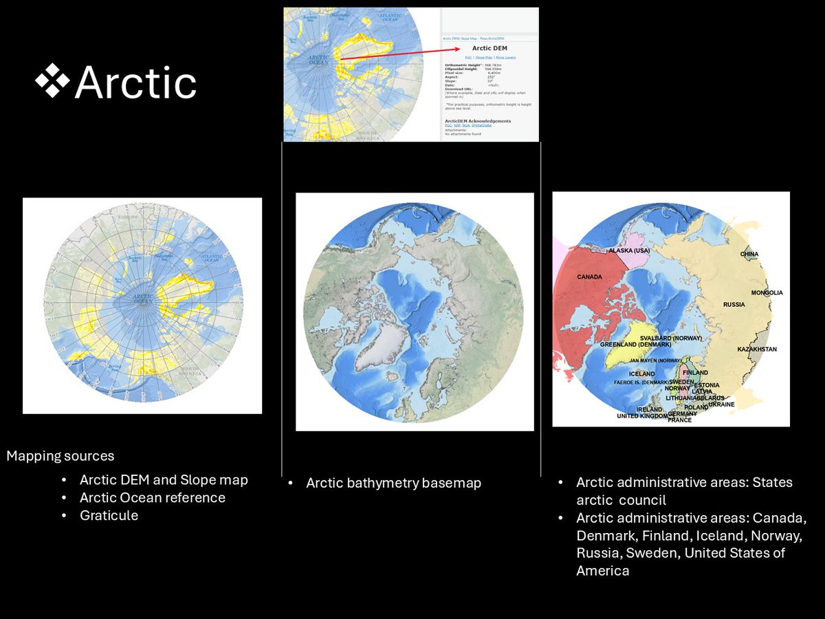
#30DayMapChallenge, Day 11 (Arctic): Finally got a chance to 🌍 explore the Arctic through #ArcGISPro! 🧊✨ Maps showcasing Arctic DEM, slope, bathymetry, and administrative areas.
#30DayMapChallenge Day 10 (Pen & Paper): AI-enhanced map of a demolished place: 3 metres to the National Park, 1 min walking distance to the best school, 5min walking distance to the market and city centre, and 10 min walking distance to the UNESCO heritage site – Dayan Old Town
The maps are visually appealing but geographically distorted; with more prompting, more errors are introduced, highlighting the importance of learning GIS.
#30DayMapChallenge, Day 8 (AI only). Prompt: Create a forest and vegetation map of Germany as if made with QGIS, including urban greenspaces, river networks, and shaded relief.