HELLO FACEBOOK
HERE ARE SOME RECENT DESIGN PROJECTS IVE HANDLED🔥🔥
Let me know what you think about the designs.
I create beautiful and very unique designs that can elevate your brand and give it the visibility you require.
Today a client contacted me and said I have seen the value that you bring to small businesses and brand's around. I've gone through your portfolio and I will like to work with you. And immediately she sent me a brief
Honestly if I am not your designer you're missing value 🌹
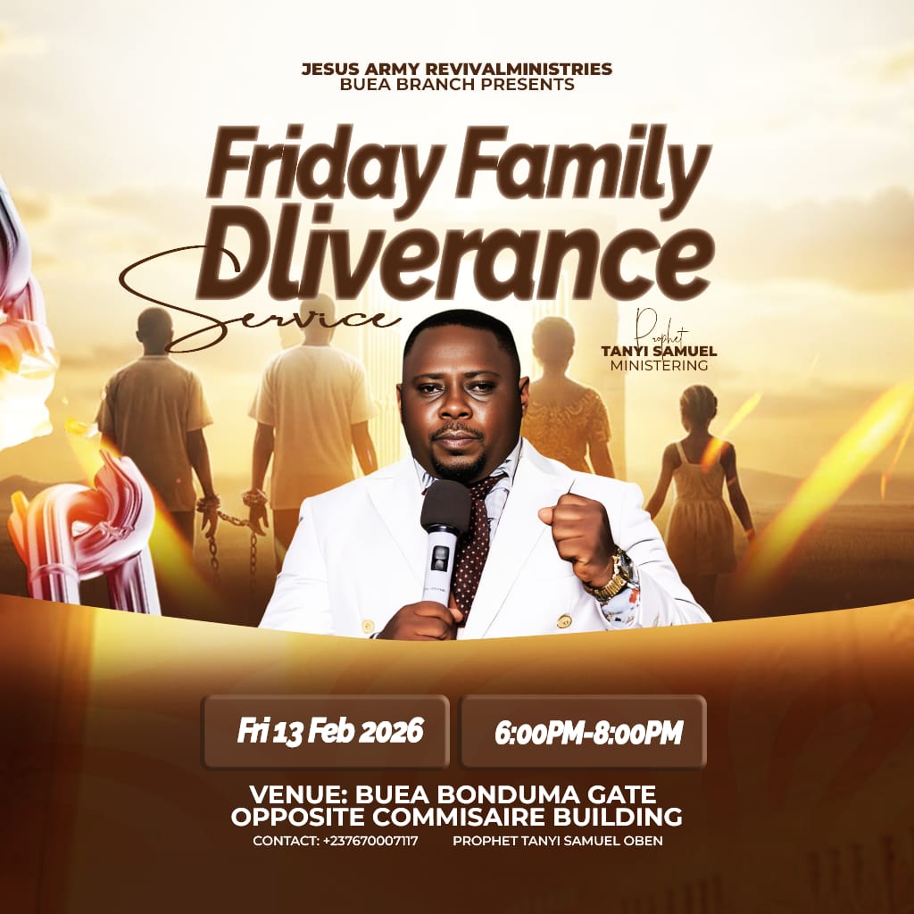
Everytime i design a church flyer i have it at the back of my mind that its not just a flyer this is evangelism through visuals🔥🔥
Please be my guest tonight
So over the weekend I had the privilege to work on a wedding project
They called and I answered and delivered 🔥🔥🔥
I create simple but very captivating designs always
Let me know what you think in the comment section 👇👇👇
#wedding#weddingdesign#fypppppppppppppppppppppp
SIMPLE CHURCH FLYER DESIGN.
My Journey into Graphic Design
I never planned to become a graphic designer. In fact, it wasn't even on my radar. However, I often watched my church struggle with designers who were difficult to work with.
#churchflyerdesign.
CHURCH FLYER DESIGN
Its not just a design it is crafted with clarity, intentionality and simplicity.
This three are the things that separate boys graphic designers from strategic and intentional designers.
#churchflyerdesign#GraphicDesign#fyppppppppppppppppppppppp
happy birthday to you sir. you're truly a blessing to us who are still up and coming. you have inspired me personally, you made me believe that in Africa you can actually make money with your skill thank you design chef happy birthday sir.
AURA AND ASH BRAND PROJECT
Aura & Ash isn't your typical tech company. Our brand is inspired by the natural world, and we use organic elements to create gadgets for your home and personal life.
We believe that simple things—like the stones we walk on can tell our stories well.
I challenged myself to take an existing design and push it further. 🎨
The Audit: The original concept was strong, but the typography and background were fighting the core message.
The Fix: Refined the visual hierarchy to make the CTA pop and cleaned up the textures.