@TiroTypeworks@davelab6@KhaledGhetas@abdullaharif We include a subtle donation request on our font download pages but it's separate from the download process itself. It's not a step you need to go through and say donation = $0 (which is just guilt manipulation). https://t.co/HyeyFe2IjM
@TiroTypeworks@davelab6@KhaledGhetas@abdullaharif The OFL certainly allows an optional donation option, and that's a nice way to do it. It just needs to be clear (esp. to those whose understanding of English is limited) that the donation is not necessary to download or use the fonts.
@OhBendy @pgconstable Sorry - no - and I didn't see them in a quick glance through my research materials. But keep in mind that I was mainly collecting examples of letters that were alraedy identified rather than searching for ones that weren't.
@pgconstable @OhBendy BTW of our fonts for New Tai Lue the Nokyung design is preferred by more people and has had the closest scrutiny by local script experts. Dai Banna SIL is an older, more region-specific design. https://t.co/ADhWCvYh8F
@MarkFonts Character variants work fine in most browsers (font-feature-settings). We offer and use a lot of CVs. Here's an example, with details on linked pages: https://t.co/pN7Wb59TPd
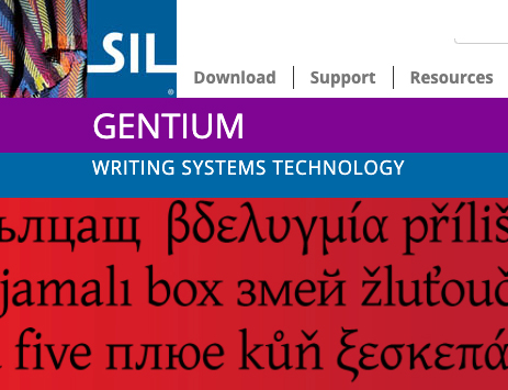
Gentium Plus 6 adds three new bolder weights (plus italics) to the full character set. Many other improvements too! New features, better Windows screen rendering, WOFF2, and more. Fully free and open project. https://t.co/CuoLWzwbPz
@KGLinguistics @jeltzz @SILintl Hi - you need to tell us the context: OS, app, exact character sequence. Then we might be able to address your problem. Thanks!
@thejourneyler I had fun making one of these a while ago, but don't really use it. I kern the same way most designers do: avoiding it as much as possible. Most kerning time lately has been spent getting tools to handle kerning data well when converting formats. https://t.co/xY4j5H3wwY
Dear Letter/Language/Script-Research interested Twitter People,
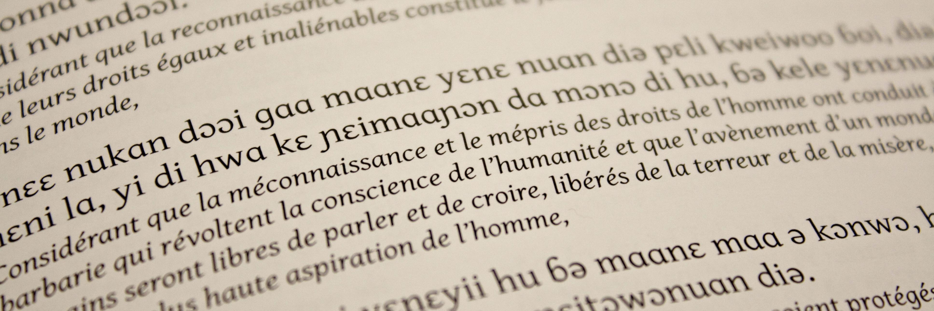
Here is some Devanagari research we are working on: https://t.co/AMcYIn4ue3
Hope it helps, and hope we can talk with you more about it!
@TiroTypeworks@enablelanguages @OhBendy @HindiRinny@a_srinidhi@alolita This is a great idea - especially if the ability to create new family/style architectures could be built into common font design tools. That would give communities (and those that support them) freedom to create alternate structures.
@TiroTypeworks@enablelanguages @OhBendy @HindiRinny@a_srinidhi@alolita More than once I've offered a community a more 'culturally-sensitive' secondary, only to have them reject the offer in favour of one that follows Latin conventions. While I groaned a bit inside, I supported them in their decision.
@TiroTypeworks@enablelanguages @OhBendy @HindiRinny@a_srinidhi@alolita While I feel strongly that the non-Latin world should be freed from any assumption that typographic 'italic' secondaries should follow Latin norms, I've found that I need to keep my purist zeal in check. It's not my writing system.