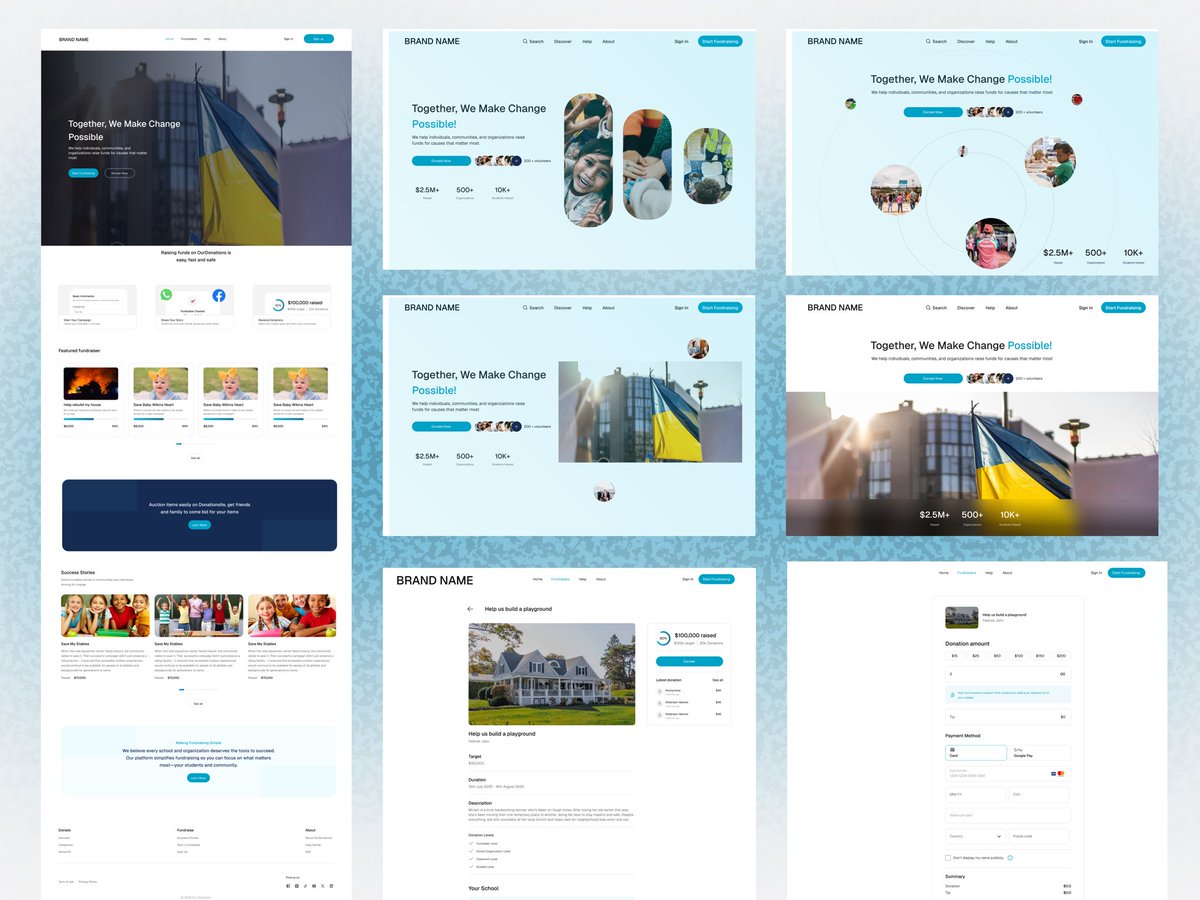
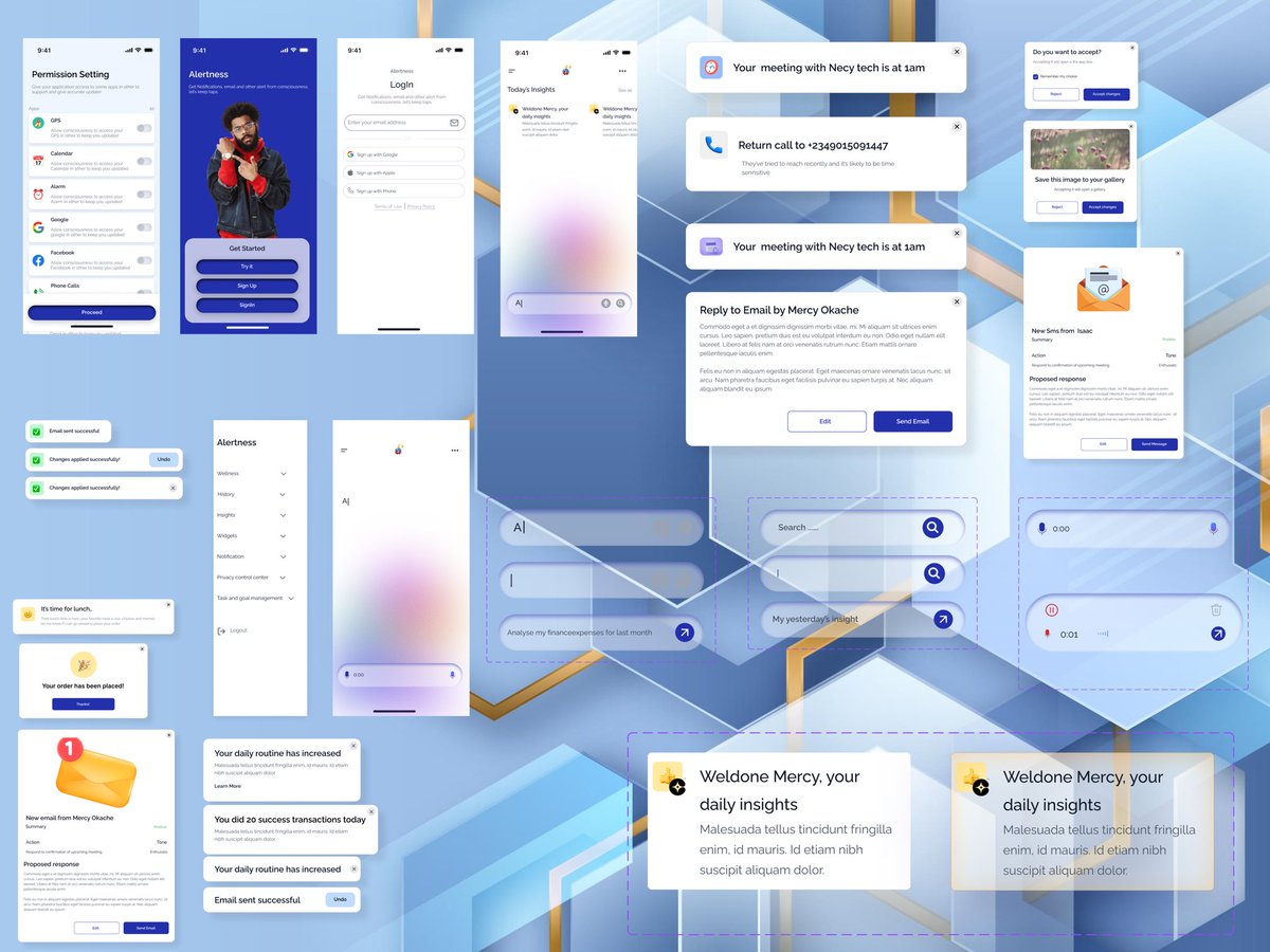
Hiring for a design role…
Dear hiring managers, I’m available and looking for UI/UX role🙏🏽🙏🏽
Dear designers, what do you think about what what you see..
#product#productdesign#ui#ux#tech#abuja
I have tasted working on-site, remote and hybrid, i highly recommend remote, nothing beat the peace, to me remote settings makes me more productive…
What about you???
My low-key workstation is ready💃🏻
This is my little workstation beginning ✌️
When I received this email from @Tegadesigns I was so excited, I squeezed myself so much to pay for her upcoming classes on AI because I know I will get value or maybe the breakthrough I’ve been looking for, I will be building and learning here on twitter and LinkedIn.
I was on a call with a UX designer at one of Europe's largest biotech companies. Sharp, clearly talented but she was struggling.
She told me . "Every time I present my work, people pile on with suggestions about what direction I should take the design next. They all seems to have opinion about my work. And honestly… it's starting to make me feel like they don't think I know what I'm doing."
I let her finish. Then I told her something that caught her off guard.
"You're the problem."
What you allow, you begin to absorb.
Here's what I mean: in design, everyone will always have an opinion. It's not like engineering, where the code either compiles or it doesn't. Design invites input, and if you don't control how that input lands, it controls you.
So here's the move and i typically started doing this since 2023. When the feedback starts rolling in, you don't defend, you don't even deflect, and you definitely should not just nod along, no try am.
Close that loop with this
"I have heard your collective feedback, and I'll go back and do what seems right for the product, with everything you have raised in consideration."
That's it. That's how you own your work. You acknowledge, you absorb, and then you decide. The designer decides.
Because if you don't hold that line now, here's where it goes: non-designers start opening your Figma files. They start moving things. And with AI making design tools more accessible by the day, that boundary gets crossed faster than you even think.
Own your work. Defend it. Not with ego oo, but with authority. You were hired for your expertise. That expertise includes knowing which feedback to act on and which to note and move past.
Try and be professional oo when doing this before you will go an unleash the dragon and talk say na Kingsley send you.
Don't mention.
If you like tips like this, i share them all the time to help you grow and navigate properly. Why not hit the follow button. Yes you....
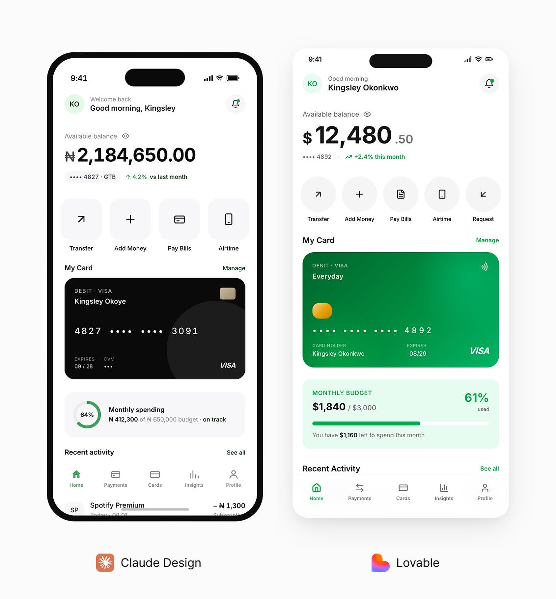
Same prompt different design. Between Claude Design and Lovable. Which one would you rather go with.
Prompt:
Design a simple, high-fidelity mobile banking app Home screen only for a mobile device.
Color direction:
- White background across the entire screen
- Green as the only accent color for primary buttons, active states, icons, highlights, and important UI elements
- Black for all primary text
- Use very light gray only where necessary for subtle separation, but do not let gray dominate the interface
UI style:
- Clean, minimal, modern, premium fintech look
- Flat design only
- Do not use drop shadows anywhere
- Do not use strokes, outlines, or visible borders around cards, buttons, sections, or containers
- Use spacing, layout, color, and typography to create hierarchy instead of shadows or borders
- Keep the interface realistic, polished, and production-friendly
- Make it feel trustworthy and easy to use
- Do not overcrowd the screen
Design only the Home screen and include:
1. Top header
- Greeting such as “Good morning, Kingsley”
- Small profile avatar
- Notification icon
2. Balance section
- Available balance
- Hide/show balance toggle
- Masked account number or account ID
- Optional small savings or account insight
3. Quick actions
Include 4 to 6 actions:
- Transfer
- Add Money
- Pay Bills
- Airtime
- Request Money
- Cards
4. Account or card preview
- One simple debit card or linked account preview
- Keep it elegant and minimal
5. Recent transactions
- Show 4 to 5 realistic transactions
- Include merchant/person name, date or time, and amount
- Mix debit and credit entries
6. Financial insight
- Add one small insight card such as monthly spending, savings progress, or budget left
7. Bottom navigation
- Home
- Payments
- Cards
- Insights
- Profile
Important constraints:
Only create one Home screen
Do not generate extra screens or flows
Do not add decorative mockup effects
Do not place the screen inside a phone frame
Do not use gradients unless extremely subtle
Do not use glassmorphism
Do not use neumorphism
Do not use floating cards with shadows
Keep every section aligned and visually balanced
Make it look like a real banking app someone would use every day