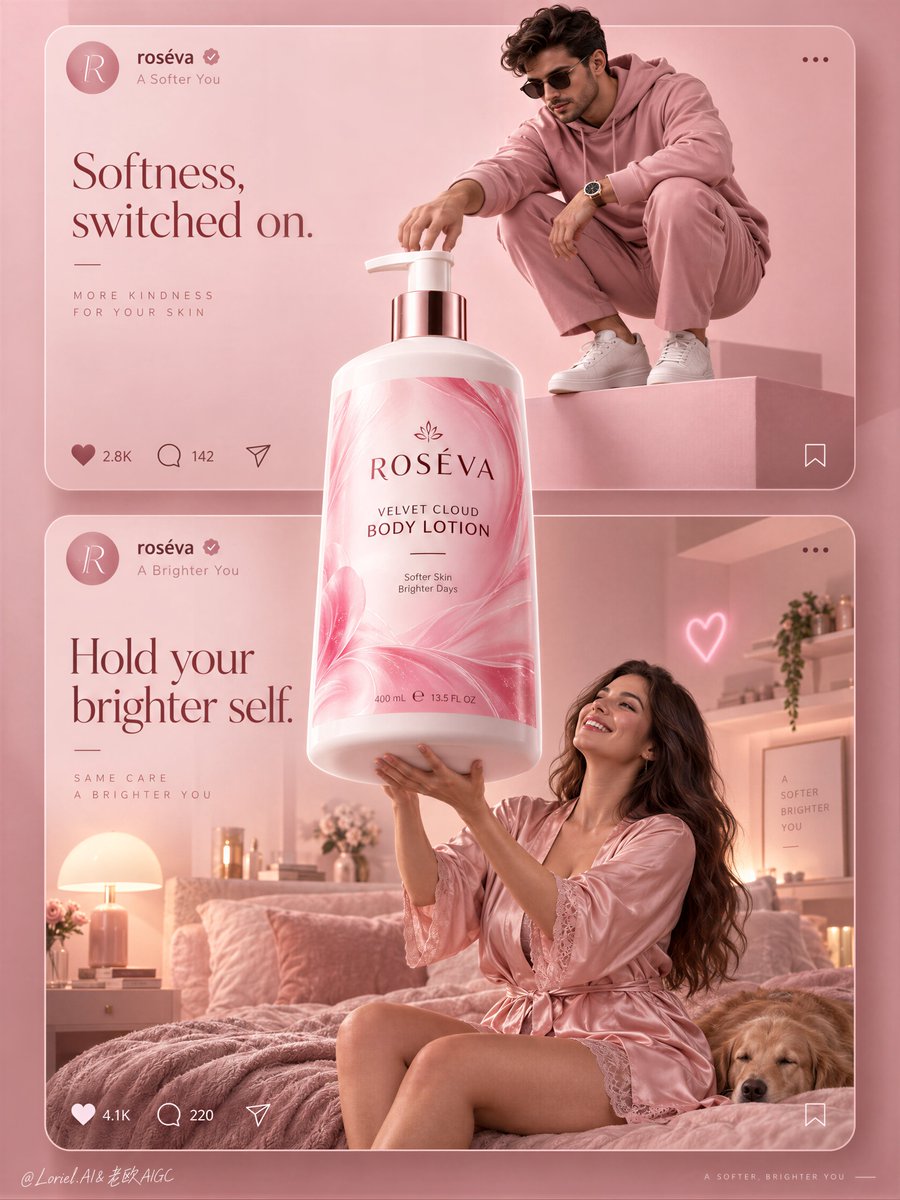
A social-style campaign feels like a brand world when the product is allowed to break the feed.
🌸 one oversized bottle centered on the shared axis, overlapping both stacked cards and extending beyond their internal scene boundaries
The bottle becomes the bridge between two moods instead of a product pasted into two separate posts.
✨ keep interface bars and interaction icons thin, low-contrast, and pinned to the card edges—not the product center
The UI reads as structure, not decoration. Your eye stays on the label, while the cards still feel instantly social-native.
GPT- image 2.5 prompt👇
A premium social-first beauty campaign poster for fictional body-care brand ROSÉVA, merging emotional lifestyle softness, material precision, and curated minimalism into one image. Preserve the exact structure: two large stacked social-media-style cards inside a monochrome blush-pink world, one oversized hero pump bottle breaking through the center and overlapping both cards, simplified interface bars at the top of each card, and minimal interaction icons below. The product is the absolute visual leader and bridges the two scenes.
Top card: a stylish adult man in a monochrome rose-pink fashion look crouches on a clean pink pedestal in a minimal editorial studio, reaching toward the giant bottle as if switching it on or claiming it. He wears a refined pink hoodie, tailored pink trousers, clean white sneakers, dark sunglasses, and a polished modern watch. His pose is sculptural, compact, controlled, and fashion-led, with strong negative space. Bottom card: an adult woman in a silky blush-pink robe or pajama set lifts both arms toward the giant bottle in a dreamy bedroom scene, smiling with real delight. She is photoreal, adult, naturally proportioned, anatomically correct, with realistic skin texture, subtle pores, natural tonal variation, elegant hands, five normal fingers, long healthy hair, mature body softness, believable gravity, natural lower-body volume, and no plastic AI skin. The bedroom is softly styled with a blush bed, warm bedside lamp, restrained shelf objects, one tiny neon heart accent, and minimal feminine decor without clutter.
The hero product dominates the center axis: one oversized premium body-lotion pump bottle floating or standing between the cards, visibly larger than life and brighter than everything else. Redesign it fully in English with an original premium system: brand name “ROSÉVA”, product name “VELVET CLOUD BODY LOTION”, one short support line only, clean elegant hierarchy, and no excess claims. The bottle must feel hyperreal and luxurious: soft-touch white plastic body, satin sheen, crisp shoulder geometry, polished pump, luminous pink label with fluid marbling or petal-like gradient movement, sharp fine print, subtle reflected highlights, and strong volumetric presence. The label is vivid but controlled, acting as the most saturated element in the composition.
Use a vertical campaign composition with clear rule-of-thirds balance, refined top-middle-bottom rhythm, and enough negative space to breathe. The social-post UI should be premium and reduced: circular profile icon, English handle, tiny verification mark, minimal like/comment/share icons, and one or two very short caption lines treated as graphic architecture rather than app clutter. Reimagine the copy in an international tone: top card line such as “Softness, switched on.” and bottom card line such as “Hold your brighter self.” Keep all text minimal, elegant, globally legible, and integrated into the pink system.
Lighting is soft, layered, and beauty-commercial: clean high-key pink studio light in the top card, warm blush ambient practical light in the bottom bedroom card, and a brighter hero light on the central bottle so it reads as the campaign core. Add soft contour light on the bottle edges, subtle glow on the label, gentle fabric sheen on the satin robe, and readable depth without muddy shadows. Color hierarchy: 70% blush pink, rose, powder, and cream tones, 20% soft white and skin highlights, 10% hot-pink label energy and tiny neon accents. Materials must feel exact and tactile: satin fabric, matte pedestal paint, soft-touch bottle plastic, polished pump, velvet bedding, glassy neon, clean interface graphics, and subtle premium print finish.
The final result should feel like Orbit, Transit, and Port fused together: emotionally inviting, materially precise, socially fluent, and elevated into a campaign-board beauty image rather than a literal feed screenshot. Hyperreal, international, graphically unified, soft yet sharp, minimal yet persuasive. No copied branding, no broken typography, no malformed hands, no extra fingers, no distorted anatomy, no warped bottle, no cluttered UI, no muddy pinks, no chaotic props, no cheap influencer aesthetic.
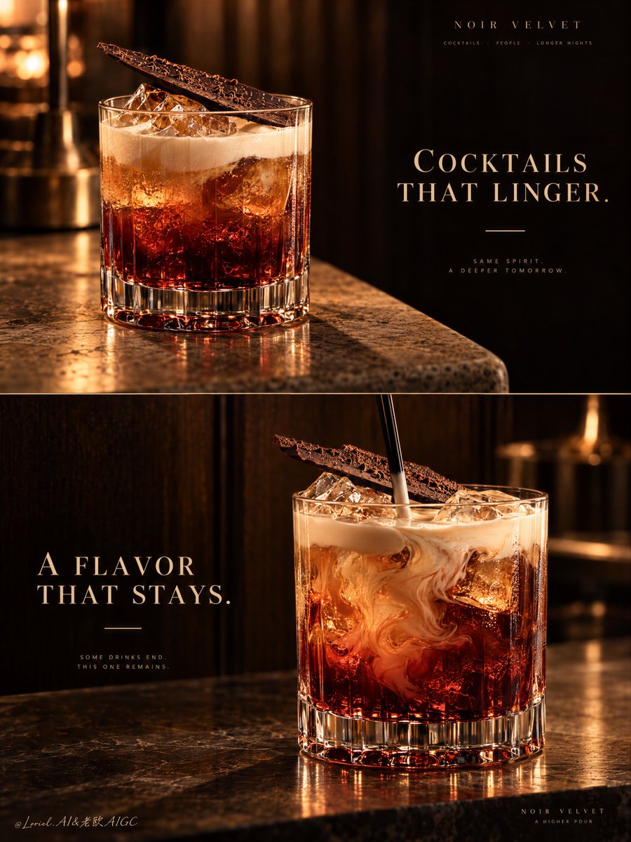
A two-panel drink campaign becomes a system when the second image changes the moment, not the identity.
🍫 repeat the same rocks glass, red-to-amber liquid body, pale cream top, and diagonal chocolate shard in both panels
The viewer recognizes one signature serve instantly. The campaign gains range without looking like two unrelated cocktails.
🌀 keep the upper panel still; reserve motion for the lower panel, where a black stirrer folds cream slowly into the amber-red drink
The contrast creates a visual sequence: first the object of desire, then the ritual of making it. The motion stays elegant because everything else remains controlled.
GPT- image 2.5 prompt👇
A premium cocktail campaign poster for fictional bar brand NOIR VELVET, merging emotional atmosphere, material precision, and curatorial restraint into one unified two-panel vertical advertising image. Preserve the exact luxury-drinks structure: two stacked horizontal panels, warm low-key bar atmosphere, dark wood and amber light language, one hero cocktail per panel, elegant text zones in negative space, and a strict campaign-wide product identity. Both cocktails must feel like the same brand family, bar program, and visual universe.
Top panel: a close three-quarter beauty shot of a short crystal rocks glass on a softly lit stone or travertine bar edge. The cocktail is the hero: deep garnet-red at the base, glowing amber through the middle, topped with soft pale cream foam, with clear ice catching warm highlights. A thin crisp chocolate shard or cocoa tuile rests diagonally on top as the unmistakable signature garnish. The glass is heavy, premium, and hyperreal, with thick base refraction, subtle condensation, and rich liquid glow. On the right side, keep a calm dark negative-space zone for elegant English typography such as “COCKTAILS THAT LINGER.” in refined serif capitals, with one thin accent line beneath. This panel should feel quieter, stiller, and more seductive.
Bottom panel: a second hero variation from the same drink family, larger and more front-facing, placed slightly right of center on a polished bar or stone surface against a deep dark wood backdrop. Keep the same short crystal glass, same red-to-amber body, same pale cream top note, and same chocolate garnish language. The liquid is shown in a fresh stirring moment, with cream folding into the amber-red body, visible ice, and a black stirrer descending from above. The motion should feel hypnotic but controlled, never messy. On the left side, preserve a clean text zone for a secondary English line such as “A FLAVOR THAT STAYS.” in the same typography system, with the same minimal accent.
This is a tightly controlled product-promotion image, so the drinks must dominate at all times. No human figures, cluttered props, random garnish drift, or extra fruit unless extremely restrained. The signature identity must stay absolute across both panels: same glassware family, color hierarchy, cream signature, chocolate accent, warm cinematic bar light, typography discipline, and editorial quietness. The result should feel like Orbit, Transit, and Port fused together: emotionally warm, materially exact, and elevated into a global luxury hospitality campaign.
Lighting is the key mood engine: warm directional amber key light from the upper side, soft fill preserving crystal, foam, and ice detail, deep brown-black background separation, glowing reflections through the red base, and smooth highlights on the cream and garnish. Color hierarchy: 60% dark espresso brown, black walnut, and shadowed bar tones, 30% garnet, burnt amber, and cognac-red liquid glow, 10% ivory foam and warm highlights. Materials must feel hyperreal and tactile: thick crystal glass, melting ice edges, silky cream foam, glossy liqueur body, delicate chocolate texture, polished stone, and dark timber depth.
Typography must be original, elegant, and integrated like luxury hospitality branding. Use English only. Keep it minimal, serif-led, widely spaced, and never touching the core recognition area of the drinks. If needed, place “NOIR VELVET” subtly in one corner or between the panels. The final result should feel like a Cannes-level cocktail poster: sensual, warm, product-dominant, graphically disciplined, globally polished, and unforgettable. No copied text, no messy splashes, no muddy shadows, no broken glass geometry, no cheap nightclub look, no clutter.
Faites attention à la façon dont vous traitez ceux qui vous aiment et vous respectent. On ne se rend pas compte à quel point les bonnes personnes sont rares aujourd'hui.
Les "seuls dieu m’e jugera" sont pleins dans les églises les dimanches espérant un jugement de celui-ci et quand à leurs yeux ils en ont pas ils recommencent de plus belle dès la sortie de celles-ci 🙄🔁