NHL #HometownRemix Concept: @MapleLeafs
Ivory/off-white is such an underused color in NHL uniforms, so I’m excited to see how Toronto taps into their long history for HTR. The sleeve stripes pay homage to the history of hockey in Toronto.
#LeafsForever
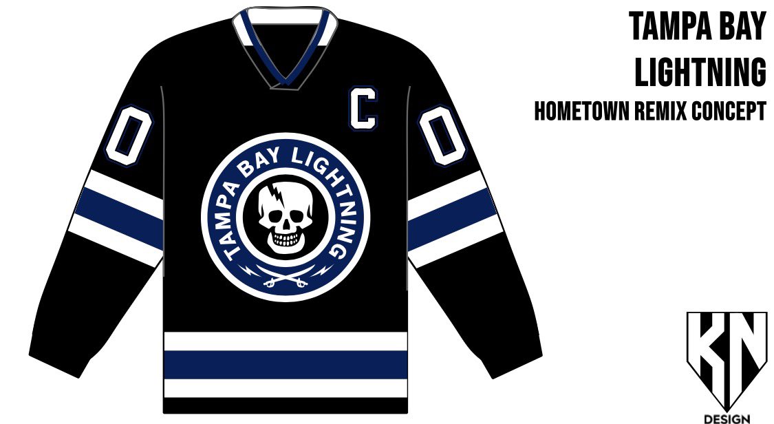
NHL #HometownRemix Concept: @TBLightning
I think the Bolts need to finally lean into the Gasparilla theme that they’ve toyed with over the years. A black jersey pays homage to their early years, something that is otherwise not really seen in the team’s wardrobe.
#GoBolts
@ToddWinz@StLouisBlues This was my first crack at a Blues HTR. I’ve since heard a report of what the crest will be, so stay tuned for some possible updates down the line once I get through the 32 teams… 👀
As for the Blues, the jersey will reportedly be black
NHL #HometownRemix Concept: @StLouisBlues
When the Blues unveiled their latest rebrand, they stated the STL mark would be best suited for a jersey “more representative of the city.” Maybe we see it take center stage in HTR?
#stlblues
NHL #HometownRemix Concept: @SeattleKraken
A four-tone blue jersey evokes the waves of the PNW, but what lurks below is far scarier. The eye of the Kraken glows as it hunts for its next meal.
#SeaKraken
NHL #HometownRemix Concept: @SanJoseSharks
The Sharks’ RR2 was one of the standouts of the set, IMO, so I think another round of Seals unis fully updated to Sharks’ branding would be an incredibly popular jersey.
#Sharks
NHL #HometownRemix Concept: @penguins
An icy blue color scheme to pay tribute to the early years of the franchise, before they adopted the black/gold color scheme. The Robopenguin returns as the crest, a nod to the Lemieux era and to the old Igloo barn.
#LetsGoPens
NHL #HometownRemix Concept: @NHLFlyers
Philly’s HTR jersey is reported to be dark gray, which allows the orange and black to really pop. I’m in love with the Liberty Bell logo teased by the team recently, so that logo finds itself on the shoulders of the jersey.
#LetsGoFlyers
NHL #HometownRemix Concept: @Senators
A city with a long legacy of hockey pre-NHL deserves a nod befitting of its history. The Senators should not be afraid to deviate from their Centurion branding, especially for a city-inspired uniform.
#Sens
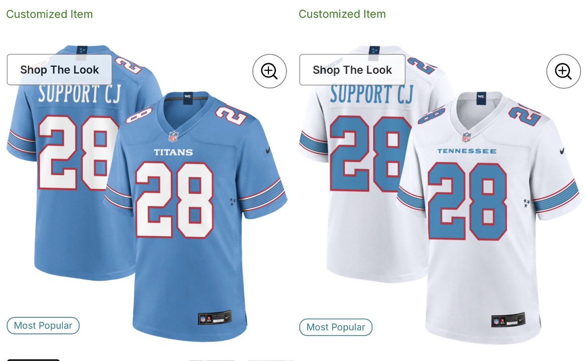
I customized both the @Titans home and away jersey on NFL shop to show my support for @ChrisJohnson28 with his battle with ALS we are all #TeamCJ2K as we all pray,support,and uplift him and his family through #WeAreCJ2K#NFL#Titans
@Johnny_Canuck69@NYRangers I think a navy third is a must for the Rangers. Their recent third jersey with the shield is one of their better alternate looks, IMO
NHL #HometownRemix Concept: @NYRangers
A black jersey allows the Rangers’ red/white/blue color scheme to shine like streetlights in the Manhattan night. The rarely-used shield primary logo replaces the traditional diagonal text.
#NYR
NHL #HometownRemix Concept: @NYIslanders
This is one jersey I’m beyond excited to potentially see on the ice this winter. Like many others, I think the Fisherman is one of the most under-appreciated logos in NHL history. And on a white base… shut up and take my money.
#Isles
This is pretty sweet.
The Reading Fightin’ Phils are doing a 4th of July hat for America’s 250th birthday as well.
And they brought back the Retro Train logo for it.
Here’s their cap in comparison to the #Phillies one.
NHL #HometownRemix Concept: @NJDevils
Finally, a black jersey that isn’t a Jersey jersey… a black uniform would round out the Devils’ uniform set in a really nice way.
#Devils