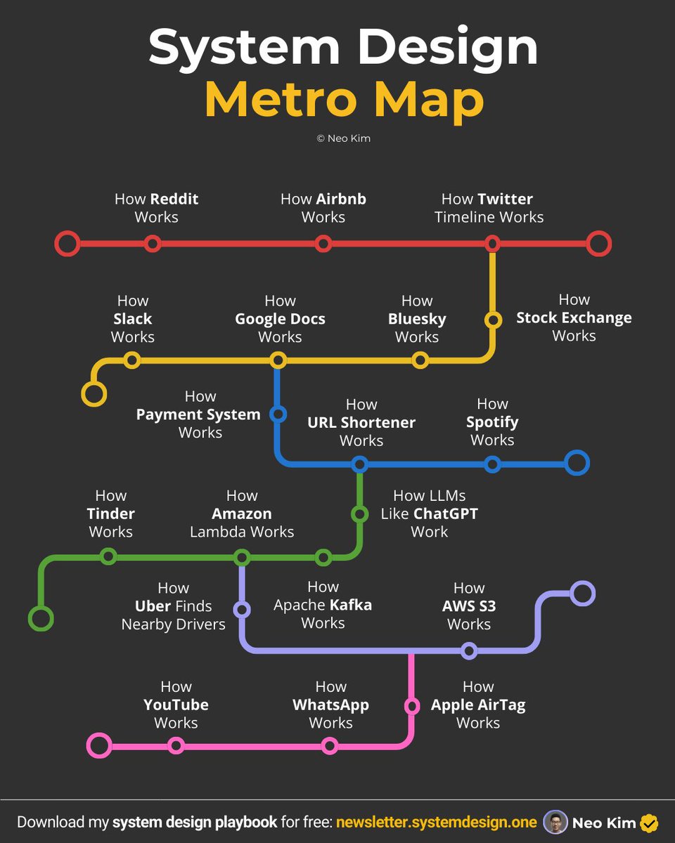
If you want to become good at system design, learn these 19 case studies (save this):
1 How Stock Exchange Works:
↳ https://t.co/iFNSX9TM9O
2 How Payment System Works:
↳ https://t.co/ARiLxGR43G
3 How YouTube Works:
↳ https://t.co/kHk3g6jz6t
4 How Google Docs Works:
↳ https://t.co/W57IkAjXpT
5 How Kafka Works:
↳ https://t.co/8rOy9KgCMo
6 How URL Shortener Works:
↳ https://t.co/tGndgdhH0V
7 How WhatsApp Works:
↳ https://t.co/VScq8QwHMr
8 How Airbnb Works:
↳ https://t.co/Bi5SAjfv5S
9 How Spotify Works:
↳ https://t.co/BxrH3oHIFS
10 How Slack Works:
↳ https://t.co/eIo29uOQOJ
11 How Reddit Works:
↳ https://t.co/o6Pw2hhj3T
12 How Bluesky Works:
↳ https://t.co/2rLYlRlky0
13 How Tinder Works:
↳ https://t.co/4E1zfgfvlw
14 How Twitter Timeline Works:
↳ https://t.co/pF2RYmPaIG
15 How Uber Finds Nearby Drivers:
↳ https://t.co/kJ2t8dtmch
16 How Amazon Lambda Works:
↳ https://t.co/lx0BjeSRZt
17 How Amazon S3 Works:
↳ https://t.co/iReWAEHwmj
18 How Do Apple AirTags Work:
↳ https://t.co/upWcgsXwKh
19 How LLMs Like ChatGPT Actually Work:
↳ https://t.co/5lCKxq2g4N
What else should make this list?
——
👋 PS - Want my System Design Playbook for FREE?
Join my newsletter with 200K+ software engineers right now:
→ https://t.co/ByOFTtOihX
———
💾 Save this for later & RT to help other software engineers ace system design.
👤 Follow @systemdesignone + turn on notifications.
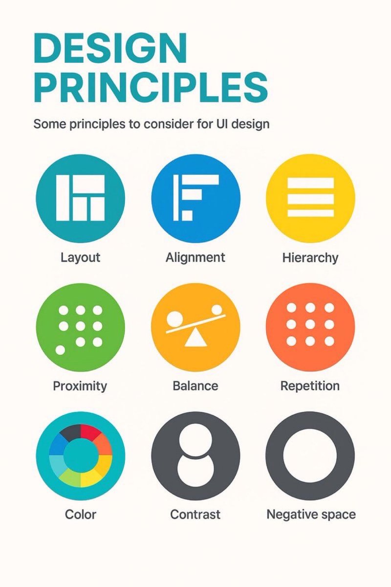
9 timeless design principles every UI designer should know 🙌
FREE Cheatsheet attached 🔖
Summary:
1. LAYOUT
Layout is the arrangement of visual elements in a design to create balance, clarity, and visual appeal.
2. ALIGNMENT
Aligning elements in a design along a common axis to create order and visual consistency.
3. HIERARCHY
Organizing elements to establish a clear order of importance, guiding the viewer's attention.
4. PROXIMITY
Placing related elements close together to indicate their connection or importance.
5. BALANCE
Weighting or arranging the elements within the image to create visual, even distribution of shape and space.
6. REPETITION
Consistently using the same design elements (e.g., fonts, colors, shapes) to create unity and reinforce visual identity.
7. COLOUR
Utilising colours intentionally to convey mood, meaning, and visual impact in a design.
8. CONTRAST
Contrast can highlight differences or add a focal point by using opposing colour, shade or textures.
9. NEGATIVE SPACE
Also known as white space, it's the empty or unmarked area around or between design elements, used to enhance readability and create visual balance.
Original cheatsheet by Jaxon White
#UX #UI #UIDesign #UXDesign
[Honor of Kings] Participate in the Christmas Gift Box event to get up to 1,800 Limited-Time Tokens. My code is: (Uncommon Christmas Gift Box LG34KYNH). Copy and use this code in the game to claim Limited-Time Token ×40!
Giveaway of the month!
Grab 8 clean Hero Section designs (Figma file) FREE!
Here’s how to get it:
• Like
• Repost
• Comment "HERO"
• Follow me so I can DM you the link
Enjoy the free drop!
Bad learning habits kill good design potential.
Most new designers randomly jump between tools and tutorials without a clear roadmap.
Here’s the ultimate guide to learning Design Fundamentals, UI/UX, and mastering Figma, step by step:
Bookmark it for later 💜