⚡ I started a free weekly newsletter: Lighthouse Weekly.
Every Friday: what the macro data actually showed this week, the news that moved markets, and what to watch next.
Drafted by AI from primary sources (FRED, ICE BofA OAS, 15 macro news feeds) — every claim reviewed by me before sending.
No clickbait. No "highest in history" stretches. Just the data, the framing, and the windows it sits in.
Today's first edition: https://t.co/jXRSX0LMR8
Sign up for next Friday: https://t.co/h9wq04yORi
Free, always will be.
Composite stress dropped from 41.6 (Jun 5) to 37.4 today.
Regime still reads COMPRESSED — "risk priced for perfection."
The CCC tier diverging from the rest is the classic late-cycle pattern.
Quiet at the top, cracking at the bottom.
Three weeks ago I posted that credit was broadening — every tier widening together.
Have to update.
It reverted, and how.
BB credit now sits at the 0th percentile of the past 3 years. Single-B at the 10th. HY at the 2nd. IG at the 1st.
Then there's CCC. 76th percentile. Still drifting wider on the week and month. The only tier with the warning triangle.
Between those two posts: a new Fed Chair, an unexpectedly hawkish dot plot (2026 median flipped from a cut to a hike), 17 of 18 officials seeing inflation risk to the upside, 2Y up 16bps.
And BB credit responded by pricing in zero risk.
One of these is wrong.
Tracking this daily on Lighthouse, free macro project I'm building. Newsletter went out this morning if anyone wants the longer version. https://t.co/5qZBRiZW4Y
For weeks I've been writing,
"CCC is the only tier widening, everything else still grinding tighter."
Looked at the dashboard this morning and that's not true anymore.
Everything moved together. BB, Single-B, HY, even IG ticked up on the day. CCC still leading but now it's got company.
Still calm in absolute terms — HY composite is at the 10th percentile, this isn't 2008. But two weeks ago only one tier was widening. Today all five are.
Composite stress went from 36.9 to 41.6 in that window. Still "normal" but moving.
Not calling anything. Just marking the day the dispersion stopped being a one-tier story.
Building these explainers as I go on Lighthouse — a free macro-education project. Friday newsletter rounds up the week in plain English.
https://t.co/5qZBRiZW4Y
"Yield curve" is one of those phrases that gets thrown around constantly in finance.
For years I nodded along like I knew exactly what it meant. I didn't really.
So here's the plain-English version I wish someone had given me.
Imagine you lend the US government money. They pay you interest — but the rate depends on how long you lend it for. 3 months, 2 years, 10 years, 30 years.
Plot those rates against time, and that line is the yield curve.
Normally it slopes upward — lend for longer, get paid more. Longer = more risk = more reward.
Right now: 2Y: 4.01% 10Y: 4.50% 30Y: 5.03%
So it's sloping up — but only just. The gap between the 2Y and 10Y is 0.49%. That's a "flat-ish" curve. Not inverted (the scary one — that's another post), not steep. Just kind of... cautious.
What a flat curve quietly says: the market isn't sure where rates are heading. Not enough conviction for a steep slope, not pessimistic enough to invert.
That's it. Genuinely not as complicated as the jargon makes it sound.
Next one I want to tackle: why an inverted curve makes everyone nervous. But first — what part of bonds or rates still feels like fog to you? I'm building these explainers around what actually trips people up.
— Data: FRED Treasury yields, 26 May close
The chart is real but the framing flattens the picture.
Every yield spike in your chart happened in a different credit regime. That matters more than the yield level itself.
Right now we're at 4.48% on the 10Y.
But underneath:
→ IG credit spreads sit at the 0th percentile of the 3-year FRED window — literal tights
→ BB at the 4th, HY composite at the 9th
→ CCC at the 73rd, +21bps on the month
When yields spiked into the 2008 crisis, credit was already widening. When yields spiked into the 2018 selloff, HY widened sharply right before. The yield level alone wasn't the warning — the credit dispersion alongside the yield was.
Today's setup is genuinely unusual: yields elevated AND quality credit at multi-year tights AND junk widening. That's not 2008 fingerprint. That's not 2018 fingerprint either. It's a new configuration worth watching carefully — but pattern-matching to past crises misses what's actually different.
Threshold I'm watching: CCC clearing 9.50% while IG stays at the floor. That's the genuine cross-tier divergence signal.
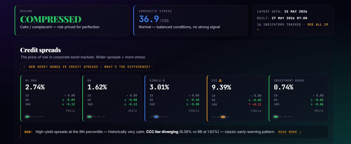
24 hours later, the dispersion just got wider.
IG: 0th %ile.
The literal tightest investment-grade credit has been in the 3-year FRED window.
BB: 4th %ile. Fresh lows.
HY composite: 9th %ile. Fresh lows.
CCC: 73rd %ile. Unchanged. Still drifting +0.21 on the month.
Quality keeps tightening. Junk doesn't. The IG-CCC gap is now wider than yesterday — not narrower.
Composite stress: 36.9. Still "Compressed."
When was the last time IG spreads sat at literal 3-year tights while CCC sat at 73rd %ile? Genuinely asking — I'm curious if this exact dispersion shape has a historical precedent.
— Data: FRED ICE BofA OAS, 25 May close. Percentiles vs 3-year history.
The equity breadth picture pairs with what's happening in credit underneath.
While NASDAQ 200-day breadth sits at 44% and S&P at 59%, credit is showing the same fingerprint — IG at the 2nd percentile (3-year tights), BB at the 8th, HY composite at the 12th, but CCC sitting at the 73rd, +26bps on the month.
Two different asset classes, same dispersion signature: headline indices calm, underlying narrow.
The mega-cap concentration story on the equity side and the quality-bid / junk-offered story on the credit side are arguably the same regime expressed twice.
The threshold worth watching: when CCC clears 9.50% while equity breadth stays in this range, that's the cross-asset confirmation.
Data: FRED ICE BofA OAS, 21 May close. Percentiles vs 3-year history.
The dispersion is the story today.
Headline credit looks bored — IG at 2nd %ile, BB at 8th, HY composite at 12th. Risk priced for perfection.
But CCC sits at 73rd %ile. +17bps in the last 5 sessions. +26bps on the month.
Quality bid. Junk offered. Headline calm.
The IG-CCC spread gap is the part to watch. Historically the low-quality tier widens months before headline credit rolls over. So far CCC is drifting, not accelerating — that's the line between melt-up setup and regime crossing.
Threshold to flag: CCC clearing 9.50%.
Where do you draw the line between compressed and elevated on credit dispersion? Curious which spread you watch.
—
Data: FRED ICE BofA OAS, daily close 21 May 2026
Percentiles ranked vs 3-year history (BAML series since April 2023)
@0xAralez There is a good case for a continued melt up but you need to keep and eye on the smoke detector, credit spreads tell us if the smoke detector is stating to sound off https://t.co/zTOx0mdO2k
Tight credit spreads aren't a timing tool.
Here's what history actually says about the gap between "credit market complacent" and "stocks top."
The pattern across the three big drawdowns of the last 25 years:
📉 Dot-Com (2000) Spreads bottomed at 1.55% in late January. S&P peaked ~6 weeks later in March. Then: Nasdaq -78%, S&P -50% over the next 2.5 years. Shortest fuse. Equity valuation bubble, not a credit problem.
📉 GFC (2007) Spreads bottomed at 1.53% in February. S&P peaked 8 months later in October. Then: S&P -57%, spreads quadrupled to over 6%. The classic case. Spreads sat at silly-tight levels for most of a year while everyone said "this time is different." Anyone shorting the market in Feb 2007 spent 8 months bleeding before being proven right.
📉 COVID (2020) Spreads bottomed at 1.96% in December 2019. S&P peaked ~2 months later in February 2020. Then: -34%, recovered fast on Fed intervention. Different — exogenous shock that bypassed the normal credit warning. Spreads can't predict pandemics.
Three lessons:
→ Spreads at troughs are NOT a timing tool. Gap to peak ranged 1-8 months. That's a 4x difference.
→ The depth of drawdown varied wildly from the same starting condition. -34% to -78%. What causes the unwind matters more than how complacent things looked beforehand.
→ The actual signal isn't the level — it's the change. Spreads being low isn't the warning. Spreads starting to widen consistently after being compressed is.
Where we sit today:
HY OAS: 2.78% — wider than the troughs before 2000 and 2007. Less extreme starting point than those bubbles.
Composite stress: 35.6/100. "Compressed/calm/complacent."
30-day change in HY: still DOWN -0.07%. Still compressing, not yet widening.
CCC tier (the riskiest): 73rd percentile, +26bps on the month. The early-warning tier IS moving — but the headline isn't yet.
So, we're in the phase that historically lasts 1-8 months before something resolves. The smoke detector is quiet. The wood is still in the fireplace. Nobody knows when, or whether, someone strikes a match.
What to watch: when CCC and HY start widening together consistently, that's the signal worth taking seriously.
Data: FRED Moody's Baa-10Y for long history, ICE BofA OAS for current credit tiers.
The macro data game is one of finance's last big rent-extractions.
Bloomberg Terminal: $30,000 a year.
Refinitiv: similar.
S3 Partners short data: five figures to start.
Goldman Sachs' research portal: institutional pricing. The detailed Fed flow-of-funds data: behind a paywall most retail traders don't even know exists.
So when you see a chart from a big macro account, half the time you're looking at $50k of annual data subscriptions packaged into a screenshot.
I'm building Lighthouse without any of that.
Everything on https://t.co/h9wq04yORi — credit spreads, yield curves, dispersion data, regime tracking — is built from free public sources:
→ FRED (Federal Reserve) for credit spreads, yields, balance sheet data
→ ICE BofA OAS series for HY, IG, BB, Single-B, CCC tier breakdowns
→ FINRA's free API for short interest
→ Treasury's TIC reports for foreign holdings
→ CFTC Commitment of Traders for futures positioning
The trade-off is real: the data is delayed. FRED updates daily on most series, but typically 1 trading day behind.
Short interest is bi-monthly with a 10-day lag. TIC is monthly with a 60-day lag.
For a trader needing nanosecond execution, that lag is a problem. For understanding macro structure and regime crossings, it almost never matters. The signal moves on weekly-to-monthly timescales. The delay is noise.
The real moat in 2026 isn't access to data. It's synthesis.
A determined builder with FRED + Python + good thinking can replicate 80% of what a junior analyst at a hedge fund builds. The remaining 20% is the difference between trading and understanding.
Lighthouse isn't trying to be Bloomberg. It's trying to be the free thing that's better than Bloomberg for explaining what's happening underneath the headlines.
The paywall is a moat. But it's also what's forcing me to build something that synthesises free data into clear narrative — and that's turning out to be the more interesting product.
Free Friday newsletter, no paywall, primary sources only.
#macro
https://t.co/h9wq04yORi
Worth pulling the historical pattern here.
Elevated shorts + equities at ATH + credit calm-at-surface has four real analogues:
→ late 1999 — melted up 5 more months before peak
→ late 2007 — held within 5% of ATH for 9 more months
→ early 2018 — recovered, ran higher, then -20% in Q4
→ late 2021 — melted up to Jan 2022, then -25% drawdown
Pattern in each: squeeze higher first, resolve later. The shorts were eventually right but mostly after a final melt-up. So short positioning alone isn’t a sell signal — it’s fuel.
What’s worth watching is what diverges underneath. Right now headline credit is calm (HY at 12th %ile, IG at 2nd) but CCC sits at 73rd, +26bps on the month.
That low-quality tier widening before broad credit is the early-warning signature from each of those four episodes — typically months ahead of the index-level resolution.
So far CCC is drifting, not accelerating. That’s the difference between a melt-up setup and a regime crossing. The threshold to flag: CCC clearing 9.50%.
If you want the weekly read on this kind of signal — what’s diverging beneath the surface and what’s the threshold to watch — I write a free Friday newsletter on it.
https://t.co/h9wq04zmGQ
Worth a second look at that data — TIC report numbers track holdings, not transactions.
When 10Y yields rose in March, bond prices fell. Existing holdings get marked down on those price changes even with zero actual selling.
Japan went from $1,239B → $1,192B in holdings. Some of that is likely real selling. A meaningful chunk is mark-to-market.
The Treasury department itself notes this in the TIC footnotes — the data is “stock minus stock,” not flow.
The actual flow picture in March (per Treasury’s separate transactions table) was more muted than the holdings change suggests.
Net foreign buying of long-term Treasuries was still positive for Q1 overall.
Doesn’t mean nothing’s happening — foreign demand is genuinely worth watching, especially with deficit dynamics in play. But “$138B sell-off” is a stronger claim than the data actually supports.
If you want the weekly read on this kind of thing — what the macro data actually shows vs. how it gets framed — I write a free Friday newsletter on it.
https://t.co/fBVms70c46
https://t.co/h9wq04zmGQ
⚡ I started a free weekly newsletter: Lighthouse Weekly.
Every Friday: what the macro data actually showed this week, the news that moved markets, and what to watch next.
Drafted by AI from primary sources (FRED, ICE BofA OAS, 15 macro news feeds) — every claim reviewed by me before sending.
No clickbait. No "highest in history" stretches. Just the data, the framing, and the windows it sits in.
Today's first edition: https://t.co/jXRSX0LMR8
Sign up for next Friday: https://t.co/h9wq04yORi
Free, always will be.