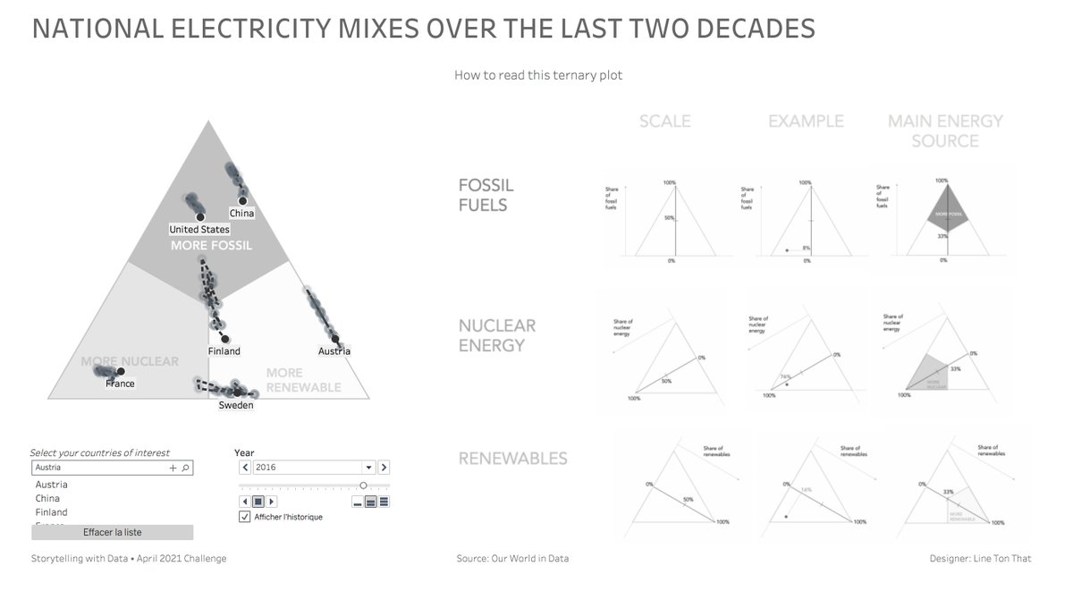
National electricity mixes: How to compare them easily?
Check out this data viz to find out more: https://t.co/m3lZdFkKvn.
---
More on the design process at: https://t.co/Z4yaElr8v3
---
#datafam
What questions do you have about making good graphs, weaving data into stories, designing effective slides & presenting powerfully? I'll answer viewer questions in our FREE *storytelling with data* mini-workshop Oct 25th 11AM–12PM ET. Register to join! https://t.co/7LtYpY0Uur
Delighted that my reimagining of Minard's dataviz on Napoleon's Russian campaign has made it onto the longlist for the 2023 #IIBAwards. Congrats to everyone on this list!
(Best viewed on desktop computer) https://t.co/Yb9uuAIsOX
#D3#Observable
Did you know that Rwanda ranks first in 2021 for the proportion of women in parliaments with 61.5% 👏?
In this dataviz, you can also explore access to electricity and military spending.
---
https://t.co/7bEK0SrQ4C
---
#iib#tableau
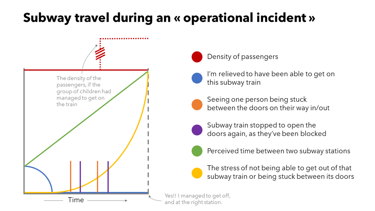
I had a lot of fun creating a comedic chart for this month's #SWDchallenge. Inspired by @mattsurely.
(I hope my next subway ride will be less stressful 😅)
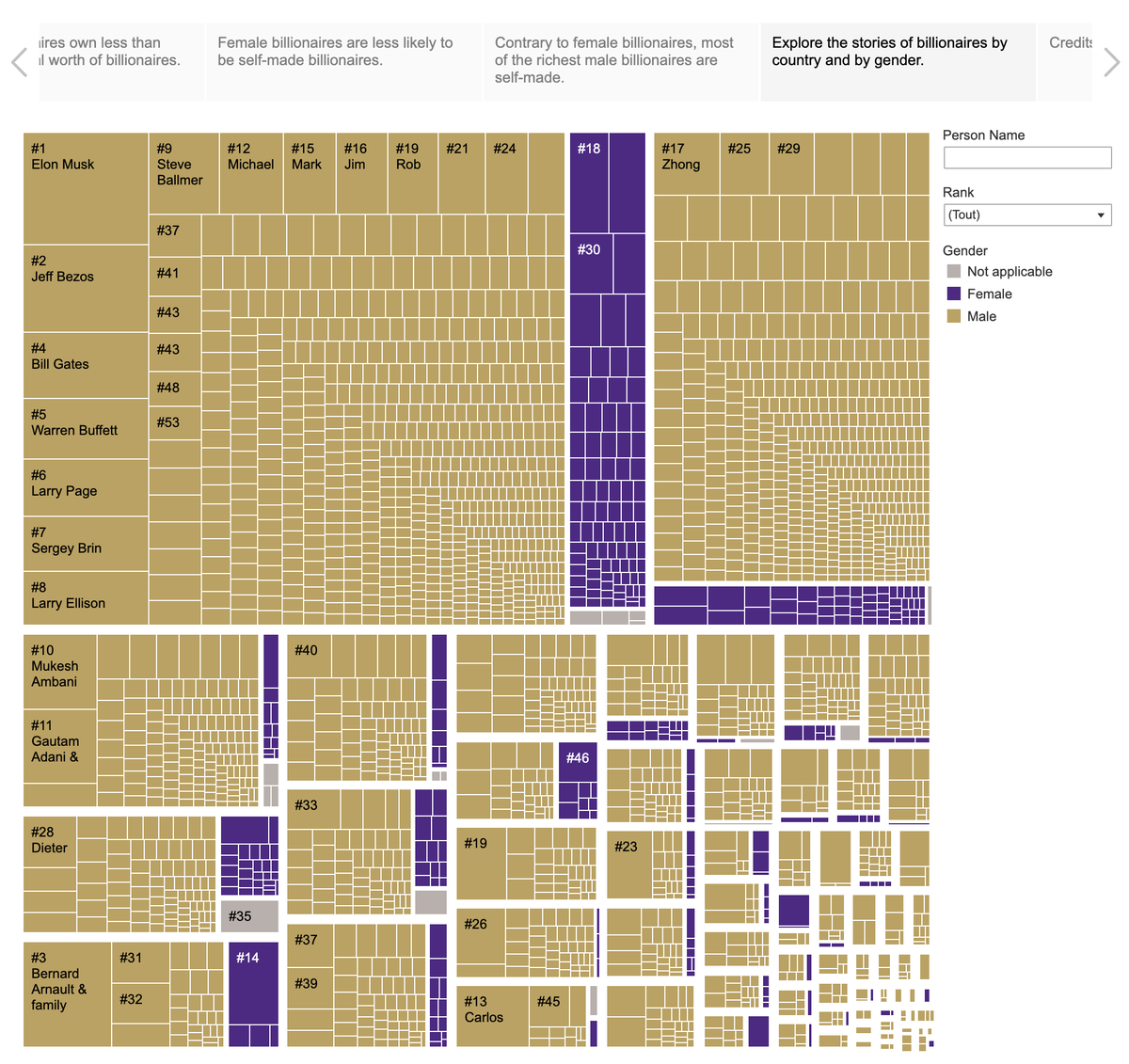
What gender are the billionaires (sorry, that's very binary like the data set...)?
Participating in data viz challenges is always a great opportunity to try new things. For me, it was tree map and Tableau story for the last #SWDChallenge.
https://t.co/HRUytbjIdr
#tableaupublic
@maf2k @NicoleKlassen12 This is great! Your passion for board games shines through! Very interesting narrative structure!
I admire that your sons cooperate so that one of them wins 😉
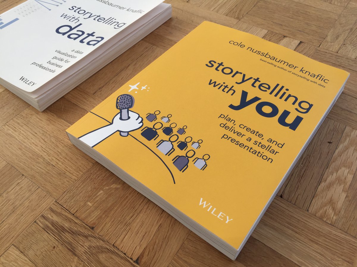
Today I received the physical copy of Cole Knussbaumer Knaflic's latest book. As much as I love reading e-books, flipping through a book is still a great pleasure, and sometimes my best way to search for an answer.
#storytellingwithyou
https://t.co/RrIF9wsjzY
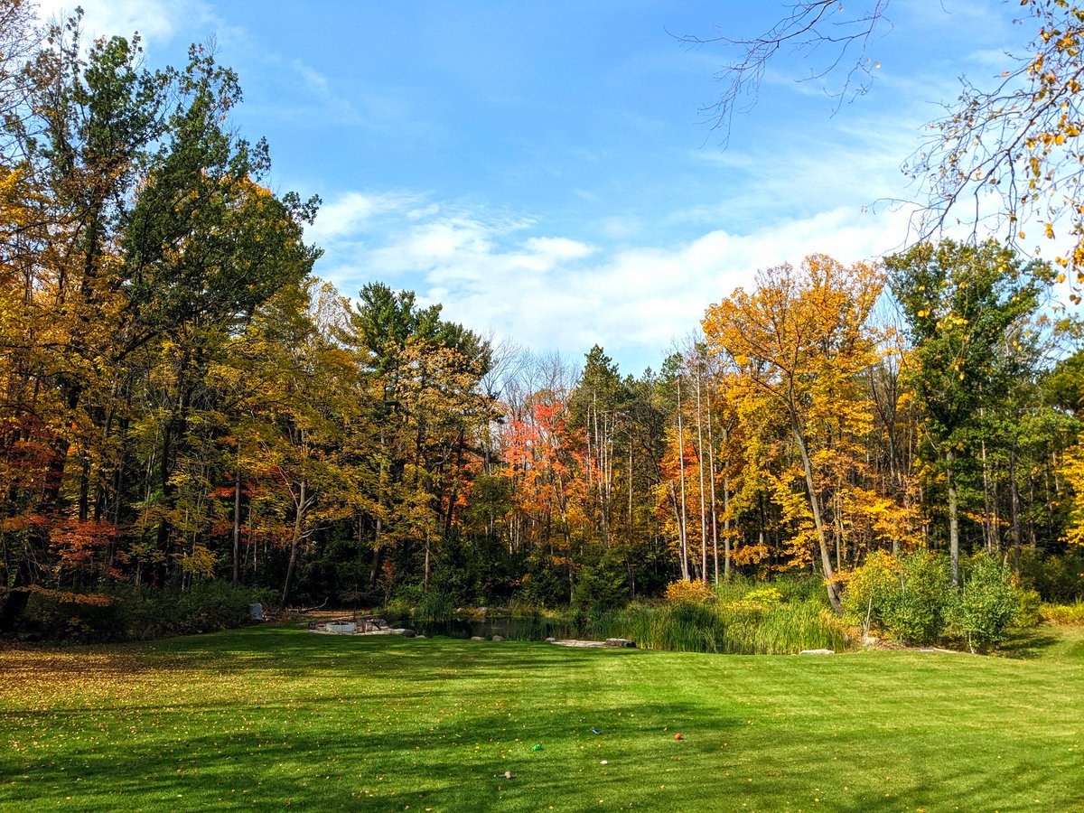
While our backyard trees turn all the pretty fall colors, the October #SWDchallenge focuses on a different kind of tree. Find some data that suits, then create & share a TREEMAP (or peruse those already shared!): https://t.co/lDMitsh7Vt #dataviz
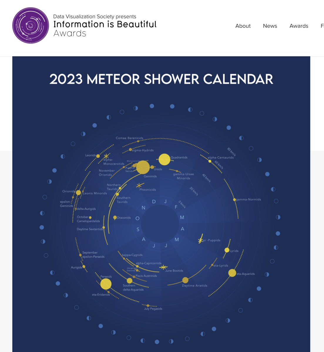
The new version of my meteor shower calendar has been long listed in the #iibawards ☺️!
https://t.co/YgigXkzjL7
https://t.co/UNGOVhic77
https://t.co/bH9TP0bR46
Announcing the longlist for the 2022 #IIBAwards! Get inspired by over 1,000 entries in our showcase created by the global #dataviz community from 2019-2022!
https://t.co/9M8K8QoNVz
@VizWithIrene There's also the scatterplot which is called "nuage de points" (literally cloud of points).
For specific terms, you can switch from English to French in Tableau using the Help menu (a bit tedious though, since you need to restart Tableau to apply the new setting)
A live and worldwide premiere about the finale presentation of the #storytellingwithyou book: It's tomorrow 12 pm Eastern time!
Wow, so cool to share this knowledge on Youtube 🙏!
https://t.co/Wm8IRQqcos
https://t.co/8T6iYwdUvG
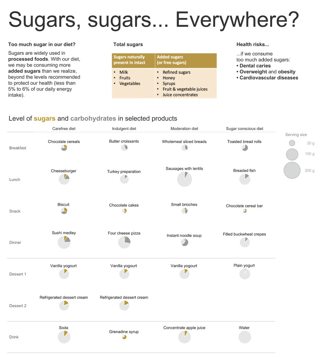
Sugars, sugars... Everywhere?
We might be eating more sugar than we think! Discover dishes that contain added sugars, and how our daily sugar intake might be too high.
#sugar#tableau#piechart#SWDChallenge
https://t.co/kq0YClo0ip
@MartheViallet @KirellBenzi@SalonData Ah ah, la surprise n'est pas feinte 😅 Je me souvenais de cette oeuvre et de ses couleurs magnifiques!
Bravo pour cette magnifique exposition et pour la conférence!! 👏���
I was so curious to know the "secret" behind great presentation skills. For me, this sentence from storytelling with you sums it all. Such an inspiring read!
https://t.co/RrIF9waIIq
#storytellingwithyou