Generosity is not about saying yes to everyone. It’s about supporting people who live up to your standards of character.
Helping people who are consistently selfish rewards the wrong behavior.
A key to healthy boundaries is reserving your time for those who respect your time.
No text back?
No problem.
Make plans with people who have time for you. Go on a solo date. Paint, cook, write, or start a new hobby. Try a new restaurant or café, or take a mini road trip. Stretch your muscles with yoga, hit the gym, or go for a run or bike ride. Take a salt bath, find a new show to watch, or dive into a book. Catch up on sleep.
Don't attach your joy, worth or time to a reply.
You should create a podcast, not a blog.
There are more than 1 billion blogs.
There are 7.8 billion people in this world.
To put it in perspective, we have 1 blog for every 7.8 people in this world.
We don’t need that many blogs… that’s why 87.34% of the pages in our database get no search traffic from Google.
Just think about that... 87.34% of the web pages out there get no traffic from search engines. It's a big waste of time and money.
On the flipside, there are roughly 4.2 million podcasts.
That’s roughly 1 podcast for every 1,857 people.
That’s not that competitive when compared to blogging.
Plus, podcast listeners have money. 51% of podcast listeners have a household income of at least $75,000.
On top of that 61% of podcast listeners have a 4-year college degree. In comparison, only 44% of the entire population has a 4-year degree.
So, start a podcast.
In an ideal world, you would have a podcast AND a blog.
But if you could only choose one, start with a podcast.
You’ll have less competition.
Stop using the color RED on your website.
Colors affect purchases.
People associate the color red with stop. Such as a stop light or a stop sign.
And when people use that color for their call to action buttons, we typically see conversion rates drop by 8 to 13%.
Instead, here are some other colors to try.
Yellow – the color is optimistic and youthful. Typically used to grab the attention of a window shopper.
Blue – creates a sensation of trust and security. Often used by banks and businesses.
Green – is typically associated with wealth and is one of the easiest colors for the eye to process. It’s used to create a sense of relaxation.
Orange – this color is typically aggressive. It’s used for call-to-action buttons like “subscribe”. Typically, because the color pops on a page.
Pink – it’s romantic and in many cases, it is used to market products to women.
Black – it’s powerful and sleek. Typically used to market luxury products. Think Amex black card.
Purple – used to soothe and calm. You see it used with a lot of anti-aging and beauty products.
Colors can affect your conversion rates in both a positive and a negative way.
Use the right color for the right time and place.
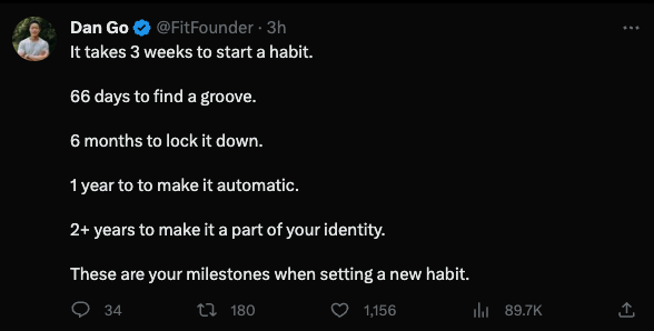
Love this from @fitfounder
When you compare your groove to someone else's identity just remember that someone else is comparing their habit formation to your groove.
Stay focused on your path.
It is nearly impossible to have your best idea the first time you think about something.
The most likely way to uncover important insights is to frequently revisit a problem. The longer you’re in the game, the more ideas bubble up to the surface.
Time unlocks insights.
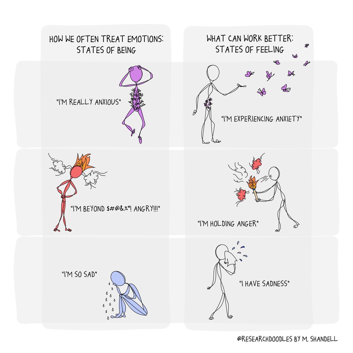
A key to regulating emotions is to treat them like visitors in your home.
"I'm angry" lets a feeling take permanent residence. "I'm hosting some anger today" is a reminder that not all guests are welcome.
Emotions may drop in unannounced, but we decide which ones get to stay.
Stop asking for advice before you start.
That's not how learning works.
You need to be building something that exposes you to problems and struggle.
Most people ask for advice as procrastination to avoid failure.
https://t.co/2ahTWEZDwl