Thanks to all of you who followed our 2020 Map of the Week challenge! #TorontoAtlas As you may have noticed, it got the best of us and we were only able to make it to week 33. Now that we're on vacation in St. Barts, we thought we'd highlight our personal faves to end the year:
#topoli To all of you who live in the venn diagram intersection that includes data nerds and development nerds -- and you know who you are -- the CoT is about to dump 15 yrs of Section 37 records into the City's open-data portal. Deets here: https://t.co/YfTdaMWw6M. Have at it.
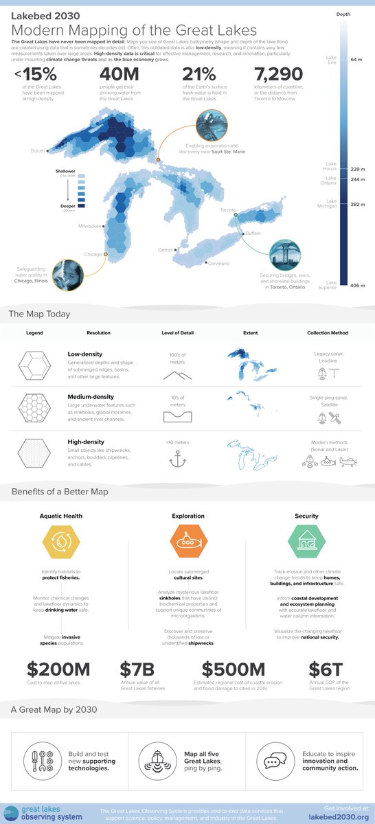
Modern Mapping of the Great Lakes!
This is a fun project we did for @RealGLOS ahead of their #Lakebed2030 Conference.
What % of the Great Lakes have been mapped in high density? See below!
#dataviz#infographics#maps
Today, only 5% of the Great Lakes are mapped at high-density, leaving big areas of unknowns across our lakefloor.
We created this infographic to explore what it will take to complete this map.
https://t.co/ESeXPbB664
More at https://t.co/Fka9gyZuqK
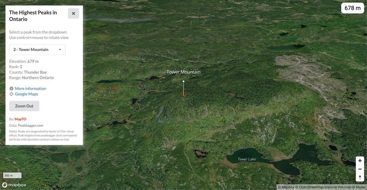
New Map: The Highest Peaks in Ontario
https://t.co/gvq1CXUBbf
For something completely unrelated to COVID (started before camping was outlawed), please enjoy this tour of the highest peaks in Ontario. 🗺️⛰️🛶🏕️
#Map#Maps#Toronto#Ontario#GIS#dataviz@Mapbox
Maps have been core to our work here at The Local, starting with our very first issue, The Geography of Difference. They reveal truths about Toronto that are otherwise invisible to the naked eye. https://t.co/dSGbUwhFun
In Toronto, the big difference between illness and health is your postal code. Here's the full collection of maps we assembled while putting together our latest story.
1. COVID-19 infections are highest in the northwest and east
In the five Toronto neighbourhoods worst-hit by COVID, all in the northwest, there are no pharmacies offering vaccines. The five neighbourhoods with the fewest infections have 12. @royinori on how COVID hot-spots have become vaccine deserts. https://t.co/QLE2ToTM3t
Ever wonder what the footprint of every building in #Hamilton looks like? Well look no further!
Check out cool interactive map of every single building in the Greater #Toronto & Hamilton Area🗺️ #HamOnt#topoli
https://t.co/w2LmSpCmxD
Week 16: People per Pharmacy in #Toronto
Thinking about how people access medication, medical supplies and other essential products, we looked at how the distribution of pharmacies compares to the population across the City.
#TorontoAtlas#Dataviz#COVID19
@shawnmicallef A little dated now and I know a lot of that data is available on the city’s open data portal. Maybe this could be a quick weekend project!