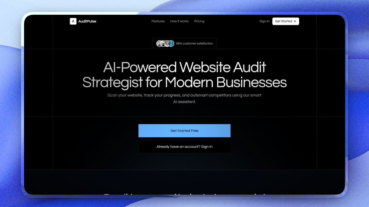
I'm building a tool that audits websites using AI. And I'm doing it completely in public.
𝗛𝗲𝗿𝗲'𝘀 𝘄𝗵𝘆 𝗜 𝘀𝘁𝗮𝗿𝘁𝗲𝗱.
Slow load times. Broken links nobody catches. SEO gaps that kill traffic. Security holes waiting to be exploited.
Most businesses don't even know these problems exist until it's too late.
I watched it happen too many times. Good businesses, solid products, getting destroyed by invisible website problems they never saw coming.
So I built ��𝘂𝗱𝗶𝘁𝗣𝘂𝗹𝘀𝗲, it's an AI that's Scans your entire site in minutes and tells you exactly what to fix and how to rank higher in Google
We're close to launch and I'm sharing everything, the wins, the mess, all of it.
Am going to run free audits for everyone that drops their website in the comments section.
Your competitor just got audited. And lost.
I'm building Competitor Battle Mode into AuditPulse.
Paste two URLs. It audits both sites and shows you exactly who wins across Performance, SEO, Security, and Content. Side by side. Category by category.
Agencies, imagine opening this in a client pitch and showing them precisely where their competitor is bleeding.
That's the close.
Most founders build MVPs wrong.
They spend 3 months building 7 features before a single user touches the product.
That's not an MVP. That's a fear project.
A real MVP is one feature that solves one painful problem for one specific person.
Not a dashboard. Not onboarding. Not a settings page.
The one thing that makes someone say "I need this."
That's your validation signal. Everything else is noise.
Ship the ugly version. Watch what people actually do. Then build what they prove they want.
Simplicity isn't laziness. It's discipline.
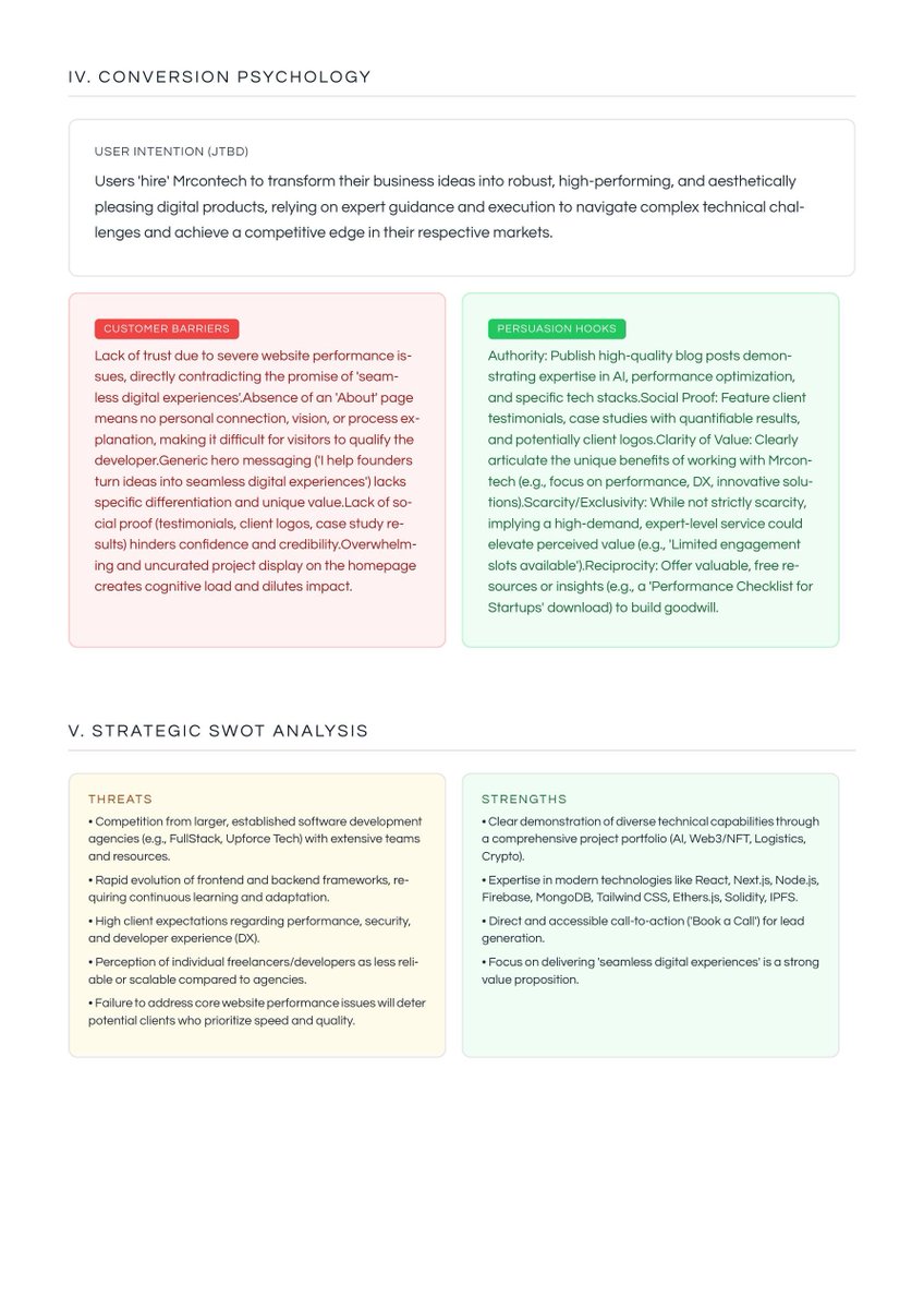
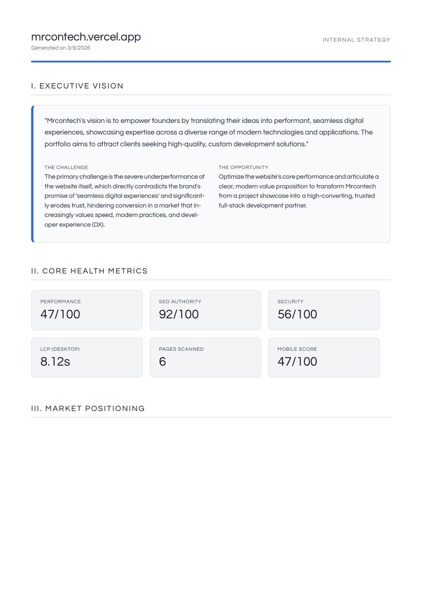
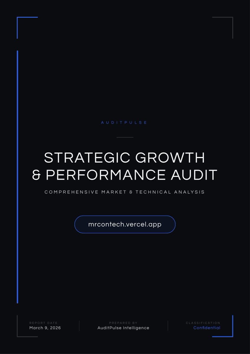
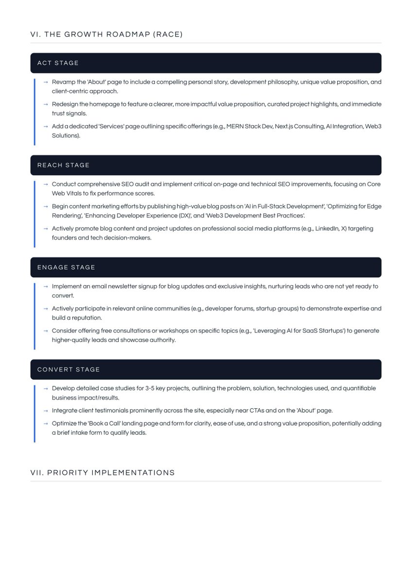
One thing I'm really proud of with AuditPulse is the reports pdf.
These aren't ugly data dumps.
They're polished, multi-page executive reports you can hand straight to a client or a stakeholder and look like you spent hours putting it together.
AuditPulse does it in minutes.
➱ Clean layout
➱ Branded design
➱ Everything explained in plain language
No technical jargon. No confusion. Just a report that actually makes sense to the person reading it.
This is one feature of many launching in AuditPulse.
Drop your site in the comments. Free audit on me.
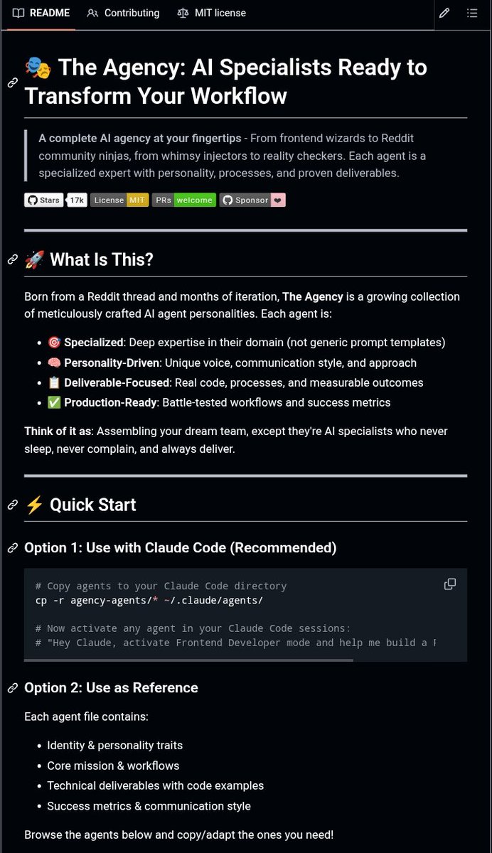
I just found a repo that gives you 61 AI specialists in a single clone.
It's called agency-agents.
From Frontend developers. Backend architects. Growth hackers. Reddit community builders. UX researchers. Reality checkers.
Each one isn't just a prompt, It's a full agent with a personality, a process, and actual outputs.
The idea is simple:
➱ Pick the specialists your project needs
➱ Drop them into Claude Code (or Cursor, Windsurf, Aider)
➱ You've got a full team without hiring one
No more "act as a developer" prompts that forget everything after two messages.
These agents have context, opinions, and they push back.
If you're a solo builder, this is worth 10 minutes of your time.
Link in comments.
I stopped struggling with AI slop design the day I started prompting with structure.
If you're a solo builder or developer using AI to move fast, steal this framework.
Most solo builders treat AI tools like magic, they type something vague and hope for the best.
That's why the results look like AI slop.
Here's the exact 6-part template I now use every time:
1. 🎯 Goal — What you're building + who it's for
2. 🎨 Style — Colors, fonts, mood, design inspo
3. 🧱 Layout — UI sections broken down clearly
4. ✨ Motion — Hover effects, transitions, animations
5. 🧠 Tone — 2–3 words that lock in the feel (minimal, bold, calm...)
6. ✅ Must-Haves — Non-negotiable UI elements
The more context you give AI, the less guessing it does.
And the less time you spend fixing what it got wrong.
Here's what a real prompt looks like using this template:
"A pixel-perfect investment dashboard called FinPoint, built for high-net-worth users who expect cinematic polish. Ultra-dark glassmorphic aesthetic using #050505 background, #ff4d15 orange accent, #00d47e success green, and Questrial as the primary font. Full-screen dark canvas with 45px outer rounding, a pill-shaped top nav with active white tab, a hero portfolio performance card with a glowing orange area chart and glass tooltip, a horizontal auto-scrolling watchlist ticker with sparklines, and a 3-column analytics grid featuring vertical bar charts with diagonal stripe backgrounds, a circular SVG risk gauge with a white needle, and an industry insights news card. Cards lift subtly on hover, bars animate on mount, ticker pauses on hover, and nav transitions are smooth with micro-motion. Premium, cinematic, intentional. Must include glossy card overlays using backdrop-filter blur and layered gradients, rounded bar tops only, 32px card radius, inner shadows at rgba(255,255,255,0.05), and strict spacing base of 24px. Built with React, Tailwind, Recharts, and Lucide React. No generic UI patterns, no default Tailwind colors."
Before this → vague prompts, mediocre results, lots of back and forth.
After this → clean designs, faster builds, less guessing.
Tools like Claude Code are incredibly powerful. But the output is only as good as the input you give them.
Bonus tip: open Claude and type this exactly.
"Here is my UI prompt framework: [paste the 6 parts]. Save this to your memory so anytime I ask for a prompt, use this format to improve my response. Now give me a prompt to build [what you want to build]."
Claude will sharpen your prompt, remember the format for every future session, and hand you something ready to build with.
Save it. Use it on your next build. Now you have no excuse not to ship. 👇
One thing I'm really proud of with AuditPulse is the reports pdf.
These aren't ugly data dumps.
They're polished, multi-page executive reports you can hand straight to a client or a stakeholder and look like you spent hours putting it together.
AuditPulse does it in minutes.
➱ Clean layout
➱ Branded design
➱ Everything explained in plain language
No technical jargon. No confusion. Just a report that actually makes sense to the person reading it.
This is one feature of many launching in AuditPulse.
Drop your site in the comments. Free audit on me.
One bad habit of mine?
Starting without finishing.
Last year, I started building this SaaS idea.
Worked on it for 4 days… then abandoned it for something “new.”
A few weeks ago, I picked it back up.
This time, I stopped chasing distractions and locked in.
More information coming in a couple of days.
I stopped struggling with AI slop design the day I started prompting with structure.
If you're a solo builder or developer using AI to move fast, steal this framework.
Most solo builders treat AI tools like magic, they type something vague and hope for the best.
That's why the results look like AI slop.
Here's the exact 6-part template I now use every time:
1. 🎯 Goal — What you're building + who it's for
2. 🎨 Style — Colors, fonts, mood, design inspo
3. 🧱 Layout — UI sections broken down clearly
4. ✨ Motion — Hover effects, transitions, animations
5. 🧠 Tone — 2–3 words that lock in the feel (minimal, bold, calm...)
6. ✅ Must-Haves — Non-negotiable UI elements
The more context you give AI, the less guessing it does.
And the less time you spend fixing what it got wrong.
Here's what a real prompt looks like using this template:
"A pixel-perfect investment dashboard called FinPoint, built for high-net-worth users who expect cinematic polish. Ultra-dark glassmorphic aesthetic using #050505 background, #ff4d15 orange accent, #00d47e success green, and Questrial as the primary font. Full-screen dark canvas with 45px outer rounding, a pill-shaped top nav with active white tab, a hero portfolio performance card with a glowing orange area chart and glass tooltip, a horizontal auto-scrolling watchlist ticker with sparklines, and a 3-column analytics grid featuring vertical bar charts with diagonal stripe backgrounds, a circular SVG risk gauge with a white needle, and an industry insights news card. Cards lift subtly on hover, bars animate on mount, ticker pauses on hover, and nav transitions are smooth with micro-motion. Premium, cinematic, intentional. Must include glossy card overlays using backdrop-filter blur and layered gradients, rounded bar tops only, 32px card radius, inner shadows at rgba(255,255,255,0.05), and strict spacing base of 24px. Built with React, Tailwind, Recharts, and Lucide React. No generic UI patterns, no default Tailwind colors."
Before this → vague prompts, mediocre results, lots of back and forth.
After this → clean designs, faster builds, less guessing.
Tools like Claude Code are incredibly powerful. But the output is only as good as the input you give them.
Bonus tip: open Claude and type this exactly.
"Here is my UI prompt framework: [paste the 6 parts]. Save this to your memory so anytime I ask for a prompt, use this format to improve my response. Now give me a prompt to build [what you want to build]."
Claude will sharpen your prompt, remember the format for every future session, and hand you something ready to build with.
Save it. Use it on your next build. Now you have no excuse not to ship. 👇
One prompt that skyrocket your response quality.
"Before you answer, tell me what additional context would make your response better."
AI stops giving you generic answers and the output quality jumps immediately. You'll be amazed.
I'm building a tool that audits websites using AI. And I'm doing it completely in public.
����𝗲𝗿𝗲'𝘀 𝘄𝗵𝘆 𝗜 𝘀𝘁𝗮𝗿𝘁𝗲𝗱.
Slow load times. Broken links nobody catches. SEO gaps that kill traffic. Security holes waiting to be exploited.
Most businesses don't even know these problems exist until it's too late.
I watched it happen too many times. Good businesses, solid products, getting destroyed by invisible website problems they never saw coming.
So I built 𝗔𝘂𝗱𝗶𝘁𝗣𝘂𝗹𝘀𝗲, it's an AI that's Scans your entire site in minutes and tells you exactly what to fix and how to rank higher in Google
We're close to launch and I'm sharing everything, the wins, the mess, all of it.
Am going to run free audits for everyone that drops their website in the comments section.
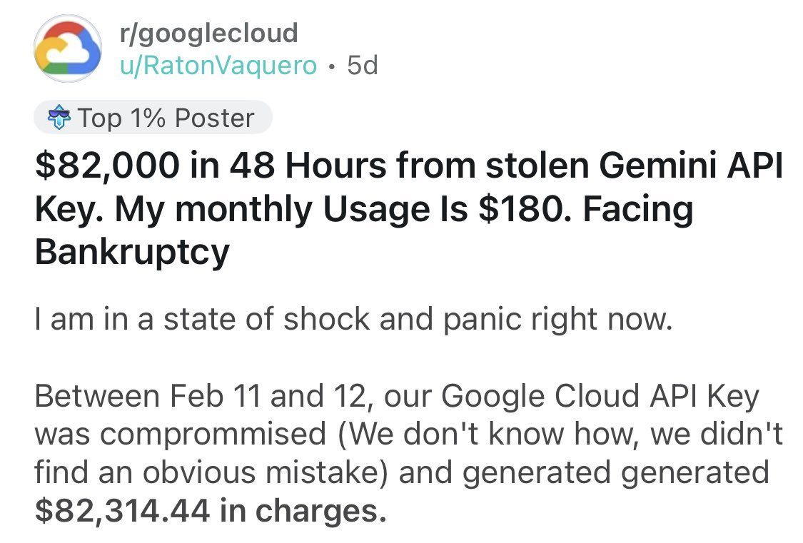
🚨 A dev team just got an $82,314 Google Cloud bill in 48 hours after their Gemini API key was stolen. Their normal monthly spend was $180 and It could bankrupt their entire company.
And the worst part? It was almost entirely preventable.
Here's what every developer needs to do right now before this happens to them. 👇
➱ 🔐 Never hardcode API keys in your code. Bots scan GitHub 24/7 for exposed keys and can exploit them within minutes of a push.
➱ 💰 Set a hard billing cap today. Google Cloud lets you set budget alerts and hard stops. If you spend $180/month, cap it at $500. 5 minutes of setup could save your company.
➱ 🔒 Restrict your API keys. Lock them to specific APIs, IPs, and referrer URLs. A stolen restricted key is nearly useless to an attacker.
➱ 🔄 Rotate your keys regularly. Treat them like passwords, change them every 30 to 90 days.
➱ 📊 Set up usage anomaly alerts. A 10x spike in API calls in under an hour should send you an immediate notification, not a surprise invoice at month end.
This team did nothing obviously reckless. One compromised key was all it took to threaten their entire business. 😓
Don't wait until it happens to you. Lock down your keys today. 🔑
One bad habit of mine?
Starting without finishing.
Last year, I started building this SaaS idea.
Worked on it for 4 days… then abandoned it for something “new.”
A few weeks ago, I picked it back up.
This time, I stopped chasing distractions and locked in.
More information coming in a couple of days.
I haven’t been active for a few days, but I haven’t been idle. I’ve been building an audit SaaS application.
Here’s how it works: you input your website link, and the AI agent scans it to detect broken links and uncover market opportunities.
Would you use this?






![Mrcontech's tweet photo. I stopped struggling with AI slop design the day I started prompting with structure.
If you're a solo builder or developer using AI to move fast, steal this framework.
Most solo builders treat AI tools like magic, they type something vague and hope for the best.
That's why the results look like AI slop.
Here's the exact 6-part template I now use every time:
1. 🎯 Goal — What you're building + who it's for
2. 🎨 Style — Colors, fonts, mood, design inspo
3. 🧱 Layout — UI sections broken down clearly
4. ✨ Motion — Hover effects, transitions, animations
5. 🧠 Tone — 2–3 words that lock in the feel (minimal, bold, calm...)
6. ✅ Must-Haves — Non-negotiable UI elements
The more context you give AI, the less guessing it does.
And the less time you spend fixing what it got wrong.
Here's what a real prompt looks like using this template:
"A pixel-perfect investment dashboard called FinPoint, built for high-net-worth users who expect cinematic polish. Ultra-dark glassmorphic aesthetic using #050505 background, #ff4d15 orange accent, #00d47e success green, and Questrial as the primary font. Full-screen dark canvas with 45px outer rounding, a pill-shaped top nav with active white tab, a hero portfolio performance card with a glowing orange area chart and glass tooltip, a horizontal auto-scrolling watchlist ticker with sparklines, and a 3-column analytics grid featuring vertical bar charts with diagonal stripe backgrounds, a circular SVG risk gauge with a white needle, and an industry insights news card. Cards lift subtly on hover, bars animate on mount, ticker pauses on hover, and nav transitions are smooth with micro-motion. Premium, cinematic, intentional. Must include glossy card overlays using backdrop-filter blur and layered gradients, rounded bar tops only, 32px card radius, inner shadows at rgba(255,255,255,0.05), and strict spacing base of 24px. Built with React, Tailwind, Recharts, and Lucide React. No generic UI patterns, no default Tailwind colors."
Before this → vague prompts, mediocre results, lots of back and forth.
After this → clean designs, faster builds, less guessing.
Tools like Claude Code are incredibly powerful. But the output is only as good as the input you give them.
Bonus tip: open Claude and type this exactly.
"Here is my UI prompt framework: [paste the 6 parts]. Save this to your memory so anytime I ask for a prompt, use this format to improve my response. Now give me a prompt to build [what you want to build]."
Claude will sharpen your prompt, remember the format for every future session, and hand you something ready to build with.
Save it. Use it on your next build. Now you have no excuse not to ship. 👇](https://pbs.twimg.com/media/HCzR9RsWsAAQzLG.jpg)