Despite how gnarly the dot-pattern gradient on the vertical stabilizer is, I only cursed *3* times while illustrating this @AirCanada A320 in the legendary Toothpaste livery. A new record for me!
It's Friday and I can't focus, so I somehow ended up counting all the individual pixels in my Spirit Airlines A319 pixel livery illustration just now. There are 48 pixels in the vertical stabilizer, and 54 on the fuselage (per side). You're welcome.
@dfwtower@united Yeah, definitely the Saul Bass livery. I did illustrate that livery on the 787-8 a while ago, but I’ve been itching to try it on other versions as well. Maybe soon!
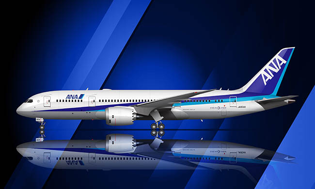
One of the things that I like the most about the ANA livery is how different it looks from one aircraft to the next. On smaller airplanes (such as the A320), the stripes are shorter and seem more angled. On longer airplanes (such as the 777-300ER), the stripes appear flatter.
Not gonna lie: I would probably (definitely) like the current Sun Country Airlines livery a lot more if it didn't replace one of the best airline liveries of all time. Their last one was amazing! This one? Meh.
Speaking of Korean Air (from yesterday's post), can we all agree that the current livery is one of the most beautiful ever? 4 colors (and straight lines) never looked so good!
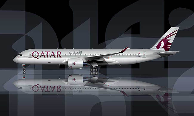
Pro tip for aspiring aircraft artists out there: start with an easy livery (example: Qatar Airways or Korean Air) to build your confidence. Starting off with something gnarly like Hainan Airlines is a recipe for disaster lol.