Hey Twitter 👋
I'm a Backend developer documenting my journey in public.
No fluff. Just real code, real decisions, and real mistakes.
Currently 5 days into building a full-stack real-time chat app from scratch as a portfolio project.
Follow along if you're into that sort of thing
This is how our users dance when their Upwork payment comes through Cleva and they realize that they don’t have to pay any fees.
Meanwhile, spot our ambassadors in full vibe mode.😌
#cleva#zerofees#upwork#getcleva
Accessibility isn't a feature you add at the end
It's the minimum bar for building something that works for everyone
Most portfolio projects skip this entirely.
This one doesn't.
Day 19 tomorrow: Lighthouse performance — code splitting, lazy loading, #buildinpublic#accessibility
Also added:
→ Skip links on Login and Register
Keyboard users jump straight to the form
→ aria-required on form inputs
→ aria-expanded on every toggleable panel
→ aria-modal + role="dialog" on modals
→ role="alert" on error messages
Result: axe DevTools — zero violations.
Real-time chat is visual by nature
New mgs appear. Users join Notifications pop up
A screen reader user misses all of it
Fix: a LiveAnnouncer component with aria-live regions
"New message from testuser1" — announced automatically
"Your request was approved" — announced instantly.
Animations played for everyone
The typing indicator bounce
The reconnect pulse
The sidebar slide.
Regardless of whether the user had asked their OS to reduce motion.
Fix:
@media (prefers-reduced-motion: reduce) {
*, *::before, *::after {
animation-duration: 0.01ms !important;
}
}
Modals didn't trap focus.
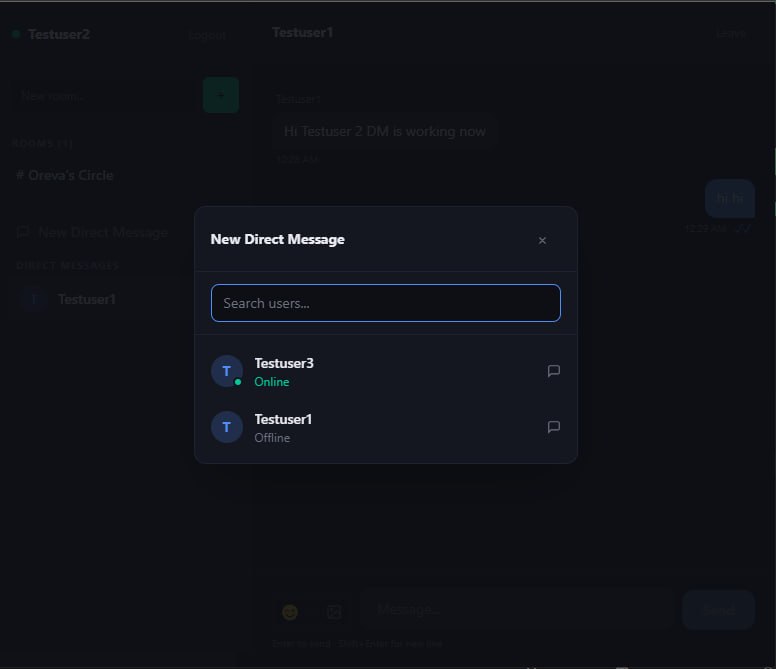
A keyboard user who opened the DM search modal could Tab right past it — into the page behind it.
The modal was visually open.
Functionally invisible.
Fix: a useEffect that intercepts Tab and Shift+Tab, keeping focus inside.
Escape closes it.
I had 12 icon buttons with no accessible name.
A screen reader announced every one of them as:
"button"
Not "Send message."
Not "Open sidebar."
Not "Close modal."
Just "button."
Fix:
aria-label="Send message"
One attribute. Completely changes the experience.
17 days in. The app now has:
✅ Public rooms — open to all
✅ Private rooms — admin approval required
✅ Invite-only rooms — hidden, invite required
✅ Real-time notifications for all permission events
✅ Direct Messages
Day 18: Accessibility audit.
#buildinpublic#socketio
The real-time notification flow:
User clicks private room
room:request_join emitted to server
All admins receive room:join_requested instantly
Admin sees bell 🔔 with red badge
Opens panel → Approve or Reject
Approved → user gets notified + auto-joins
No polling. No refresh.
The part I'm most proud of:
When a user tries to join a private room —
they don't see an error.
Their request is sent to the admin automatically.
"You can't come in" is frustrating.
"Your request has been sent" is an experience.
The difference is one decision in the UX flow.
The room:join decision tree:
if public → join freely
if private + invited → join
if private + not invited → send request to admin
if invite-only + not invited → reject
One handler. One place to read.
One place to change if the rules evolve.
The schema:
admins[] ← who controls the room
pendingMembers[] ← waiting for approval
invitedMembers[] ← have a standing invite
type: 'public' | 'private' | 'invite'
Four new arrays. That's the entire permission system.
Clean data model = clean logic.
🌐 Public — walk right in
🔒 Private — knock and wait for admin approval
✉️ Invite-only — hidden, you need to be shown where it is
One Room model.
One type field.
Three completely different behaviours.
You don't notice good architecture when you're building it.
You notice it when a new feature costs almost nothing to add.
DMs took one day.
Because the foundation was solid.