Shrink your nail salon logo to a booking thumbnail. Can you still read the name? Soft colours need enough contrast.
Try a direction for your studio:
https://t.co/y8jDGC6TqL
#NailSalonLogo
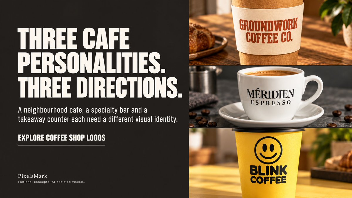
Three cafe personalities, three brand directions. A neighbourhood cafe, a specialty bar and a takeaway counter need different visual identities. Fictional concepts. AI-assisted visuals.
Coffee shop logo directions: https://t.co/UEBgJ9J2a6
#CafeBranding#CoffeeShopLogo
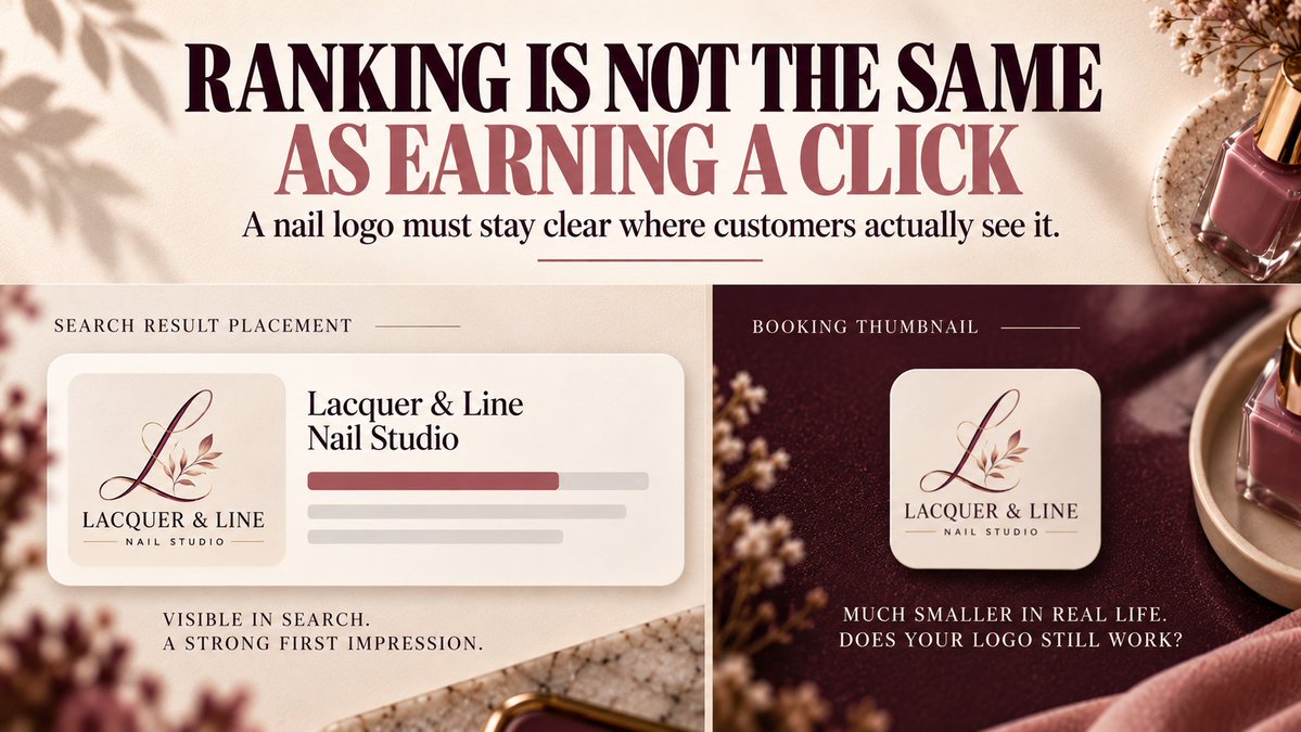
Appearing in search results and earning a click are two different things. A nail logo also has to stay recognizable in a booking thumbnail, a profile circle and a printed card.
The 4-place test: https://t.co/h3ZyvPIiQH
#NailSalon#LogoDesign
Two book-cover quotes can carry identical labels and cover entirely different things. Before you compare prices, find out what each one actually includes.
The scope checklist: https://t.co/bJ3ZrH4USJ
#BookCoverDesign#IndieAuthor
The right watermark tool depends on what you need to repeat. One photo is a different problem from a full gallery export, and both are different from building a mark your clients recognise.
Compare the workflows: https://t.co/TFMmXPzwDp
#PhotographyWatermark#FreeTool
Two book-cover quotes with different prices might not be quoting the same work. Before comparing numbers, check what each one actually includes.
Full cost breakdown: https://t.co/QpIxdE3dOs
#BookCoverDesign
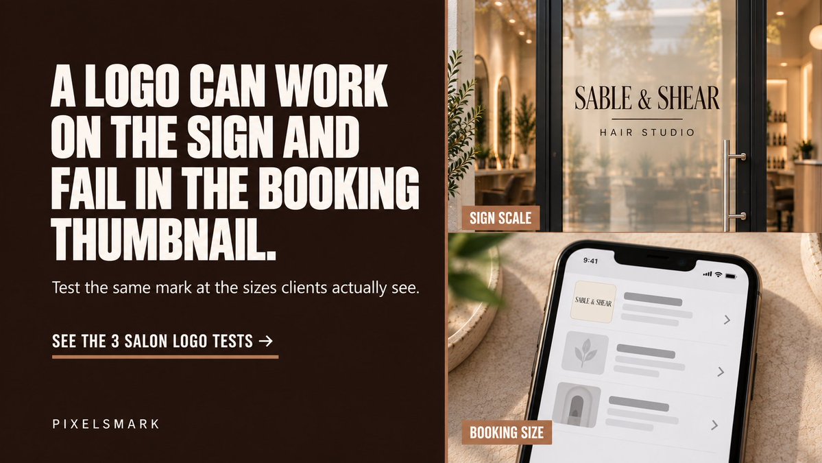
A hair salon logo that looks sharp on a large sign can turn into an unreadable smudge inside a booking thumbnail. That gap is worth checking before the identity goes live.
Three practical size tests for salon logos: https://t.co/2f45KDFdQZ
#HairSalonBranding
A beauty logo can look polished on a presentation board and still fail in the profile circle, the booking-page header or a watermark. Those are the sizes clients encounter.
Five checks for real-world salon logo usability: https://t.co/6VytGCm0wO
#BeautyBranding
A cover can be readable at thumbnail size and still send the wrong genre signal. Readability and genre recognition are two separate checks, and both matter before a cover goes live.
See the Book Cover Maker at PixelsMark:
https://t.co/cGEFiJoq0O
#BookCoverDesign
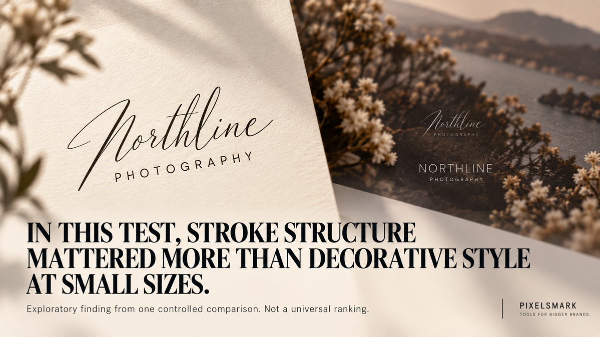
In a controlled test of eight watermark fonts across four scene conditions, stroke structure affected readability at small sizes more than decorative style did.
Read the evidence: https://t.co/y7e4dEH9Jy
#PhotographyWatermark
Photographers usually approve a watermark font while it looks its best: large, isolated, on nothing. Place it over the most demanding photograph in the set, reduce it and lower the opacity. That is the actual test.
Read the full watermark-font guide: https://t.co/XTlUji9bAv
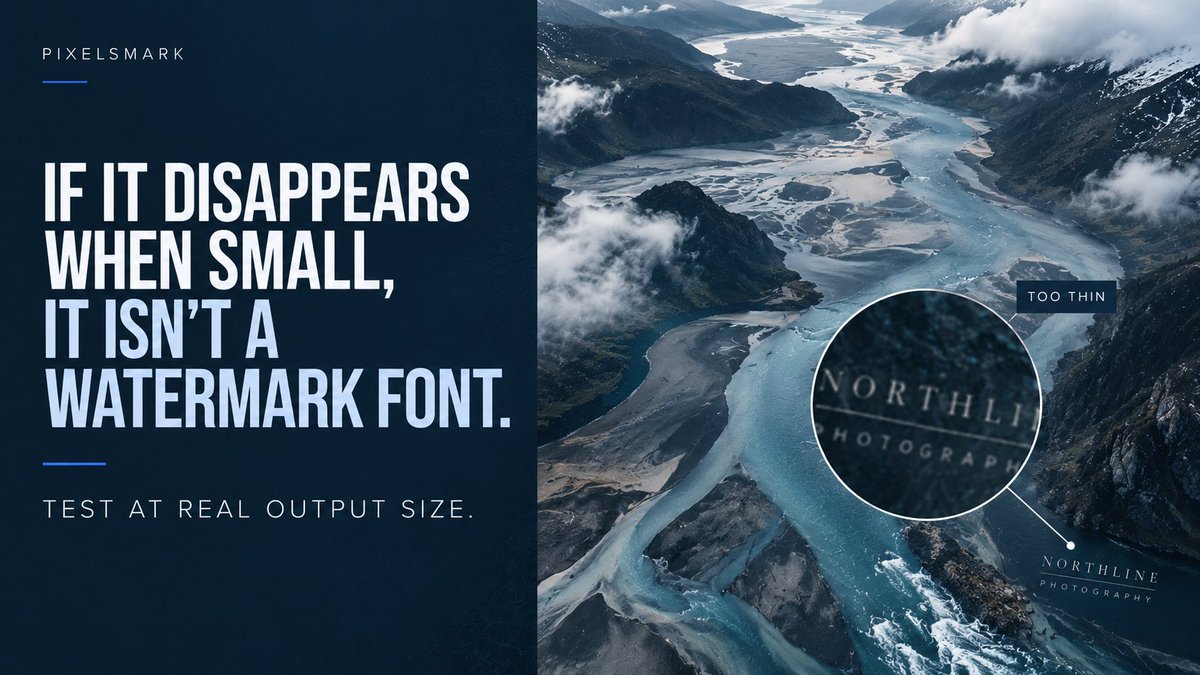
A font that looks refined at full size can vanish at thumbnail scale. That is the test a watermark actually has to pass — not how it looks in the design file.
See which font characteristics survive the reduction: https://t.co/oaQo2d8u5t
#PhotographyWatermark
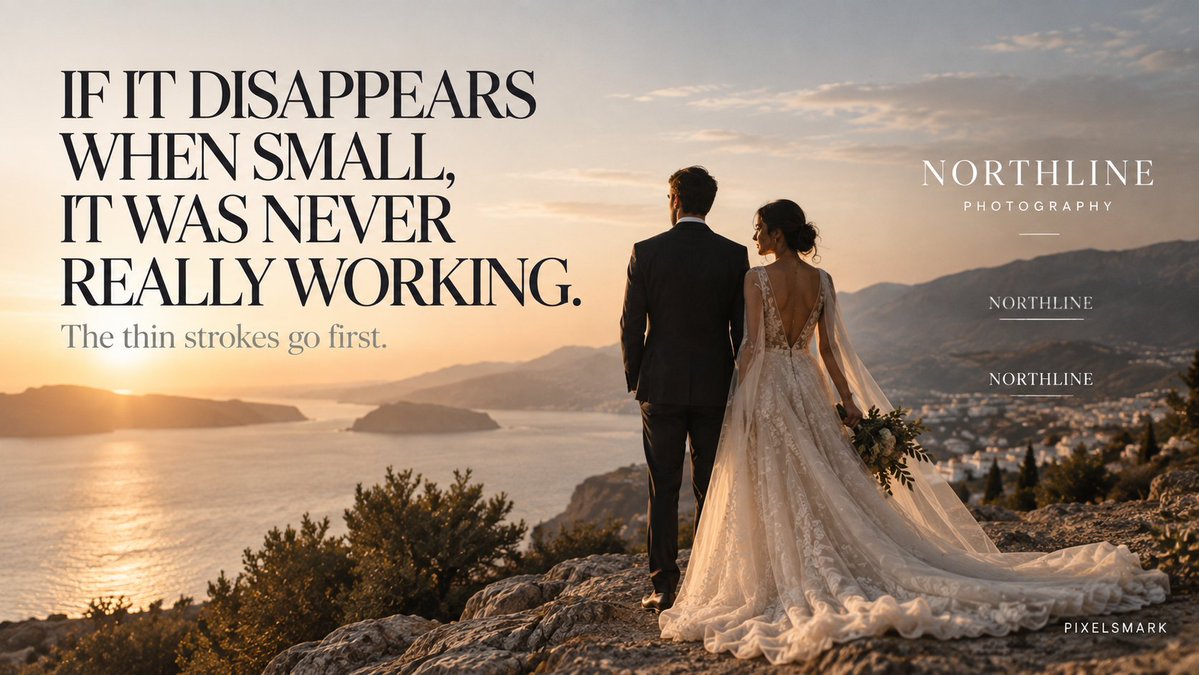
A watermark that disappears at thumbnail size was never really working. The failure is the small version — not the export settings.
See which font characteristics survive the reduction: https://t.co/2JBDIELtsV
#PhotographyWatermark
A medical spa’s branding communicates clinical credibility before a client books. The typography, palette, and mark all carry that signal.
https://t.co/XSQcDl5e70
#MedSpaBranding
Signal the danger. Protect the answer.
A thriller cover's job is to suggest the right kind of tension—not resolve it. The sealed door. The amber line. The shadow that may or may not be architectural.
https://t.co/qh1rirAfNA
#ThrillerWriting
A watermark font should be tested at export size.
A watermark font should be tested at export size—not just while it looks large on your screen.
https://t.co/oaQo2d8u5t
#PhotographyBranding
Before readers open your book, the cover has already set their expectations.
Give your story a professional first impression:
https://t.co/Zisf5v9VmQ
#BookCoverDesign#SelfPublishing