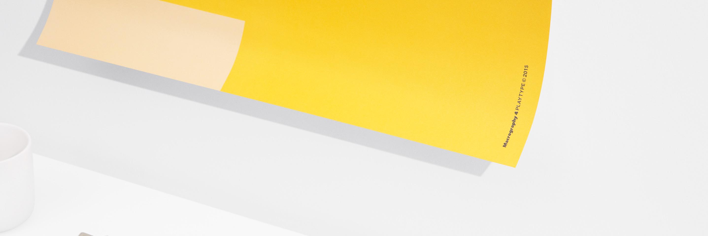
Publish Gothic in use by @louismontez in FRAGMENT OF TIME, as part of his final bachelor project at @kglakademi.
We love seeing our typefaces put to use in printed matter and especially in beautifully designed books like this.
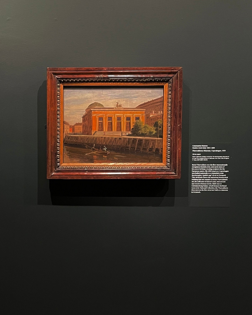
Berlingske in use at The Met, NYC! @metmuseum
If you are in the states, don't miss out on the exhibition Beyond the Light: Identity and Place in Nineteenth-Century Danish Art.
Super neat work by June Yoon
Playtype is looking for a full-time graphic designer to join our office in Copenhagen.
Please send an email marked ‘Graphic Designer’ with application and attached portfolio to [email protected].
We look forward to hearing from you.
Sincerely – Playtype
GLYPH IN FOCUS: INVERTED QUESTION MARK [U+00BF]
The inverted question mark are punctuation marks used to begin interrogative sentences or clauses in Spanish. The initial marks are mirrored at the end of the sentence by the 'ordinary' question mark.
Italian Plate No2 family put to good use by @kilroydenmark
'We go beyond!' boasts Kilroy. Kilroy uses Italian Plate No2 Black Italic and Italian Plate No2 Expanded across their content.
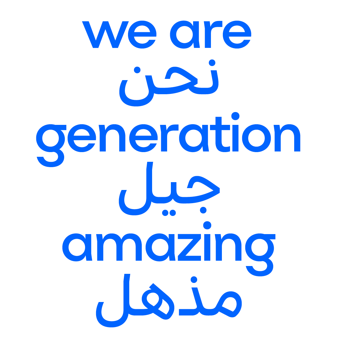
Bespoke typeface: Generation Amazing Display
Generation Amazing is a movement that revolves around one common goal: Using football to empower our youth and improve our world. They operate under the philosophy of ‘passing it on’ referring to football terminology.
TIDAL. Typed in Nationale.
Music streaming subscription service @tidal is using our Nationale typeface across their platform and in their marketing content.
Available here: https://t.co/lvjDSptYId
GLYPH IN FOCUS: Æ [U+1D01]
Æ (lowercase: æ) is a character formed from the letters a and e, originally a ligature representing the Latin diphthong ae. It has been promoted to the full status of a letter in some languages, including Danish, Norwegian, Icelandic, and Faroese.
Nationale in use by O.C.E.
The @o.c.e._official is born out of a love and fascination for the Scandinavian aesthetics and way of life, O.C.E. wanted to bring a more authentic Nordic look and feel to their branding.
GLYPH IN FOCUS: INTERROBANG [U+203D]
The interrobang is an unconventional punctuation mark used in various written languages to combine the functions of the question mark and the exclamation mark.
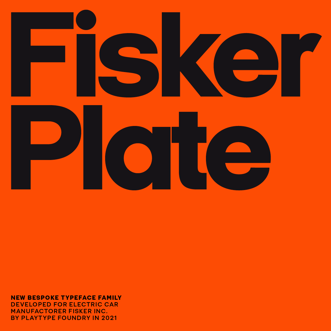
Last year we developed a new bespoke typeface family for @fiskerinc called Fisker Plate Expanded. The typeface is starting to be used as they're gearing up for the release of their first electric car. Stay tuned for full case!
GLYPH IN FOCUS: AMPERSAND [U+0026]
The ampersand, also known as the ‘and sign’, is the logogram &, representing the conjunction ‘and’.
It originated as a ligature of the letters et — Latin for ‘and’.
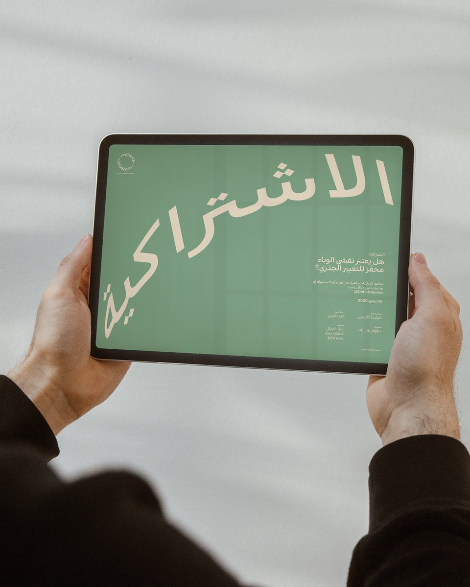
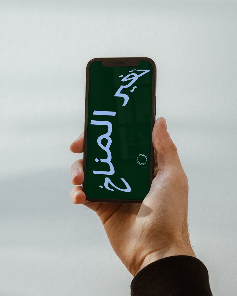
Typed in Noir No1 Arabic.
Doha Debates is a free speech forum hosting debates and discussions on controversial topics ranging from local questions to global concerns. Carried out over web, print and more, @etypes_cph is responsible for the complete rebranding of @dohadebates.
Publish Gothic and bright colours is the primary elements in the new visual universe for Parisian nightclub @sacre142. The visual expression developed by @paradestudio comes across playful and almost hypnotising.
Publish Gothic and bright colours is the primary elements in the new visual universe for Parisian nightclub @sacre142. The visual expression developed by @paradestudio comes across playful and almost hypnotising.
Publish Gothic and bright colors is the primary elements in the new visual universe for parisian nightclub @sacre142. The visual expression developed by @paradestudio comes across playful and almost hypnotizing.
Studio 6 poster created by Paw Poulsen
Paw Poulsen designed our popular Studio 6 typeface along Jeppe Pendrup for the Studio 6 podcast studio which used to be located Værnedamsvej in Copenhagen.
Studio 6 is available on our website
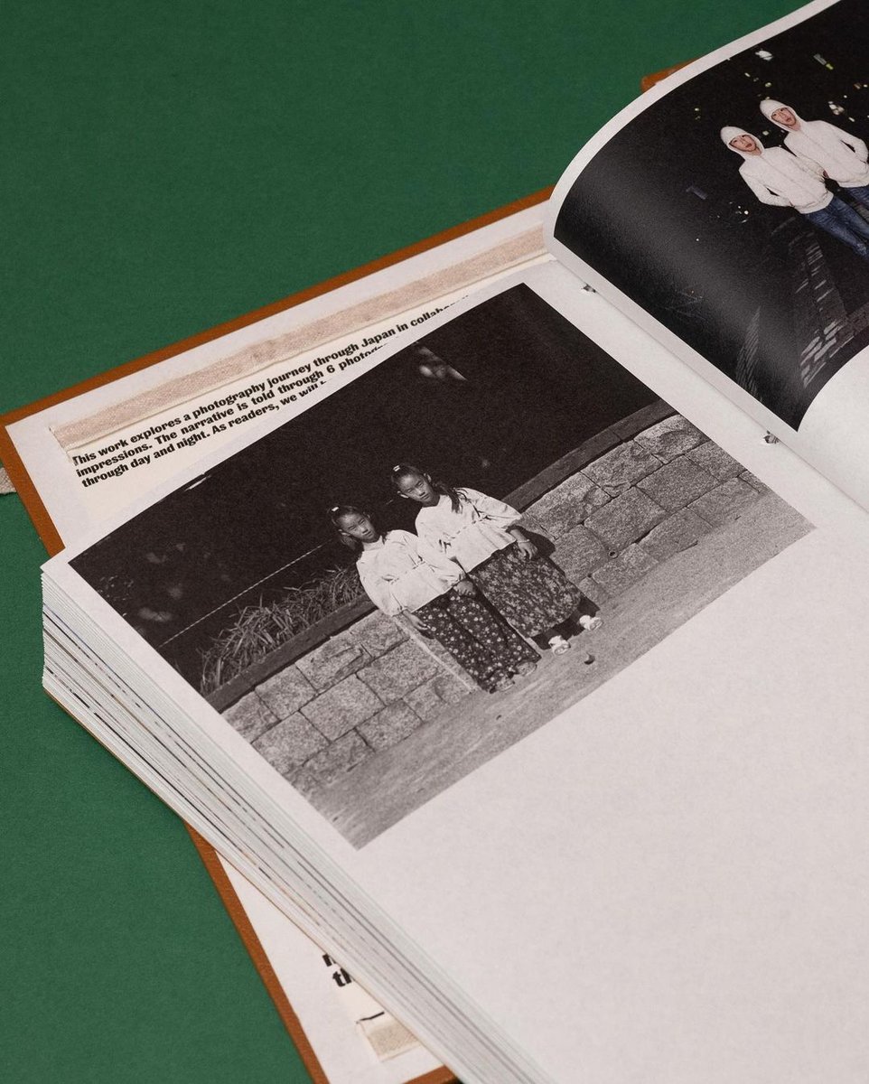
Our good friends at @tofucollective recently published the second edition of their cookbook “Ten Tofu Recipes from Vesterbro’s Asian Markets” which is available in English. Here’s a combination of shots from the first edition which features our Studio 6 font.


![playtype's tweet photo. GLYPH IN FOCUS: INVERTED QUESTION MARK [U+00BF]
The inverted question mark are punctuation marks used to begin interrogative sentences or clauses in Spanish. The initial marks are mirrored at the end of the sentence by the 'ordinary' question mark. https://t.co/9iUajb0LQl](https://pbs.twimg.com/media/FPQbZMuWQAA9pfd.png)
![playtype's tweet photo. GLYPH IN FOCUS: INVERTED QUESTION MARK [U+00BF]
The inverted question mark are punctuation marks used to begin interrogative sentences or clauses in Spanish. The initial marks are mirrored at the end of the sentence by the 'ordinary' question mark. https://t.co/9iUajb0LQl](https://pbs.twimg.com/media/FPQbZGHX0A44dQz.png)
![playtype's tweet photo. GLYPH IN FOCUS: INVERTED QUESTION MARK [U+00BF]
The inverted question mark are punctuation marks used to begin interrogative sentences or clauses in Spanish. The initial marks are mirrored at the end of the sentence by the 'ordinary' question mark. https://t.co/9iUajb0LQl](https://pbs.twimg.com/media/FPQbY-CXsAEeF6y.png)


![playtype's tweet photo. GLYPH IN FOCUS: Æ [U+1D01]
Æ (lowercase: æ) is a character formed from the letters a and e, originally a ligature representing the Latin diphthong ae. It has been promoted to the full status of a letter in some languages, including Danish, Norwegian, Icelandic, and Faroese. https://t.co/BWgkR36MDw](https://pbs.twimg.com/media/FOIVJCYXMBIe5tK.png)
![playtype's tweet photo. GLYPH IN FOCUS: Æ [U+1D01]
Æ (lowercase: æ) is a character formed from the letters a and e, originally a ligature representing the Latin diphthong ae. It has been promoted to the full status of a letter in some languages, including Danish, Norwegian, Icelandic, and Faroese. https://t.co/BWgkR36MDw](https://pbs.twimg.com/media/FOIVI6zXMA81yBi.png)
![playtype's tweet photo. GLYPH IN FOCUS: Æ [U+1D01]
Æ (lowercase: æ) is a character formed from the letters a and e, originally a ligature representing the Latin diphthong ae. It has been promoted to the full status of a letter in some languages, including Danish, Norwegian, Icelandic, and Faroese. https://t.co/BWgkR36MDw](https://pbs.twimg.com/media/FOIVIxxXMDo0AMF.png)
![playtype's tweet photo. GLYPH IN FOCUS: INTERROBANG [U+203D]
The interrobang is an unconventional punctuation mark used in various written languages to combine the functions of the question mark and the exclamation mark. https://t.co/G1idLBDCuI](https://pbs.twimg.com/media/FNZ-17tXoAMG9VD.png)
![playtype's tweet photo. GLYPH IN FOCUS: INTERROBANG [U+203D]
The interrobang is an unconventional punctuation mark used in various written languages to combine the functions of the question mark and the exclamation mark. https://t.co/G1idLBDCuI](https://pbs.twimg.com/media/FNZ-11IWYAILi7O.png)


![playtype's tweet photo. GLYPH IN FOCUS: AMPERSAND [U+0026]
The ampersand, also known as the ‘and sign’, is the logogram &, representing the conjunction ‘and’.
It originated as a ligature of the letters et — Latin for ‘and’. https://t.co/2ETVkukRxW](https://pbs.twimg.com/media/FMwzcOIXwAMNRPP.png)


![playtype's tweet photo. GLYPH IN FOCUS: INVERTED QUESTION MARK [U+00BF]
The inverted question mark are punctuation marks used to begin interrogative sentences or clauses in Spanish. The initial marks are mirrored at the end of the sentence by the 'ordinary' question mark. https://t.co/9iUajb0LQl](https://pbs.twimg.com/media/FPQbZUwX0Asi3In.png)


![playtype's tweet photo. GLYPH IN FOCUS: Æ [U+1D01]
Æ (lowercase: æ) is a character formed from the letters a and e, originally a ligature representing the Latin diphthong ae. It has been promoted to the full status of a letter in some languages, including Danish, Norwegian, Icelandic, and Faroese. https://t.co/BWgkR36MDw](https://pbs.twimg.com/media/FOIVJJAXEAIxTzD.png)

![playtype's tweet photo. GLYPH IN FOCUS: INTERROBANG [U+203D]
The interrobang is an unconventional punctuation mark used in various written languages to combine the functions of the question mark and the exclamation mark. https://t.co/G1idLBDCuI](https://pbs.twimg.com/media/FNZ-2ELXEAc_I8K.png)

![playtype's tweet photo. GLYPH IN FOCUS: AMPERSAND [U+0026]
The ampersand, also known as the ‘and sign’, is the logogram &, representing the conjunction ‘and’.
It originated as a ligature of the letters et — Latin for ‘and’. https://t.co/2ETVkukRxW](https://pbs.twimg.com/media/FMwzcU1XIAMaDEC.png)