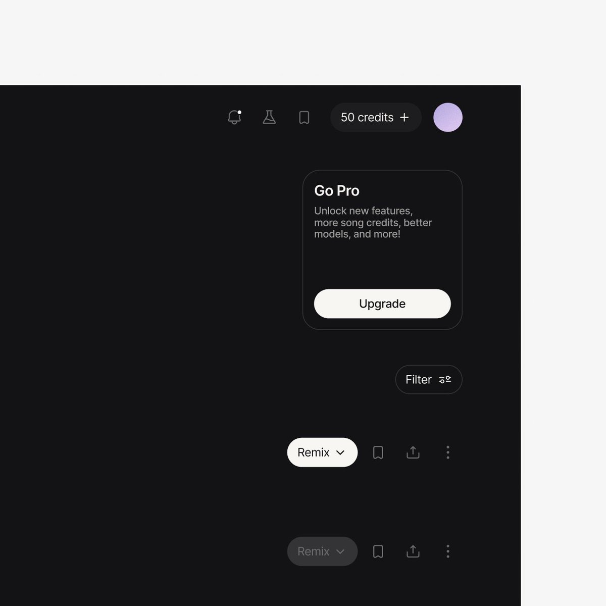
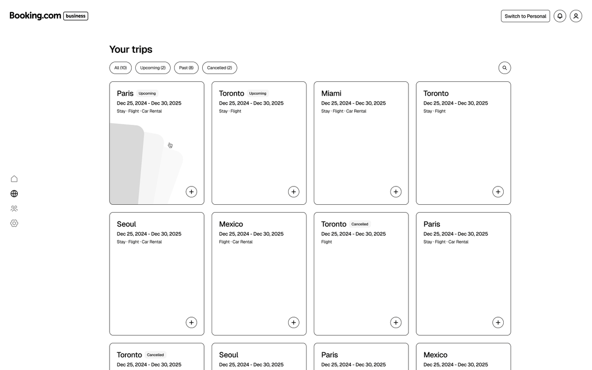
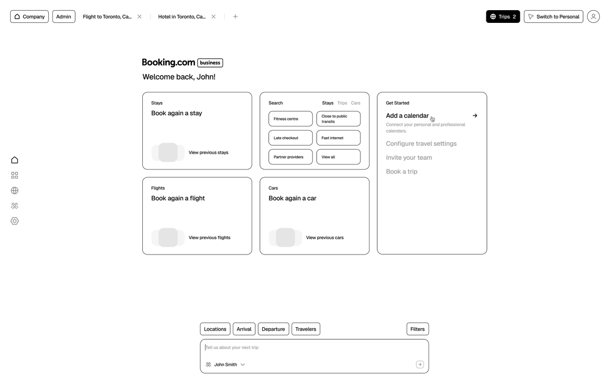
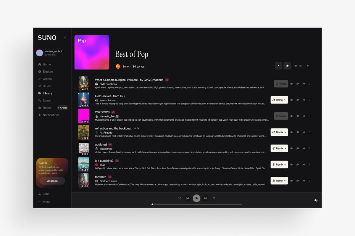
Redesign concept of @suno.
The product is genuinely great. I wanted to give a different take on song discoverability and creation.
Sidebar became a top bar, kept the upsells and credits always visible, and refined the navigation experience to add more hierarchy.
@sofianedesign Yeah, the video is coming this Friday. And they got acquired this week!
Now that it's owned by Bending Spoons, I'm not sure how the design will evolve 🤔 They're like the LVMH of tech, lowest cost for highest margins
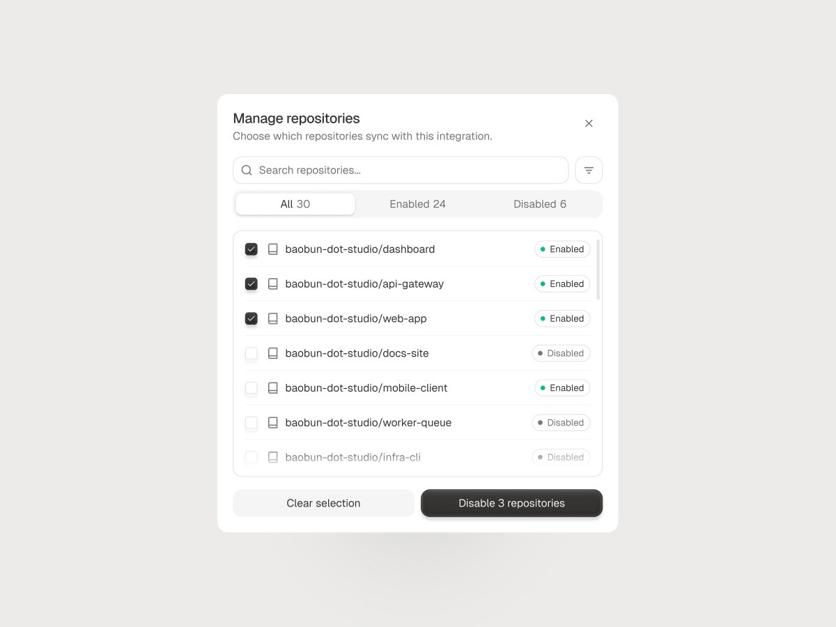
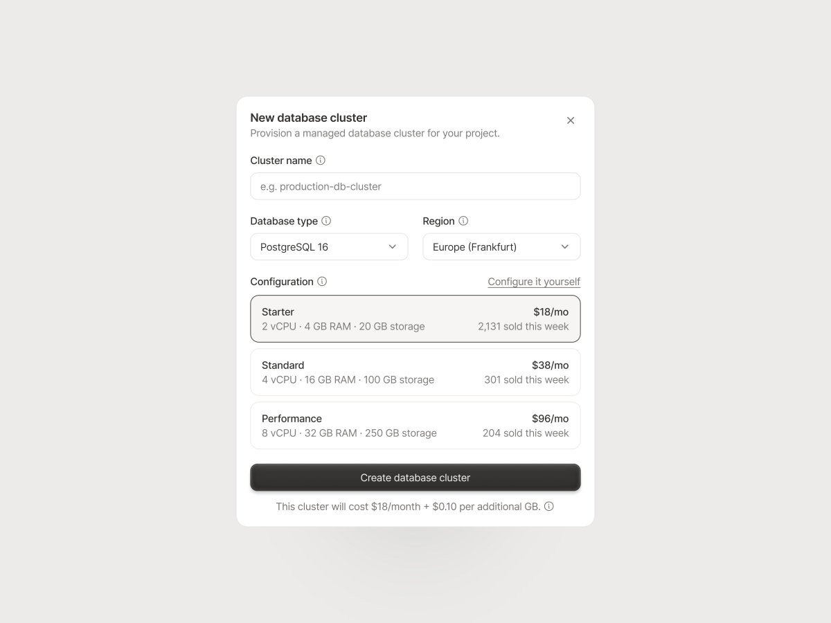
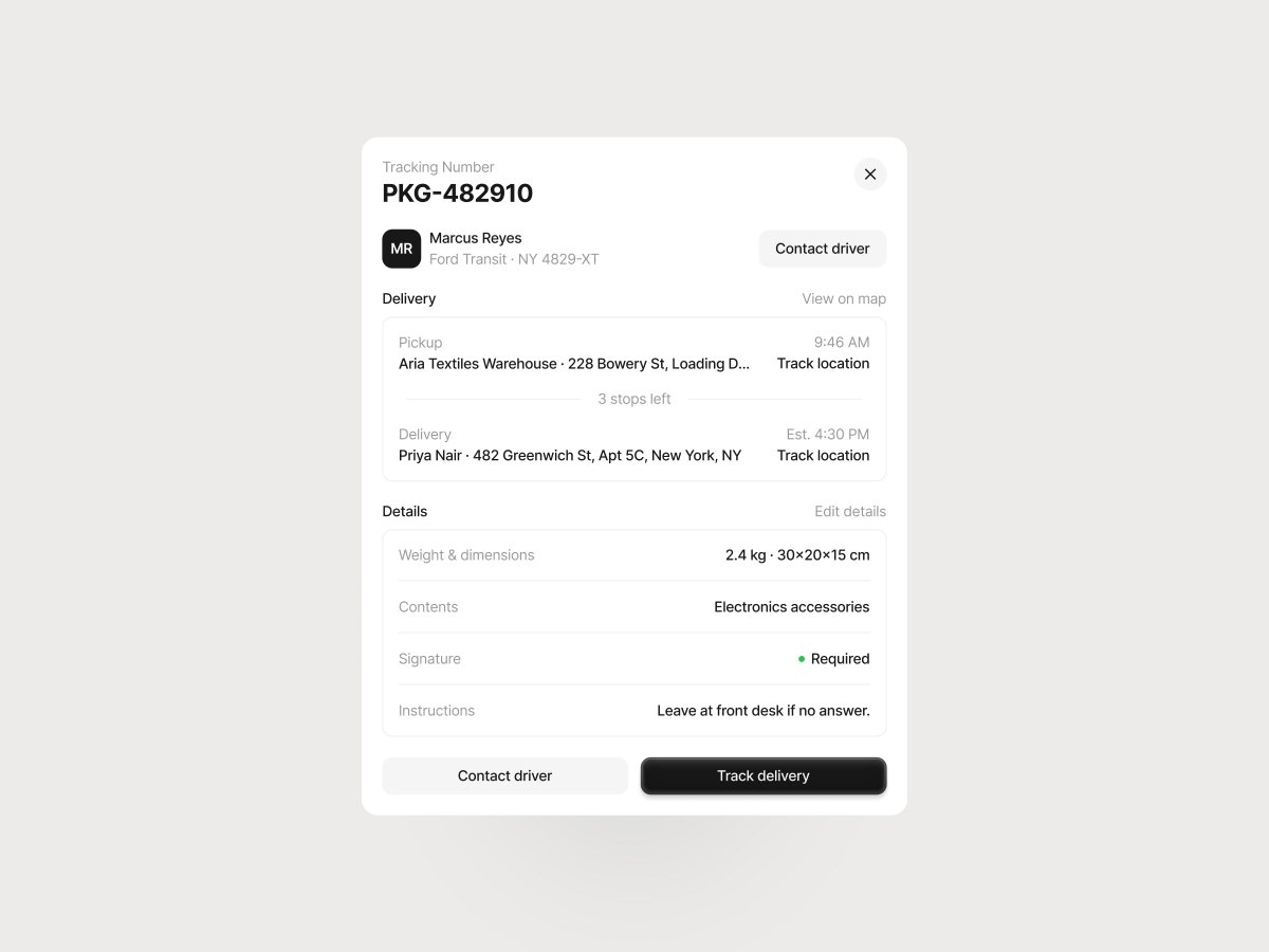
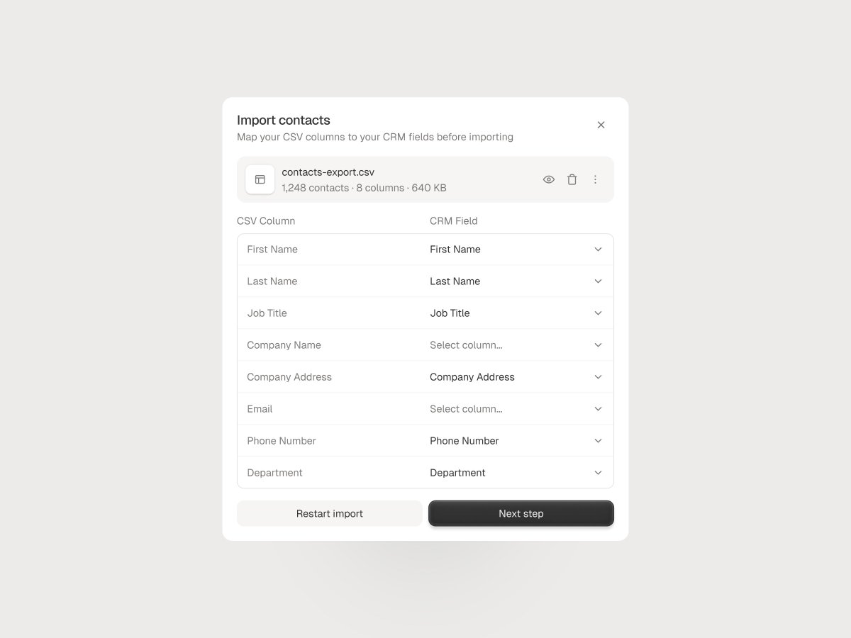
You seem to have liked this one so here are the design primitives (bookmark for later):
- Type: Geist Medium 18/22px title, Geist Regular 14/20px body, 0% letter spacing
- Labels: Geist Regular 14/18px
- Buttons: 36px buttons, 10px radius (CTAs) + 28px row actions, 8px radius (Icons)
- Rows: 14px horizontal / 6px vertical padding, 8-12px gap between elements
- Spacing: 16px between sections, 20px modal padding
- Colors: 343434 primary, 7d7c7a secondary, e5e5e5 border, F6F5F3 dividers, f6f5f3 surface
A clean product always starts with clean primitives.
@sofianedesign You're right! Obviously it depends on the budgets and timelines too.
On those big projects where you redesign everything from the ground up, it's super important to start lo-fi to quickly get as many ideas out as possible