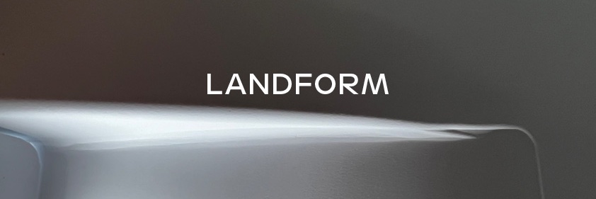
@proof_and_co@frerejones Eric, who designed Landform, puts it between geometric and grotesque, but also says it doesn’t neatly fit either. It's an interesting question — when exactly does something become a trend that deserves classification or does it fit into an existing category.
@tntype Have you tried comparing the .ttf and .otf? TTX both and then compare/diff in a text editor. Maybe you'll find a clue as to what's different between the two, since one works as expected and the other doesn't.
A healthy type design process includes asking a lot of questions. A lot. Explore the big questions with us while you expand a typeface you’ve already started outside the program.
https://t.co/qajtSfEd2h
🗓️ 📢 Apps due soon for Practica Two!
@JTDType Curious too. Every now and then I get fired up about it ... to remove them ... and never get anywhere. I at least know where they live on my machine 😅
Hey Bloomington, Indiana, what are you doing Friday, Sept. 30 at 5p? Nicole is giving a public lecture and will talk about working as a type designer, women in type and more. Come!
https://t.co/KbP3Esy4CD
@aditiger28@TiroTypeworks I second Alice's Capucine (which has some relation to Auriol from Craig's comment). I would add Vendetta from John Downer. — Nicole
New Release! Stationed at points between geometric and grotesque, Landform is a multi purpose sans with distinctive capitals and a simplified lowercase.
30% off with code: FORMFORM until Oct. 2
https://t.co/T2v7Xz2Ue4
On Thursday (at 9a/Chicago), we‘ll be talking about the type design process, where you can get off track and how to get back. Join us, it’s free! https://t.co/bWezk1Sqmt
Our next Lunch & Learn will feature Greg Hoffman, former CMO at Nike, sharing his new book "Emotion by Design: Creative Leadership Lessons From a Life at Nike." Register at https://t.co/ZImwnfwCRM