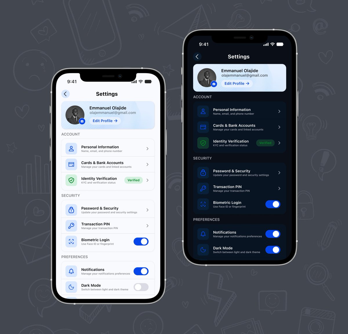
Day 11/15 - Settings & Account ⚙️
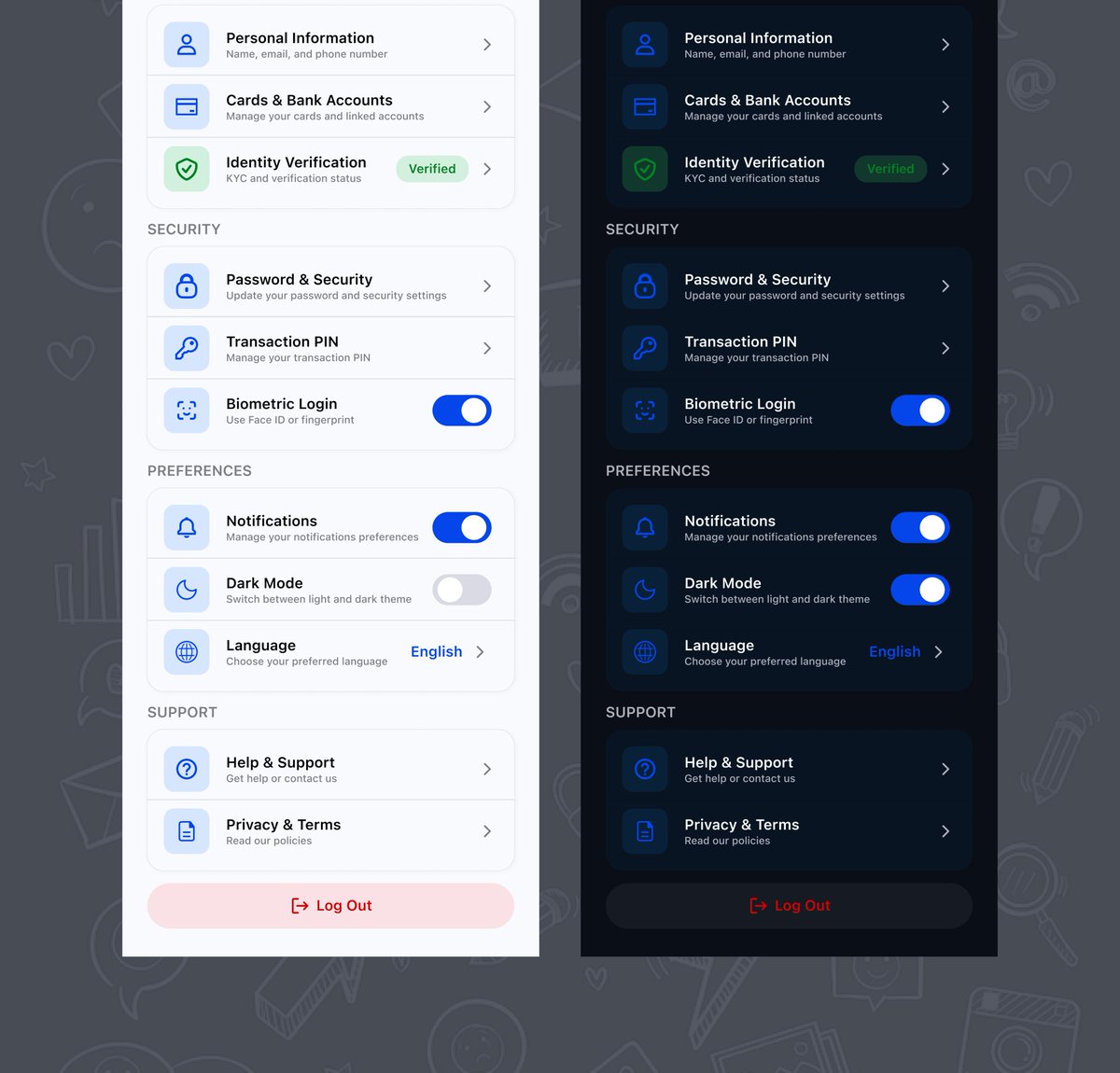
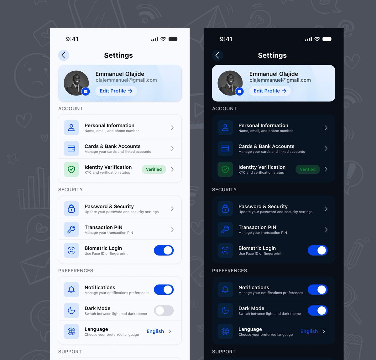
Today’s focus: giving users control.
I extended my banking UI with a settings experience focused on logical grouping, clear hierarchy, semantic colour, intuitive controls & consistent Light/Dark modes.
Good settings UX isn’t about more controls - it’s about making them easier to understand and manage.
Day 11 done. 4 more to go. 🚀
@JoshOpaleke@Meedayyy@TechCrushHQ
Day 10/15 — Messaging App 💬
Today: helping users communicate & interact.
Designed a mobile messaging experience for Circlo, focusing on chat hierarchy, message states, attachments, feedback, affordance & interaction.
@JoshOpaleke
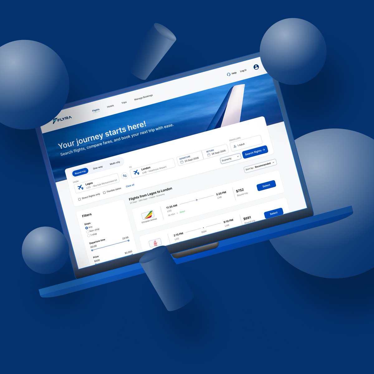
Day 09/15 - Travel Booking Search ✈️
Last week; helping users understand data.
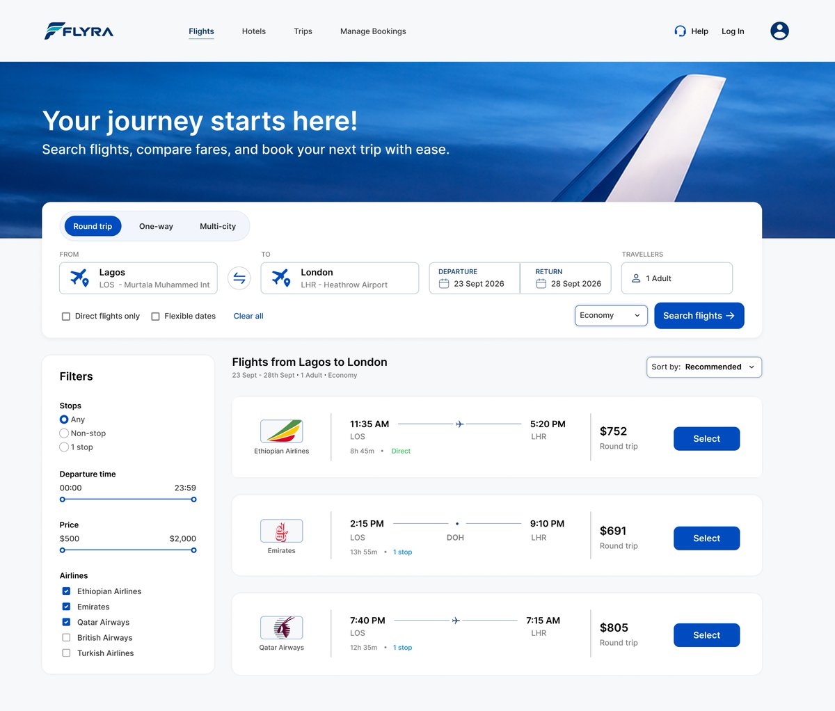
Today: helping them search, compare & decide.
Designed a flight search experience for FLYRA, focusing on interactive inputs, filters, clear CTAs, semantic colour, hierarchy & information density.
Day 08/15 — Analytics Dashboard 📊
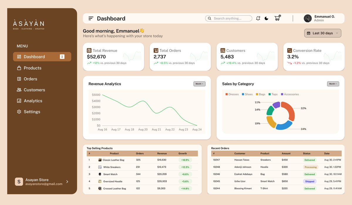
A dashboard isn’t just about showing data; it’s about helping users understand it quickly.
Today, I focused on hierarchy, clarity and usability across KPIs, revenue trends, category sales and order data.
@JoshOpaleke@Meedayyy@TechCrushHQ
Happy new week! 👋🏽
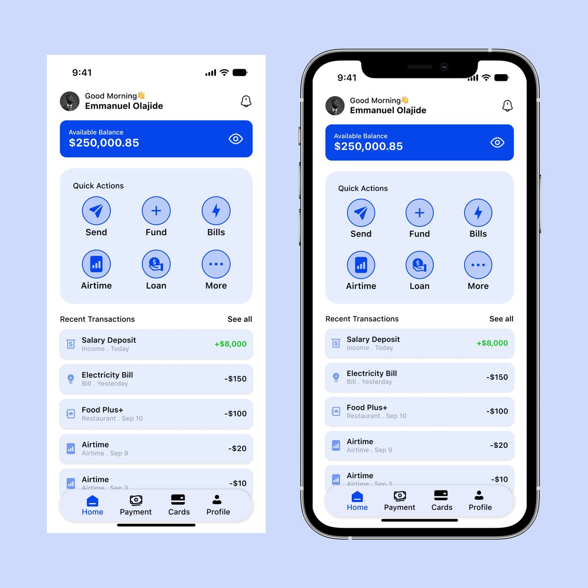
Revisiting last week’s mobile banking home design, I explored light & dark modes to create a more comfortable and consistent UX across different user preferences and environments.
@JoshOpaleke@Meedayyy@TechCrushHQ
@JoshOpaleke@Meedayyy@TechCrushHQ I also used semantic colors; 🟢 green for inflows, while outflows remain neutral: making transaction states easier to understand at a glance.
Prototyping helped me see how these details work together beyond individual screens.
Small decisions. Better experiences. 🚀
Day 07/15 — Mobile Banking Home 🏦
Today, I designed a Mobile Banking Home screen for a finance product.
Small details like hierarchy, spacing, labels and colour can make a big difference when users need to quickly understand their money.
@JoshOpaleke@Meedayyy@TechCrushHQ
Day 06/15 — Checkout 🍽️
Yesterday was about helping users decide to buy.
Today, I focused on what happens after that decision.
I revisited FOOD PLUS+ and continued the flow:
Cart → Checkout → Order Confirmation
@JoshOpaleke@Meedayyy@TechCrushHQ
I focused on delivery details, payment, order summary, total cost and giving users clear feedback after placing an order.
Six days in, I'm learning to think beyond individual screens and more about the journey between them.
Day 6 done. 9 more to go. 🚀