Last week’s momentum-filled gains were abruptly reversed on Friday after the jobs report showed that the US economy is running quite hot while there is still no easy offramp from the conflict in Iran. Add them up and we get persistent inflation, no hopes of rate cuts, and a Fed model left tail that is causing valuation pressure on equities. Fortunately, earnings are booming (the right tail), which should help offset any P/E derating (as it did back in March when the P/E-multiple fell twice as much as the price index). But the pressure is coming at a time when a lot of excitement has built about the upcoming giga IPOs. Momentum builds quickly but can evaporate just as fast. Let’s explore.
https://t.co/ODHBaQwMPQ
If the 10-year does climb into the danger zone from here, say to 5%, that would equate to a 3 point P/E compression, taking us down towards the pink line below. Again, rising earnings provide the offset to falling valuations, with price as the residual.
The Equity Valuation and Fed Model chart below shows the distribution of the P/E ratio (top) and the Fed model signal (bottom). Fortunately, equity valuations are largely justified and the Fed model signal is near the middle. That suggests that the current left tail risk is only moderate for now (as compared to the extreme signals in 1987 and 1999).
With the 10-year yield flirting with the danger zone of 4.5%-5.0%, the Fed model is once again “active.” We are nowhere near the extremes reached in 1987 and 1999, but with stocks and bonds now positively correlated and with the risk-free offering the same yield as equities, this is a left tail risk that will probably be with us for a while.
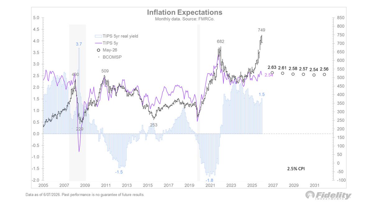
Inflation is perking up again, with the PCE up 3.8% year-over-year and the core PCE up 3.3%. The latter is of little comfort to anyone who buys groceries or gas. The inflation rate has now been above the Fed’s 2% target every month for 5 years as shown in the Inflation Expectations chart with data sourced from FMRCo and Bloomberg below. 🧵(1/2)
It’s a stunning data point, which it makes it all the stranger that the TIPS curve is so calm. The TIPS market is clearly betting on mean reversion, which in the past has been the right bet. But I wonder if it still is, given where commodities are. (2/2) 🧵
When the conflict in Iran began in late February, it was widely expected to last only a few weeks. Four months later, we can see that the 12-month forward contract remains near the highs, while inventories are falling. With no clear offramp, it’s a little surprising that the market has focused almost exclusively on the right tail.
We can see that the narrowing or broadening is really just an AI vs ex-AI dynamic. Excluding AI, the market has not even taken out the pre-Iran highs, although in recent days it has come close. On Friday when the SPX was down 2.6%, the Goldman Sachs ex-AI basket was flat. It’s a good reminder to remain diversified.
With the S&P 500 cap-weighted index down 2.6% on Friday and the equal-weighted index down 1.4%, it is clear that the market narrows on the way up and broadens on the way down as shown in the S&P 500 Index chart below.
Looking at the heat map below 👇, we see that the right tail drivers of earnings (+20%), margins (15.8%) and credit spreads (73 bps) continue to propel the cyclical and secular bull market. But the left tail is perking up too, via the 10 year nominal yield (4.53%), real yield (2.16%), and now a rising SOFR curve. Crude oil remains elevated and the 12-month forward contract at $81 (Brent) remains near its level from when the conflict began 4 months ago ($82). Meanwhile, Cushing inventories are getting more depleted, which makes you wonder what the endgame is going to be for the Strait of Hormuz, oil prices, and inflation.
For me the biggest outlier is the 5-year TIPS break-even spread of 2.48%. Either the market is whistling past the graveyard in the hope of a quick resolution, or it’s assuming that demand destruction will eventually bring oil prices back down.
Off to 9 cities in 5 countries throughout AsiaPac for the next 3+ weeks (with one carry-on) to vist clients, so my charts (and photos) will be coming at you from a different timezone. For now, I am leaving a very lush and green Boston behind.
Secular bull markets always end with a valuation reversal, either because they reach bubble levels unsupported by fundamentals (1929 and 2000) or because they get derated by inflation (1968). Whenever the current trend comes to an end (hopefully not anytime soon), it will likely be for one of those two reasons. Perhaps it will even be both, if the two tail risks manifest at the same time. But for now, valuations are supported by the fundamentals of margins and credit spreads, so let’s enjoy the ride while we can.
A boom-turned-bubble is one scenario for an end to the secular trend, but an inflation bust is another. Below in the Commodity Super Cycles chart we see that commodities appear to have entered another secular bull market of their own. What’s interesting about this is that super-cycles for commodities and equities tend to be mirror images of each other (illustrated by the 10-year CAGRs below). So perhaps the strength in commodities is a subtle early warning sign for the secular trend in equities.
If commodities continue to rally, the “open jaw” below between the Bloomberg Commodity Spot Index and the 5-year TIPS break-even will be a challenge for the bond bulls. One of those lines is wrong, I think, and if it’s the inflation break-evens, then it has implications for the Fed and therefore for bonds and therefore for equities via the Fed model.
The Fed model returned to relevance in 2022 after being dormant for several decades. The Fed model simply holds that if the risk-free asset is competitively priced against the risk asset (equities), and its valuation derates, then so must equities. Hence, per the above chart, if inflation remains sticky in the 3-4% area and pushes up the TIPS breaks, then bond yields may well rise into that danger zone of 5% or above, which per the Fed model could force the stock market to derate.
Capital flows have also been a driver of the “US exceptionalism” theme of the past decade. The Tariff Tantrum a year ago did nothing to stop that train. /4
And of course, financial engineering has been a powerful force. When we add up the new supply of shares (via IPOs and secondaries) we get $3.5 trillion in new supply since 2009. Now when we add up the demand for shares via M&A and buybacks, we get close to $30 trillion. That’s an almost 10:1 ratio of demand vs supply. No wonder the market is up 17% per annum since 2009. /END