Happy new year! 🎉 Want to learn responsive design? Or the basics of CSS Grid? Check out my online class, which comes with a free 2-month @skillshare trial! https://t.co/Qj9Uq1O6ZE
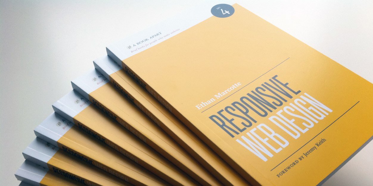
Happy 11th Birthday Responsive Web Design! On May 25, 2010, web designer Ethan Marcotte published an article entitled "Responsive Web Design" in the online magazine A List Apart. https://t.co/vjK4affT5b
#WebDesignHistory
I’ve often said testing your responsive designs in landscape mode is one of the fastest ways to highlight design issues, especially vertical ones. Here’s a wonderful example of that in action: https://t.co/PalTqIeCC0
So what happened?
The page was built for mobile responsiveness. Portrait-mode only, of course.
Developers, CHECK YOUR MOBILE STYLES IN LANDSCAPE PLEASE. Use CSS media queries to unstick sticky shit.
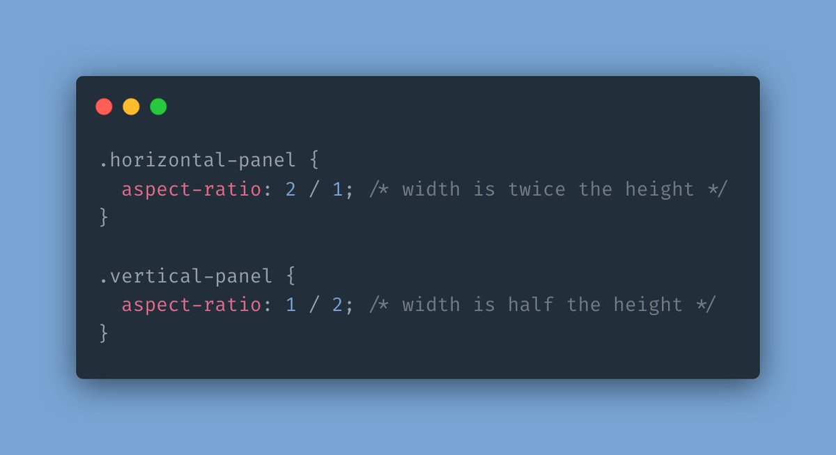
At long, long last, there’s real movement on container queries. And that’s incredibly exciting.
Here’s @una with how you can start experimenting with CQs today! https://t.co/In4p2FJB3d
🚨 An experimental flag for container queries (@container) just hit Chrome Canary!
Yes, seriously!
Go to: chrome://flags in your URL bar and turn on enable-container-queries to try it out.
Here's a demo to help you see how they work (w/flag in Canary): https://t.co/DrZxzoggV4
“People using small screens won’t want to subscribe to our newsletter.”
“People using small screens don’t want to print.”
“People using wide viewports won’t use geo-aware services.”
🤔🤔🤔🤔🤔🤔🤔🤔
one day i will get the VIEWPORT SIZE IS NOT A PROXY FOR DEVICE DETECTION knuckle tattoos i keep talking about
i just need more knuckles https://t.co/A8QFI5tmqE
Viewport size is not a proxy for device detection.
Product designer assumed downloading an .exe shouldn't be shown because viewer was on a phone.
Except they were on their desktop with large monitor 800x600 resolution with an unmaximized browser, because they had low-vision.
This is an impossibly exciting new project from @robweychert, but WOW it is ALSO a really beautifully-made piece of responsive design! 😍😍😍 https://t.co/YgIzpgy7gq
“80% of all digital minutes are on mobile.”
If your team or organization hasn’t adopted a mobile-first mindset, now would be a *fantastic* time to start.
https://t.co/1JdMFYRrWA
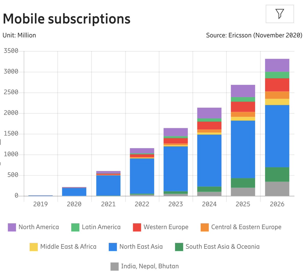
🔥 The State Of Mobile in 2021.
– 80% of all digital minutes are on mobile
– Avg. consumer upgrades their phone every 2 years
– In the US phone replacement cycle is 33 months
– 84.8% of all shipped phones are Androids.
Jump to all details:
https://t.co/JF7KyuP4UC
@nhoizey Well, I think the point about mobile first is still valid, even if we’re discussing native apps. (Many of which have, or link out to, browsers!)
behold, a photo of Yours Truly from 2010, giving the talk that coined the phrase “responsive web design”
while looking as though i’d never seen this slide before 🤔 https://t.co/IMn9DasUTr
We used to have the ability to create responsive, viewport-aware videos, but it was removed.
I think @scottjehl is right: responsive videos should be restored in HTML, and expanded. https://t.co/qKUnbsoeqg
“ethan, what’s your favorite responsive design,” they will ask me
“i love them all,” i’ll reply
but i’ll know
i’ll know it’s secretly this one https://t.co/cTJWGujgwq
i’ll *know*


