Agradezco al Dr. Velastegui @andvelastegui por la oportunidad de ser parte de este proyecto que dió como resultado la siguiente publicación. Los invito a todos leerla:
Acoustic contamination assessment during the transition between the CO... https://t.co/NI8744AAz8
@FCNM_Espol
Sé paciente contigo.
No todo se ordena en una semana.
No todo se entiende al primer intento.
No todo se sana cuando tú quieres.
Hay días donde solo avanzar ya es mucho.
Donde levantarte es suficiente.
Donde respirar con calma es todo un logro.
No te midas con prisa.
No te exijas respuestas inmediatas.
Estás aprendiendo, y eso toma tiempo.
Estás haciendo lo mejor que puedes.
Y eso también merece respeto.
¡Buenos días almas inciertas!
Es 12 de mayo, Día de la Mujer Matemática en honor al Maryam Mirzakhani y Día de la Enfermería en honor a Florence Nightingale quien, además, fue una gran Estadística.
Hay mucho que celebrar pero mucho más por lo que luchar.
Aquí algunas ideas👇
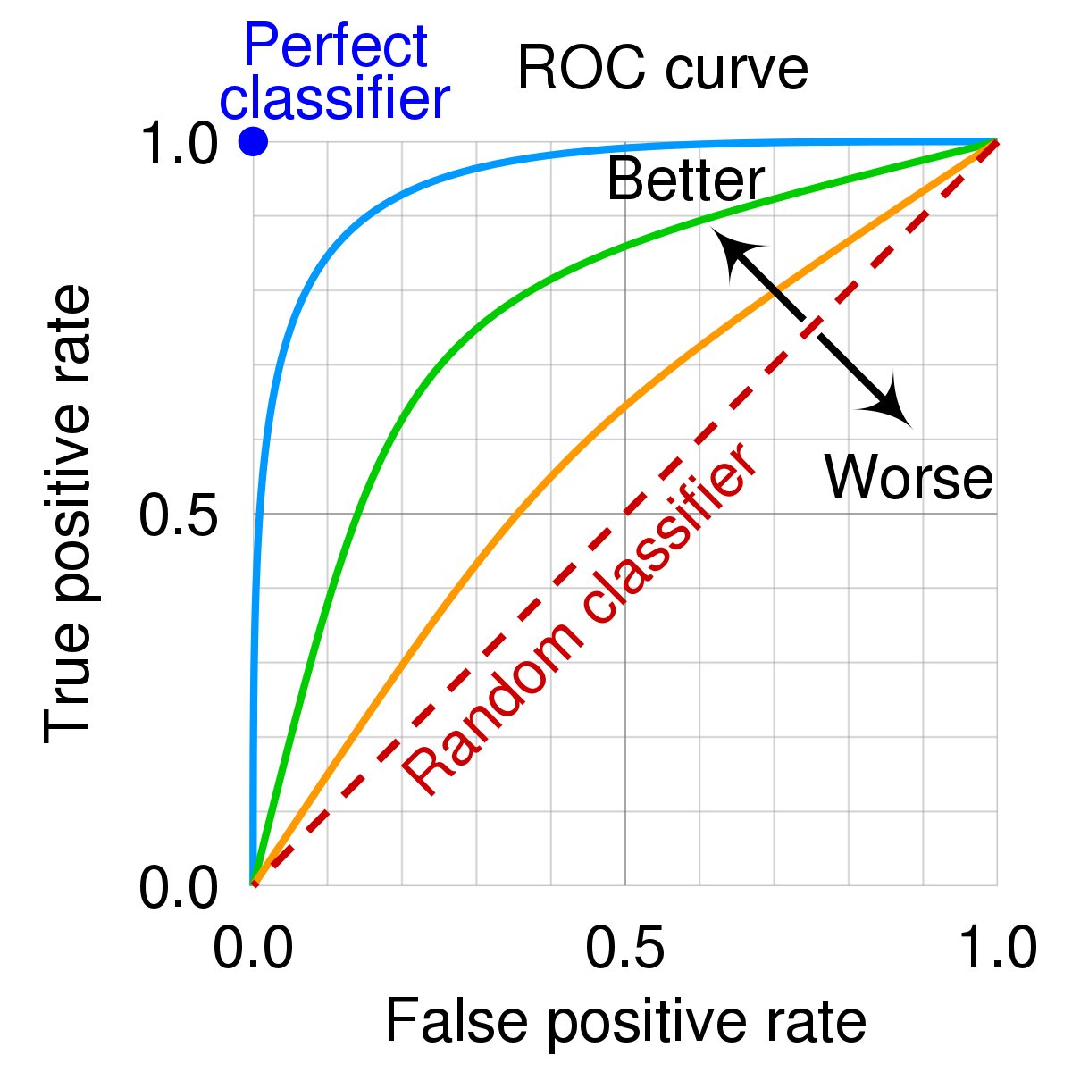
Decoding ROC Analysis
1/ ROC analysis is a fundamental tool for evaluating the performance of classification models. It helps us to understand how well our model can distinguish between two classes, for example, if a patient is sick or healthy.
2/ ROC stands for Receiver Operating Characteristic. It's a graphical representation that shows the diagnostic ability of a binary classifier as its discrimination threshold is varied. Basically, it helps us to visualize the trade-off between sensitivity and specificity.
3/ When you have a test that is supposed to distinguish between 'sick' and 'healthy', the test doesn't give a simple 'yes' or 'no', but a score (e.g., 0.7). We then have to decide which scores should be classified as 'sick' and which as 'healthy'.
4/ In the ROC curve, the true positive rate (sensitivity) is plotted on the Y-axis, and the false positive rate (1-specificity) is plotted on the X-axis. Sensitivity is the ability of a test to correctly identify those with the disease (true positive rate), whereas specificity is the ability of the test to correctly identify those without the disease (true negative rate).
5/ The ROC curve is created by plotting the true positive rate (TPR) against the false positive rate (FPR) at various threshold settings. The threshold is a cut-off value above which we classify the output as the positive class, and below which we classify it as the negative class.
6/ A perfect test would result in a point at the top left corner of the ROC space (100% sensitivity, 0% 1-specificity), meaning it correctly identifies all the positive cases and none of the negative ones. A test with no discrimination ability would result in a 45-degree diagonal line from the bottom left to the top right.
7/ The area under the ROC curve (AUC) is a single number that summarizes the overall performance of the diagnostic test. An AUC of 1.0 represents a perfect test, while an AUC of 0.5 represents a worthless test. It essentially quantifies the overall ability of the test to discriminate between positive and negative cases.
8/ Choosing an optimal cutoff point is crucial. It is the point that balances sensitivity and specificity in a way that makes sense for the particular clinical situation. A high cutoff point may result in fewer false positives but more false negatives, and vice versa.
9/ However, ROC analysis has limitations. It does not take into account the costs and benefits of different types of errors (e.g., false positives vs false negatives), and it assumes that sensitivity and specificity are equally important.
10/ Additionally, ROC analysis is only applicable to binary classification problems and does not consider the prevalence of the disease. This means it may not be suitable for situations where there are more than two classes or when the prevalence of the disease is particularly high or low.
11/ In summary, ROC analysis is a powerful tool for assessing the performance of binary classification models, but it has its limitations and should be used judiciously. It's essential to consider the context in which the model will be used and the relative costs of different types of errors.
#Statistics #DataScience #ROCAnalysis
Harvard university is offering FREE world class education in Data Science!
Courses cover:
- Python
- Data Visualization
- Probability
- Statistics
- Machine Learning
- Data Science: Capstone
A project-based pedagogy that allows you to learn while building! 🚀
Read more!👇
I am very excited to participate in the International Geoscience and Remote Sensing Symposium #IGARSS2023, Pasadena, CA.
It is an excellent opportunity to meet the international #remotesensing community
🚨#PaperAlert 📢
En 2020, la pandemia #COVID19 obligó a implementar restricciones de movilidad, reduciendo el ruido en las ciudades.
¿Deseas conocer cómo varió el nivel de ruido en #Guayaquil entre los años 2020 y 2021?
Revisa nuestra última publicación: https://t.co/HmTkwMr5MF
Durante la pandemia COVID-19, se aplicaron restricciones de movilidad para controlar la propagación del virus.
¿Estas restricciones alteraron el nivel de ruido en #Guayaquil?
Investigadores @espol 🇪🇨, @UGrenobleAlpes 🇫🇷y @ULisboa_ 🇵🇹comparten su estudio
👉https://t.co/UybnXPVjjd
Acabo de descubrir este paquete y parece interesante, lo comparto por aquí
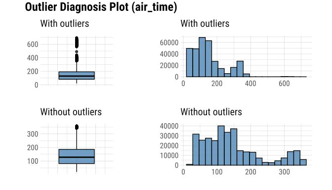
📦 dlookr diagnostica, explora y transforma datos en #RStats
Genera automáticamente informes
Admite diagnóstico de calidad y EDA para DBMS
https://t.co/3jv4hcV9Wp
#dataviz#stats#analytics#DataScience
¡Feliz Día del Maestro Ecuatoriano!
El 13 de abril no es un día común, es el natalicio del Cosmopolita del Cervantes de América: Juan Montalvo Fiallos, maestro de las letras, el honor y la justicia, en cuya memoria se declara el Día Clásico del Maestro Ecuatoriano.
#UTEQ
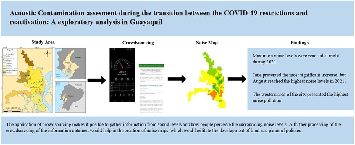
Varios sectores (barrios, urbanizaciones) ubicados hacia el oeste de la ciudad están más afectados por contaminación acústica, y con variaciones más pronunciadas en los niveles de ruido.
https://t.co/eWnTk4Tang
Compartimos una aproximación para evaluar la contaminación acústica en #Guayaquil, usando nuevas metodologías.
Descubre las mediciones del nivel de ruido en #gye para los años 2020 y 2021
Revisa nuestra publicación: https://t.co/gC9AsmVm5K
El análisis por franjas horarias determinó que por la noche se presentó la mayor variación de ruido 📢. Por otro lado, los barrios ubicados al oeste de la ciudad presentaron los niveles más altos de contaminación acústica.
En este contexto, nuestra investigación tiene como objetivo, comprender cómo varió el nivel de ruido en #Guayaquil entre 2020 y 2021, y evaluar la distribución espacial del ruido en diferentes áreas urbanas y franjas horarias.