Well... this is the "FO" part of FAFO.
Last time I checked the USA were the only NATO state that ever needed help - and all the allies came immediately. So better stop trying to threaten your allies and remember what NATO is for.
Lindsey Graham: “Just spoke to POTUS about our European allies’ unwillingness to provide assets to keep the Strait of Hormuz functioning, which benefits Europe far more than America. I have never heard him so angry in my life. I share that anger given what’s at stake.”
@front_ukrainian I do know a really effective way to stop those drones produced in Germany and operated by the Ukrainians hitting Russians:
Get the f**k out of UA, and the drones will stay on ground.
@RpsAgainstTrump Imagine creating THAT much chaos and disorder in the world that people even start to seek help in irratgional things like religion - and boast about it like it is an achievement.
@DelusionPosting This sound totally great.
...until you get a tooth ache. Or a wound infection. Or appendicitis, or complications during birth...
But besides this medical stuff: Yes, sound great.
@alphafox Please, folks!
The energy for charging the EV has to come from somewhere. Extending the range this way viloates fundamental physical rules.
Sorry to say this, but: No, this setup will even REDUCE your range, as the generator / charger has efficency < 1.
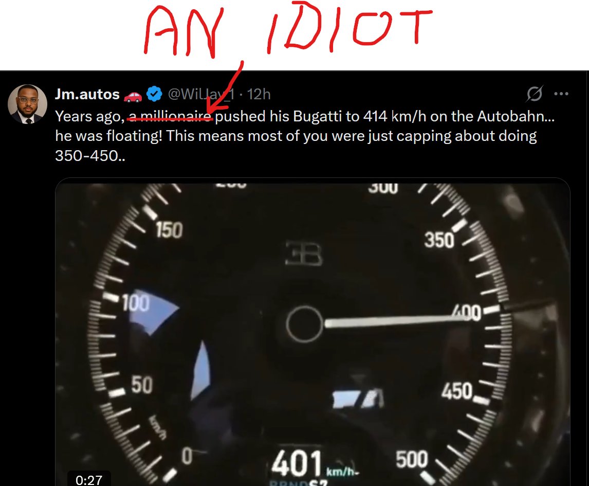
@WilJay_1 There, I fixed it for you:
Who ever can afford such a car surely can afford to rent time on a race track.
Physics does not care about your bank account. If you think you can risk the lifes of others for fun - get off this planet, scumbag.
@HyperMind13@SpencerHakimian Not saying you should apply log to *this* graph. It is just an example for scales that are totally correct, but often misinterpreted by the audience.
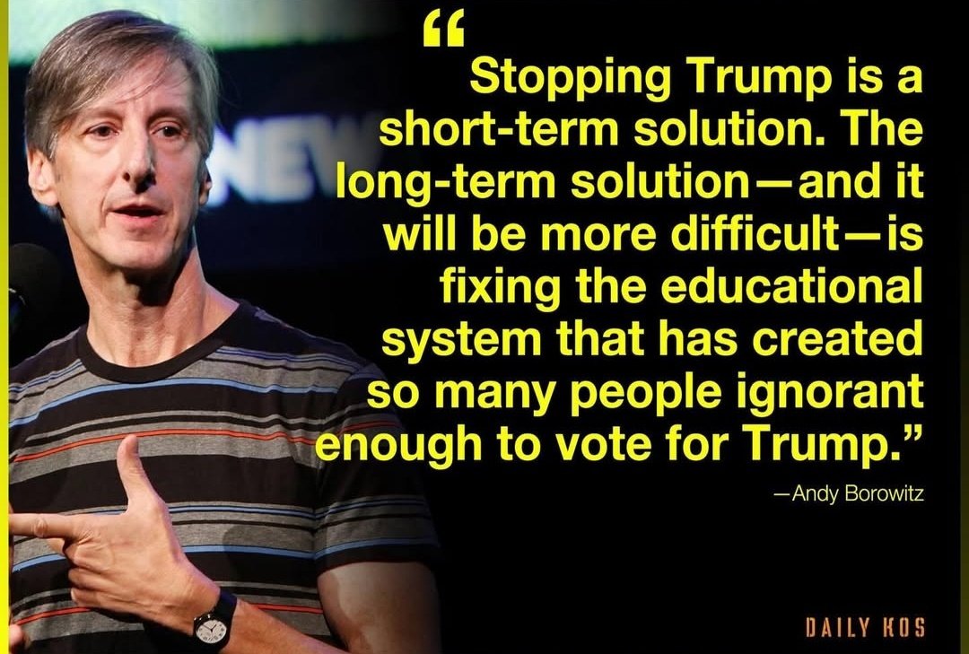
People (and thus voters) tend to believe easy to digest information instead of using their brains - and this is misused by DJT
@HyperMind13@SpencerHakimian No need for getting rude here.
This is a totally correct graph. If you are in data analysis, just think about logarithmic scales.
But I get your point: If presented to an uneducated or inattentive audience, this chart is highly deceptive - and this on purpose, I reccon.
@SpencerHakimian The more I think about this, you might be right.
Technically, this is a totally correct display of information. But in the given context it seems that the authors really wanted to sell the readers a 1% growth as nearly 100% growth.
@SpencerHakimian No. The graph actually does show exactly what it is supposed to show. That is why the axis has labels.
It is not that the author tries to fool the readers. It is more likely that the author OVERESTIMATED the brightness of the readers by assuming they could read a simple graph.
@JessicaTetreau I mean: Teach them early! That's cool.
But please don't let him think that he is a programmer because he learned how to prompt a machine to combine the knowledge of programmers into some code that somehow works - without him understanding what the code really does.
@Endur_of_those @SpencerHakimian As this is totally common (and useful) in science and statistics, I think you might be right here: For distribution in popular media this kind of data display could be misleading - which might be not only have been accepted, but also wanted by the authors.