Your nav's first link gets more clicks than your hero button.
Almost every Shopify store still points it at "Home."
I pulled the click maps on 30+ stores.
Same leak, every time.
→ That first link carries the most trust on your whole site
→ Someone who clicks it already believes you enough to look deeper
→ Most CRO advice tests the hero button first, it makes a cleaner before/after screenshot
→ Almost nobody touches the nav, even though it holds more trust than any banner test
If your bestseller, your best-converting collection, or your quiz isn't that first link, you're handing your best traffic a dead end.
Open GA4.
Check where that link sends people and how many bounce off it.
Swap it to your best-converting collection this week.
Your website search is collecting the most valuable information you could know about your customers, every single day.
And you're not using it.
People who search convert 3 to 10x higher when they actually find what they're looking for.
Here's the part almost nobody checks: every time someone searches and finds nothing, they're telling you exactly what to build next.
→ A new product you don't sell
→ A sizing or color option you don't have yet, one you could add to your catalog
→ A synonymous term for something you already carry, like someone searching "leggings" when you call them "tights"
You're probably paying for ads and customer surveys to learn this. It's already sitting in a report inside your store, free.
You want to redeisng your homepage before you touch your cart.
That's backwards. Homepage traffic hasn't decided anything yet.
Cart traffic already said yes.
If your ad spend is up and revenue isn't moving with it, this is where to look first.
There are common reasons a cart kills a sale that was already won.
Three of them:
→ An upsell shown that has nothing to do with what they're actually buying
→ No guarantee or return info anywhere on the page, no mention that returns are free, no mention that you back the purchase
→ A checkout button that isn't always visible in the cart
None of these need a redesign.
Someone just has to check for them.
If your cart has more than one of these, you're losing buyers who already wanted to buy.
Run five of these in 90 days and you're not guessing about your store anymore. You're running a different one.
Reply TESTING and I'll send the sheet I use to pick which test goes first.
That one test tells you more than any audit you've ever bought. You can't argue with what already happened on your own site.
Any agency whose job ends the day the report lands is selling you an opinion at the price of proof.
Most Shopify brands run fifty headline tests before they run one discovery test.
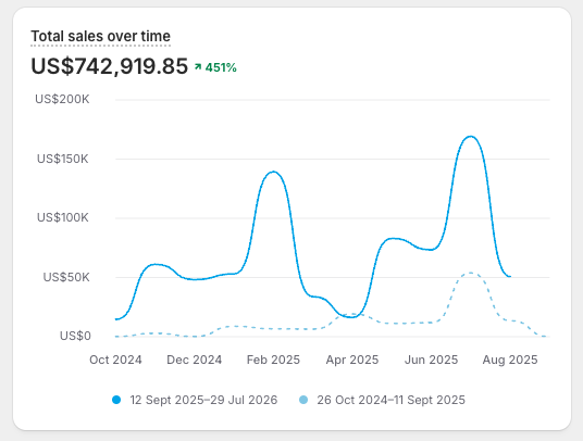
Across every store I've tested this on, it's added more than $500k combined in revenue.
Not from new headlines.
From fixing how people find their way to a decision.
A headline test changes what someone sees: an image, a piece of text, a color.
A discovery test changes how they get anywhere at all, before any of that even matters.
Buyers make a routing decision before they make a design decision.
Discovery tests are about that routing.
What counts as a discovery test:
→ Putting "find my size" right next to the size selector, whether that's a simple size chart, a way to message an expert, or an AR feature that checks the fit
→ Sorting a collection page by your own rules (revenue, conversion rate, margin) instead of the default sort
→ Letting people scroll through a product's images straight from the collection page, before they click in
→ A two-step quick add: tap the button, a drawer opens with the info that actually matters, then they add to cart
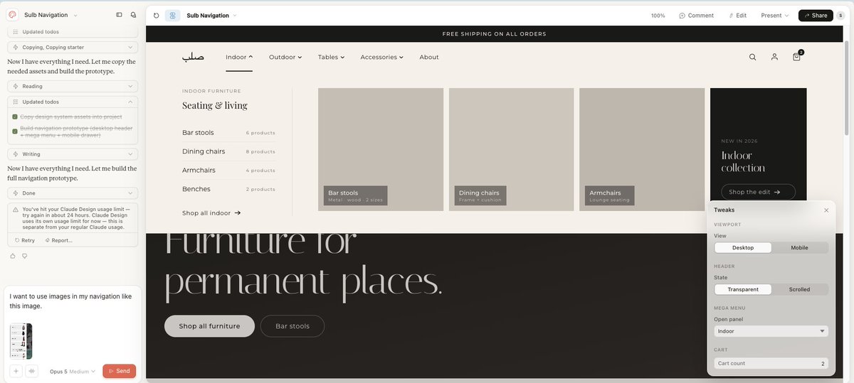
→ Putting an image next to every link in your mobile nav drawer instead of just text, so people see what they're tapping before they tap it
→ Whether your add to cart bar stays sticky as they scroll
Here's the test: if you want people to find things faster in your nav drawer, is it better to add images next to every link, or rewrite what the links say?
Add the images.
That's a discovery fix. It changes how people find their way, not what the words say.
The one exception: if a link is actually misdirecting people, like link text that says "cover up" going to a T-shirt collection, fixing the words is the real fix.
That's not a discovery problem. That's just wrong labeling.
Most brands test headlines first because it's faster to set up.
Discovery tests take real product thinking.
That's exactly why almost nobody runs them, and exactly why they're still sitting there, unclaimed, on every store that hasn't checked.
Test discovery first. The headline can wait.
A beautiful new product page can still be losing you the exact same sales as the old one.
I've found that on every one of the 30+ Shopify product pages I've designed this way.
I skip the beauty contest and design straight from the leak, not from a moodboard.
Here's the process:
1/ Feed Claude your brand: colors, type, spacing, voice
2/ Connect it to your GitHub repo so it reads your real theme
3/ Upload screenshots of the exact page that's leaking, not just "the store"
4/ Ask for the fix, not a redesign. Claude writes the full HTML and CSS
5/ Your developer turns that into Shopify code
The screenshots of where people drop off are the brief.
A moodboard never diagnosed anything.
A prettier page that doesn't fix the leak is just a more expensive version of the same problem.
Every week you spend making it prettier is a week you didn't spend finding out why it's leaking.
Let me explain to you why you'll NEVER scale outside of your local market/country.
And i'll best explain with this scenario:
Your international blended conversion rate looks fine.
Split it up by each country and one market is carrying the WHOLE number. Likely your main market.
Stripe found that adding the right local payment methods can lift conversion by double digits, in some markets far more.
Sounds like payment method is the fix but you're still missing the core issue.
Payment is one piece.
Understanding customers PER MARKET is the other piece you're forgetting.
A US product page: Tons of copy, tons of education, not very lean in content but it's what works.
A GCC product page: headline. Button. Minimal subtext, tons of images to replace as much text as possible.
Education done through images and indirect methods, ALL TO AVOID A TON OF TEXT.
The images do the work.
Put the US layout into a new market and buyers don't ACTUALLY skip the copy.
They JUST never see it as copy.
They see clutter in front of the buy button.
It reads as noise, as annoyance, as "this brand is so complicated".
It's the Same store, same product but a different audience.
Different conversion math per country.
Opened a second market and CVR went down instead instead of climbing?
Check the local customer behaviour and what influences them before you touch ad spend.
And try to get your page to ONLY touch those influences and absolutely nothing else.
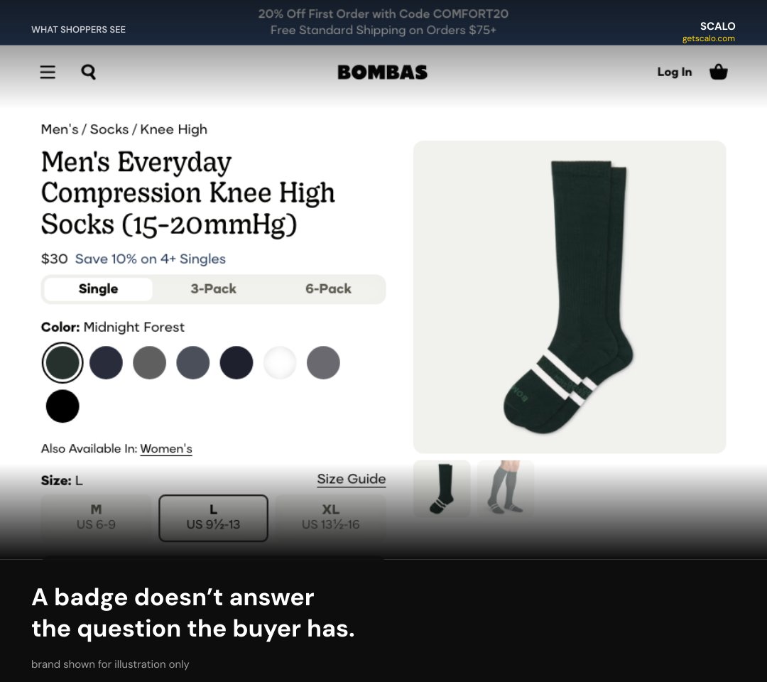
Trust badges create the very suspicion that they're meant to get rid of.
I've torn apart dozens of Shopify product pages this year.
Every one had the same badge stack:
→ five stars
→ a lock icon
→ a money-back guarantee
All placed correctly above the fold.
Ad spend kept flowing in. Conversion rate stayed flat.
A badge doesn't answer the actual question the buyer has.
A star rating doesn't explain a 9-day ship time.
A lock icon doesn't explain why the price is $12 higher than your competitor.
Badges are generic. The objection killing that page is specific: your product, your price, your traffic.
Stop stacking icons.
Write down the exact sentence a skeptical buyer would say on that page.
Answer it in copy, right where they'd say it.
Tomorrow:
→ Pull your 3 highest-traffic product pages
→ Write the objection
→ Answer it above the fold
→ Delete any badge that isn't doing that job
One swap that actually worked:
Instead of: Try 100% Risk Free With Our 30-Day Guarantee
Do: Under 3% of shoppers use our Risk-Free 30-Day Guarantee
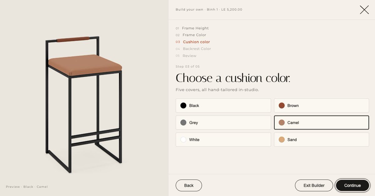
A furniture brand needed 6 options to show the right image every time: backrest, armrest, frame material, frame color, height, finish.
Shopify's normal variant system couldn't do it.
So we built a different kind of content: one entry for every valid combination, each one pointing to the correct image. Pick your options, the right picture shows up.
That's called a metaobject. A content type you build from scratch.
A metafield is different: extra data bolted onto a product you already have.
Get that choice wrong and you don't find out at the build stage. You find out after launch, when a customer picks their combo and the wrong picture loads.
On a $2,000 configurable piece, that's not a bug ticket. That's a lost sale.
The test: is this a property of a product you already have, or a standalone type of content that shows up in more than one place? First one's a metafield. Second one's a metaobject.
Decide that before you build. It's a 30 minute call, not a rebuild six months in.
We make that call first, in every Store Autopsy, before any code gets written.
Right now: open your own store on your own phone. Try to buy your own bestseller. Time it.
If it takes longer than 90 seconds, that's the leak. It's the first thing we check in a Store Autopsy, before we ever touch your ads or your creative.
I built a checklist of the 12 mobile problems we see over and over on Shopify stores.
Reply MOBILE and I'll send it.
You have never bought anything from your own store.
We've added $500k+ across client stores without touching a single redesign. Just fixing what breaks when a real customer tries to buy on their phone.
Check this⬇️
A pretty desktop mockup is not a store. It's a screenshot an agency sold you.
The buy button sits three scrolls down. The buttons are too small to tap. Finding a product takes three taps too many. That's the same leak we find on almost every Shopify store we open.
Claude is the perfect example of a very impressionable employee.
You will not get what you want without proper training. You will get exactly what you with proper trainnig.
Out the box claude is almost like any other AI. You need to give it all that "training".(hooks, skills, sops, self improvement instructions etc.)
Your best-selling collection page is working against you. Right now.
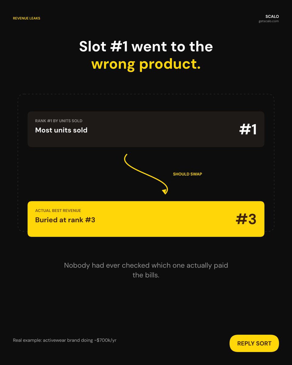
Shopify's default sort is called Best Selling. It doesn't sort by revenue. It sorts by how many units sold.
That's the same leak behind $500k+ in fixes across brands i'm working with.
We found it on an activewear brand doing about $700k a year: sorting by Best Selling put the item with the most units sold in slot one, not the item bringing in the most revenue.
Those weren't the same product, and nobody had ever checked.
Every agency checks your ad spend first. Almost none check this.
It's a five-minute fix that moves more revenue than most ad tests we run.
We wrote custom code that sorts collections by revenue per visitor instead.
Slot one goes to the product that actually pays your bills.
Reply SORT and I'll send you how we build it.