Today we're announcing AMPLIFAI
A masterclass for designers who want to build and ship real SaaS products with AI workflows.
What this is:
A 4-module course built around a single end-to-end project.
You start with a Figma design system and finish with a deployed application. Every exercise builds on the last.
The project is the curriculum.
The stack:
Figma → Claude Code → GitHub → Supabase → Vercel
Who it's for:
Designers, design leads, and PMs who've been watching the AI wave and want to go from "that's interesting" to "I built that."
No prior coding experience needed.
No slides about the future of design.
You build from day one.
Details:
→ Starts July 1, 2026
→ 6-month access
→ Early bird pricing available until July 15
→ https://t.co/tVDb9SOPQH
This course exists because we wish someone had packaged this workflow a year ago. Would have saved us months of dead ends.
If you know a designer who's been curious about this space, we'd appreciate you sharing this with them.
Tech folks under 1k 👇
Let’s run this up.
If you’re building in tech:
SaaS, AI, design, dev, growth.
Follow everyone in this thread.
Support each other.
Reply. Engage. Amplify.
Let’s get everyone past the first 1,000.
Momentum > waiting on the algorithm. 🚀
If your Figma design system has 20,000 components, it’s not a flex, it’s massive inefficiency.
That number usually means:
◆ Maintenance hell (every tweak becomes a cleanup project)
◆ Inconsistency (teams pick whatever looks close enough)
◆ Governance theatre (rules nobody follows because the library is chaos)
A real design system should reduce choices, not explode them.
That’s why Superframes UI ships with the least number of components: 20.
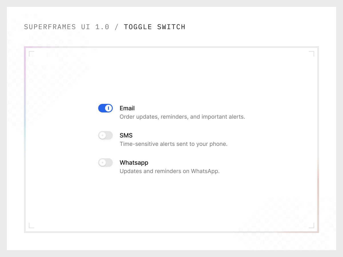
One for each core building block.
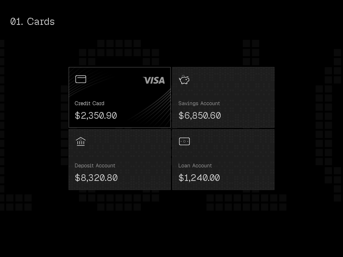
But each one is a Supercomponent, designed to be configured hundreds / thousands of ways through properties + tokens, not duplicated into endless variants.
Less library. More system.
Small surface area. Massive output.
If your design system is growing by adding more components, it’s not scaling, it’s sprawling.
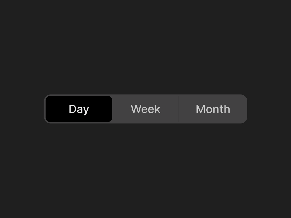
Here's a quick demo of how we achieve 1000s of configurations from a single button component.
Join waitlist at https://t.co/RKC1lkn9eT
If your multi-brand setup in Figma relies on component duplication, it’s bound to collapse over time. That approach might work initially. But the moment you try to give each brand its own flavour (different fonts, corner radii, visual language) it becomes a recipe for complexity.
For Superframes UI, multi-brand styling is handled at the variable layer.
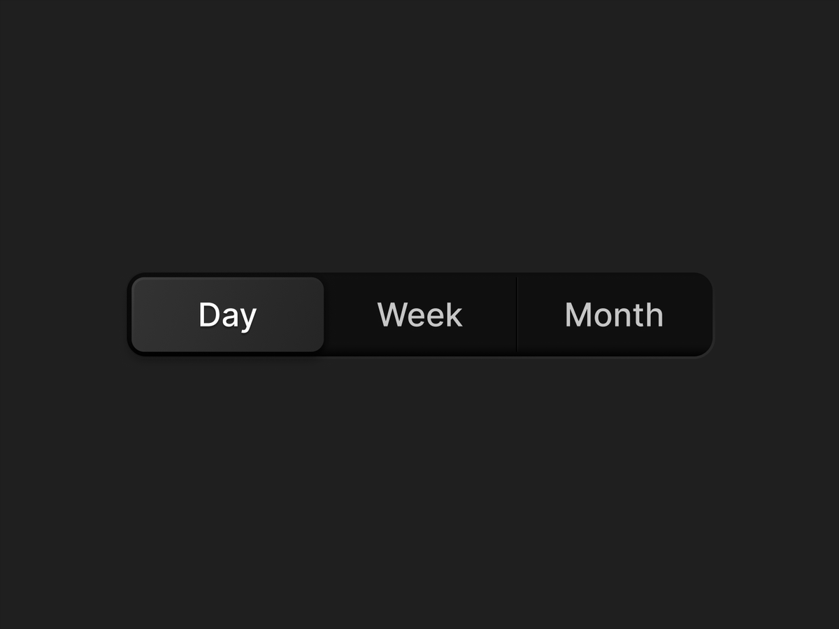
The same button adapts its color, corner radius, and typography as the brand changes. No duplicated components. No manual overrides.
Designed for multi-brand products that need to scale without breaking.
What this enables
◆ One component across brands
◆ Multi-brand color support
◆ Light / dark theming
◆ Brand specific corner radius
◆ Brand specific typography
◆ Full control via variables
◆ Consistent behavior across states
Explore more at: https://t.co/RKC1lkn9eT
If your multi-brand setup in Figma relies on component duplication, it’s bound to collapse over time. That approach might work initially. But the moment you try to give each brand its own flavour (different fonts, corner radii, visual language) it becomes a recipe for complexity.
For Superframes UI, multi-brand styling is handled at the variable layer.
The same button adapts its color, corner radius, and typography as the brand changes. No duplicated components. No manual overrides.
Designed for multi-brand products that need to scale without breaking.
What this enables
◆ One component across brands
◆ Multi-brand color support
◆ Light / dark theming
◆ Brand specific corner radius
◆ Brand specific typography
◆ Full control via variables
◆ Consistent behavior across states
Explore more at: https://t.co/QNqXYiyBrK
Most design systems don’t break at v1.
They break at scale.
Multiple products.
Multiple teams.
Multiple brands.
That’s why we built Superframes UI — a tokenized design system designed to hold up as complexity grows.
We’re live.
Join the waitlist. Early access opens soon.
👉 https://t.co/HohLAnFJhV
Launching Q1 ’26.