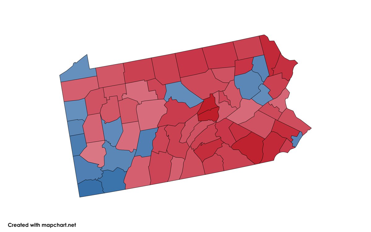
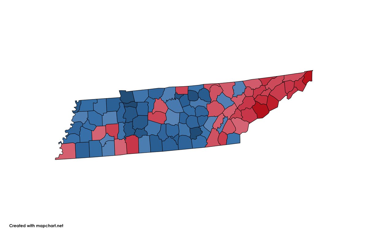
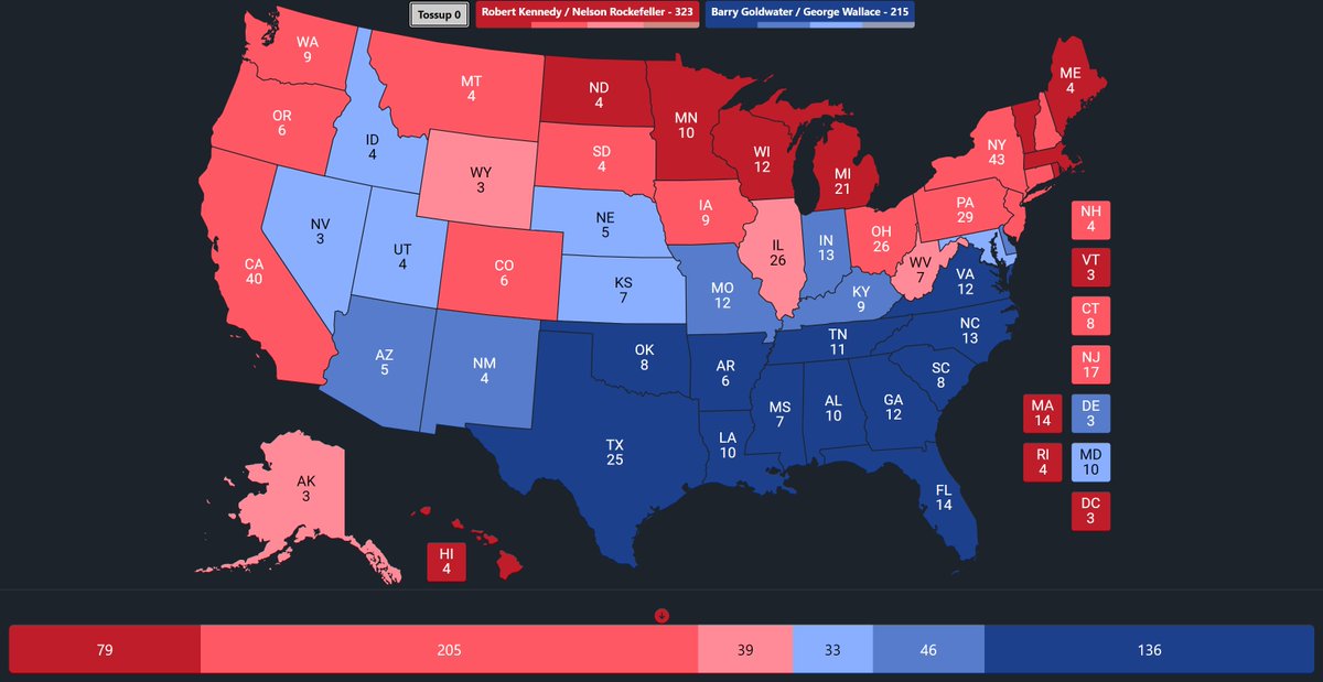
Here's an interesting map with some new party coalitions! Candidates were chosen on a whim, but the core idea was liberal vs. conservative using data from 1924, 1952, 1964, and 1968.
Alright, I felt like making a Dem Trump coalition set in the 60s (mostly so I could disguise the mess down south lol)
There's not any story here, but I think it looks pretty cool!
The Wallace coalition uses Wallace as a base, and it's divided by an average of Carter 76, Perot 96, and Trump 20 that was 10th rooted before the division--just to make a little more room for Trumphrey since that coalition overlaps a bit with normal Wallace.
@GoldenSand_ Also thanks for crediting me for my help (even though I didn't help that much lol). Totally unnecessary, but welcome for sure haha! That was very nice.
@GoldenSand_ Ooooh, this is lovely. Richards is great, glad someone made use of her other than me in my own 96 map lol.
Anyways, beautiful coalitions, very nice mix of the 80s Mondalian-type union/midwestern look and the 90s neo-southern coalitions for Richards. Phenomenal!
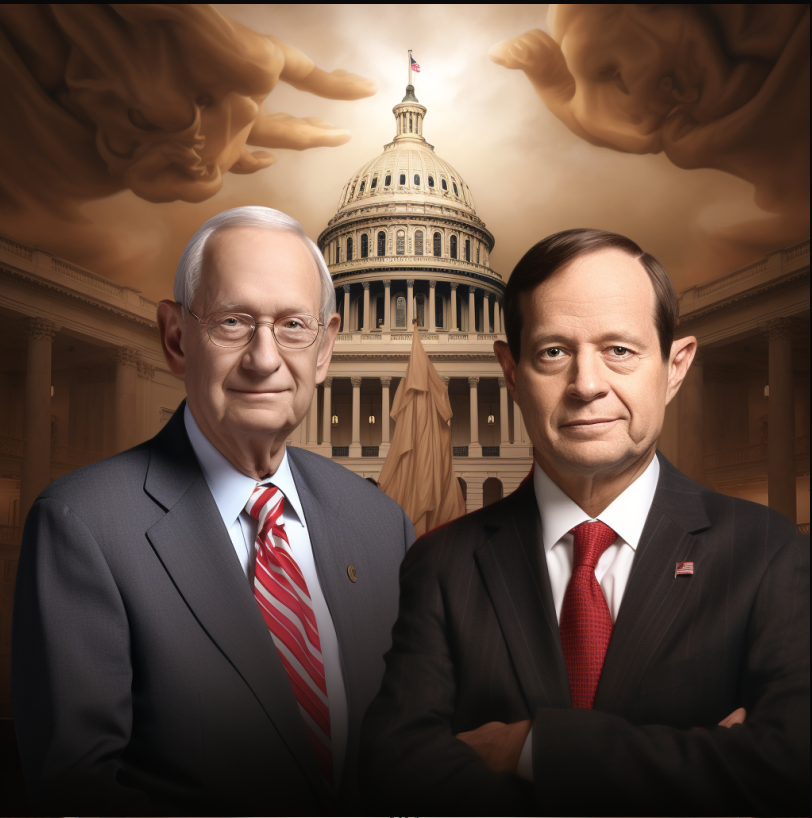
I asked @midjourney to draw two senators from each state. Here are some of the images of what it thinks these pretend legislators would look like:
Alabama
@kingfish77713 Beautiful coalitions. Only based on aesthetics, beautiful, mwah, italian-style chef mwah, yanno? The actual candidates make me sad, but it's better than what we've actually got with this polarized hell of red rurals and blue suburbia---or where we're heading with that, I suppose.




![TartyThePie4604's tweet photo. Heyyy there's green, haven't seen that one in a while! I finally figured out how to make this work and I'm quite happy :] https://t.co/PkbpW6V90l](https://pbs.twimg.com/media/GLKZnOFasAA5XJC.jpg)