🔶 50+ Claude Code Skills for Designers & PMs
A curated catalog of the most useful installable skills for Claude Code.
→ https://t.co/Lt22JfraWT
By Tommaso Nervegna
Hey friends, if you're a content creator, or you know someone who needs help with ongoing design work, a marketing design retainer spot just opened up in my studio (https://t.co/ilEeeHx39C).
We've been working with some of the world's top creators and helped their content reach millions of people.
Here's what we can do for you:
👉 Refresh and reorganize your personal brand assets into one clean system.
👉 Design custom Figma or Canva templates built for you, not AI-slop.
👉 Create a personal-brand.md file that defines your voice and style.
👉 Static and animated posts, ads, slides, and graphics, all on brand.
If that sounds like you, reply or DM me → https://t.co/ilEeeHx39C
⚡️ UI design tip - Decrease letter spacing for large text
A small trick to make large headings look better is to decrease their letter spacing (space between letters).
How much you decrease letter spacing depends on the typeface and size, but generally, you should decrease letter spacing more as text gets bigger.
This is because many typefaces were designed to be read at small sizes in long body text. They’re known as “text type” typefaces and have wide letter spacing to make them more legible at small sizes.
You probably won’t need to decrease letter spacing for “display type” typefaces, as they were designed to be used at large sizes and generally have closer letter spacing.
PS This is just 1 of 100+ design guidelines from my @PracticalUI design book 📘
⚡️ UI design tip: Avoid form placeholder text 🙅♂️
Placeholder text is a short hint displayed inside an input field before a person enters a value. To save space, placeholder text is often used instead of a label.
This is problematic for the following reasons:
❌ It disappears on focus so you forget what the field is for.
❌ It can look like the field is already filled, so some might mistakenly skip the field.
❌ Its low contrast makes it difficult to read.
Here's what to do instead:
✅ Always display a short descriptive label above form fields.
✅ Add a hint under the label and above the field if more information is needed. Don't display hints below fields as they can be covered by autofill menus and on-screen keyboards.
PS There are some exceptions to this guideline. Using placeholder text for single form fields like search boxes is fine, as long as you increase the contrast ratio of the placeholder text to at least 4.5:1 and ensure the field has an accessible label for screen readers.
Thoughts?
🧠 Cognitive Bias Index
A handy tool to help you design for how people actually think and learn why we do the weird things we do 😅
→ https://t.co/w4l2lks4Hs
By Jon Yablonski
AI can redesign your entire app overnight. But a faster brush doesn't make a better painting 🖼️
This article from Karri Saarinen at Linear is a great articulation of why design is fundamentally about understanding — not output.
He draws on Christopher Alexander's idea that good design is a fit between form and context. Not a pretty UI. Not a fast prototype. A worked-through response to the real forces shaping a problem.
The danger with AI tools isn't that they produce bad work. It's that they produce plausible work very quickly — polished enough to look finished, but built without ever taking the time needed to truly understand the problem underneath.
Worth a read if you work in product, design, or anywhere AI is changing how you build.
→ https://t.co/hlrWjxsX5K
How have AI design tools changed your design process?
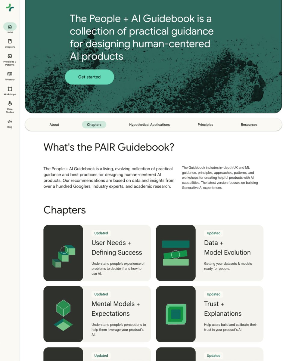
🤖 Google’s People + AI Guidebook
A collection of practical guidance for designing human-centered AI products.
✅ User Needs + Defining Success
✅ Mental Models
✅ Feedback + Control
✅ Explainability + Trust
✅ Data Collection + Evaluation
✅ Errors + Graceful Failure
Check it out 👇
https://t.co/G7CHrZOjoY
UI/UX Designers, this might be one of the cleanest color generators out there.
UI Colors is a platform that lets you quickly generate beautiful, ready-to-use colour palettes for your UI projects, helping you speed up design decisions and stay consistent.
Bookmark it for later 💜
👩🏻💻 Claude Code for Designers
A practical step-by-step guide to designing and shipping with Claude Code.
→ https://t.co/egWMPsxGDf
By Tommaso Nervegna
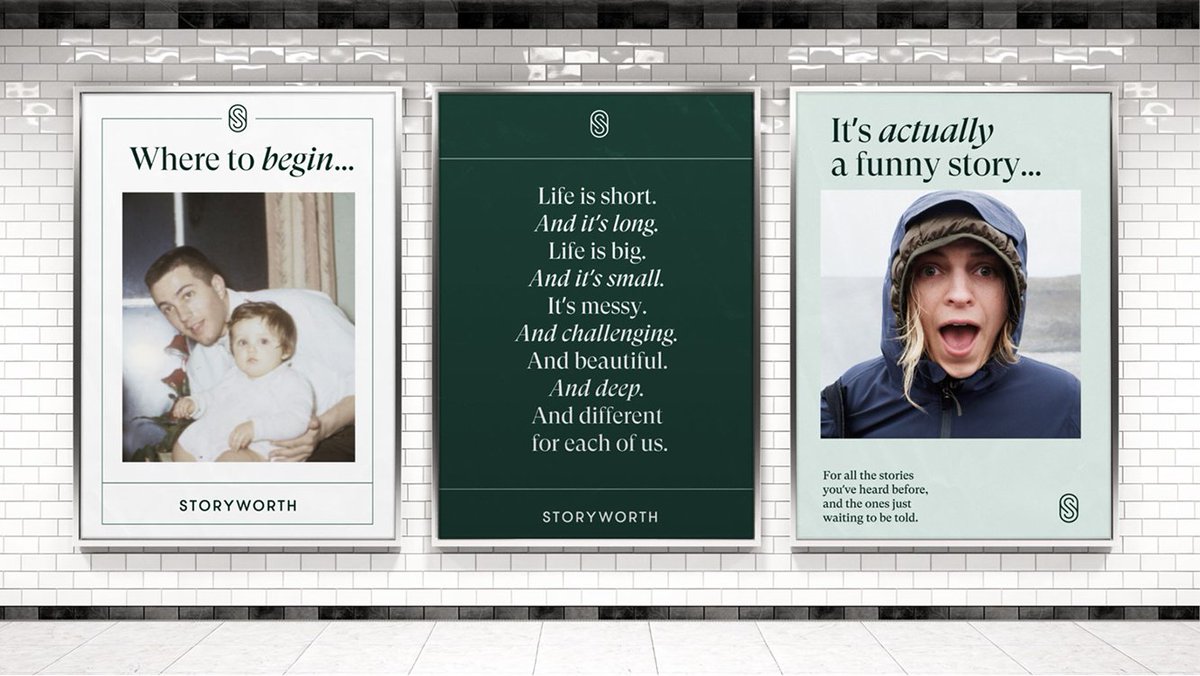
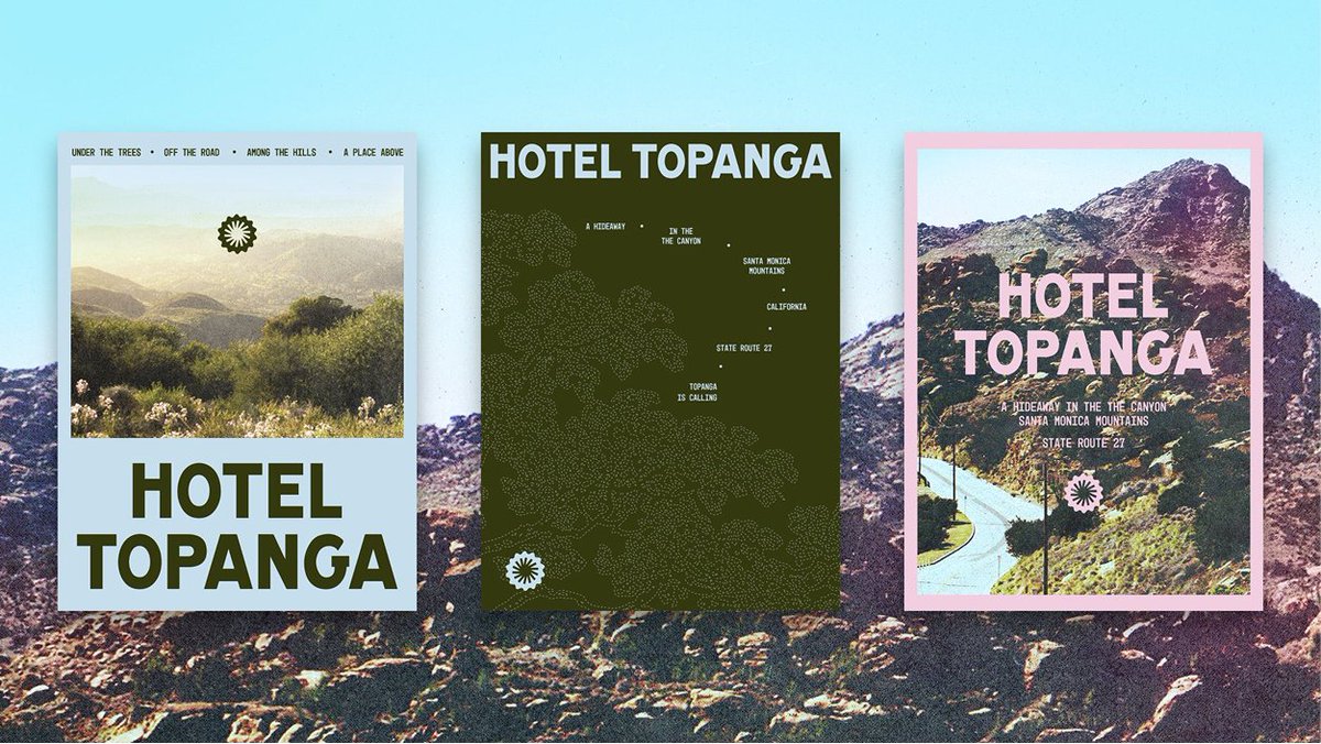
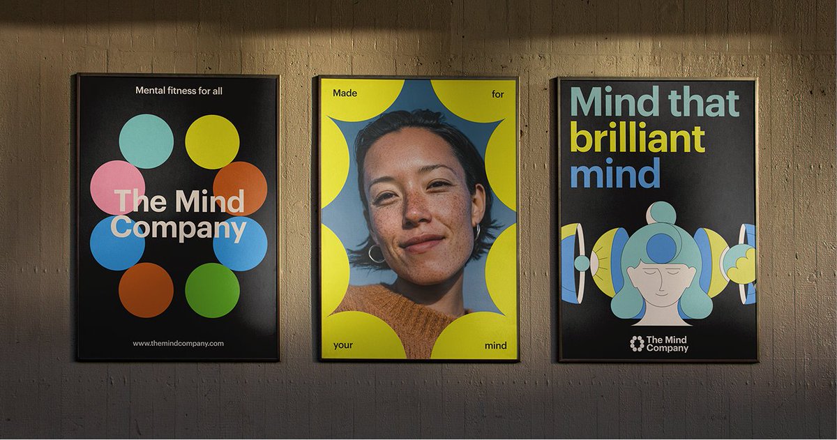
My go-to brand system stress test when creating new brands: the 3-poster test.
Create 3 layouts side by side. If the brand can’t flex across all three, it’s not done yet.
Not every brand needs posters but this exercise usually shapes social, web, and campaign layouts.
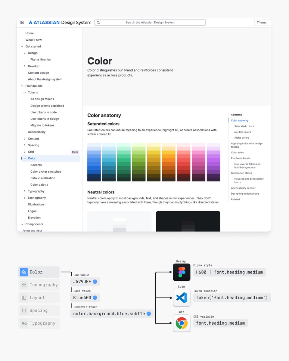
📌 I've studied hundreds of design systems over the years and here's what I learned from the top ones including:
• Google’s Material Design System
• Shopify’s Polaris Design System
• GitHub’s Primer Design System
• Apple’s Human Interface • Guidelines
• Gov UK Design System
• Microsoft’s Fluent 2 Design System
• GitLab Pajamas Design System
• Twilio’s Paste Design System
• Salesforce’s Lightning Design System
• Vercel’s Geist Design System
• BBC’s GEL Design System
• Mozilla’s Protocol Design System
Learnings 👇
https://t.co/INz8Jvprx8


