Hello! This is Fonts speaking. Well typing. In what seems to be Arial. It is not really my choice of font, but let's see what fonts there are out in the world.
This tweet will be forever pinned (unless something nuts happens)
Please send me fonts to review! Either as a comment on this post or DM me!
If I hit 1000 Followers then I’ll change up my profile picture’s font. I’m getting a bit sick of TNR lately from all these papers
-Fonts
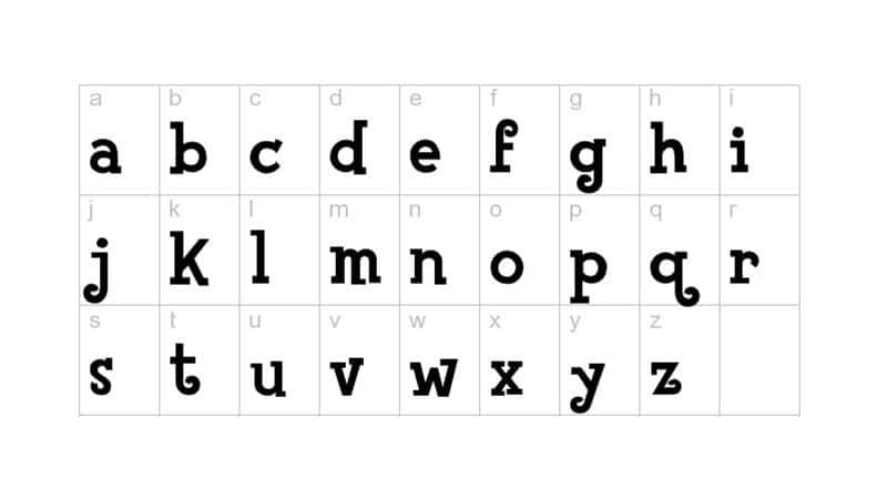
#fontreview: Animal Crossing Font by #Nintendo
Event: #AnimalCrossingNewHorizons
If slaying demons is far from your thing, Animal Crossing New Horizons can be your game to relax instead. With a font that's very cute, it's perfect to relax upon those shores! 10/10 #fontscore.
#fontreview: AmazDooM by Amazingmax
Event: #DOOMEternal
Oh yeah, this font rocks! It takes a lot to make a four-letter word iconic and badass, so I'm glad somebody got around to get the rest of the alphabet in on it. 10/10 #fontscore. Go to @DOOM for updates about the game!
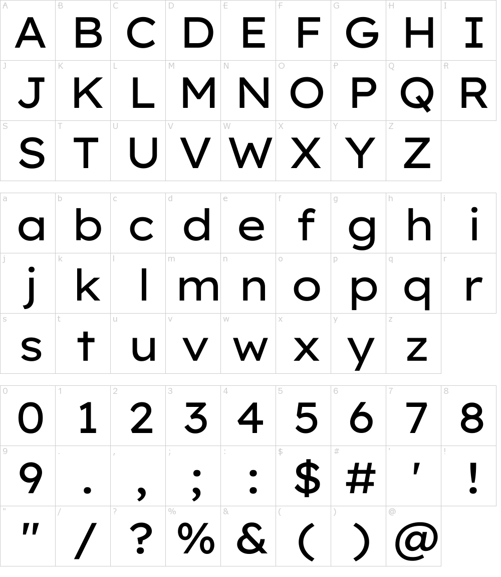
#fontreview: Proxima Nova by Mark Simonson
Requested By: @MGB498
Despite its clean look, Proxima Nova has existed for nearly a whole 15 years. Despite its many years of service, I can’t help to notice that it is too basic of a font. 5/10 #fontscore. It’s just boring to me.
This tweet will be forever pinned (unless something nuts happens)
Please send me fonts to review! Either as a comment on this post or DM me!
If I hit 1000 Followers then I’ll change up my profile picture’s font. I’m getting a bit sick of TNR lately from all these papers
-Fonts
(2/2) This font was completely unknown to me before today, but I can see why it is the CEO of @SpaceX’s favorite font. However, the lower-case “d” shares the same as the lower-case “b”, so I can only really give this font a 6/10 #fontscore. Not a bad font, but it irks me.
#fontreview: Hard Gothic by @fontke
Favorite font of @elonmusk
(1/2) Out of a recent tweet, I have discovered this font is Elon Musk’s favorite font. Stylistically, Hard Gothic is a unique straight edge typeface with very sharp characters and a simple futuristic aesthetic.
(2/2) I absolutely adore this goal. I have seen it in action, and I can definitely say that this is truly #changingthewaytheworldreads. I don't know what else to say other than to wish my deepest respect. 10/10 #fontscore. Doing God's work here.
#fontreview: Lexend by @ThomasJockin & @bshavertroupEdD
Requested by: @SkydiverTyler
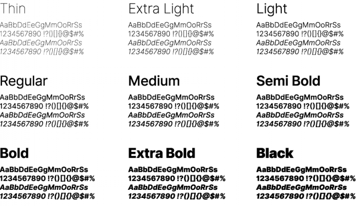
(1/2) Lexend is possibly in pursuit of the noblest quest of any font. Similar but not quite similar to the previously reviewed font Inter, Lexend is designed to be read by virtually everybody.
(2/2) However, I must be honest when I say that I am indifferent to this font. I may have used it in the past for a project, but I won't be using it for a paper or a poster. I don't hate it, but I neither love it either. This rings true for Undertale too. 5/10 #fontscore
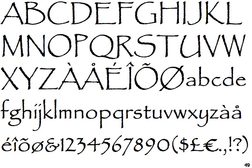
#fontreview: Papyrus by Chris Costello
Requested by: @CrazyPanda90009
(1/2) Before I give my take on this font, I need to say that the creator of Papyrus spent several months perfecting this font using textured paper and a calligraphy pen. Now that's dedication to one's craft.
(2/2) Inter is sharp and very to the point. However, it has plenty of special character support and several font styles to your liking. I am proud to say that Inter certainly earns its 8/10 #fontscore. I will certainly add this font to my collection.
#fontreview: Inter by @rsms
Requested by: @SkydiverTyler
(1/2) I feel like I have gone over several sans serif fonts, but the purpose of this font was to be clearly eligible and to perfectly fit as an 11pt font. It is needless to say, but I am very impressed by this font.
#fontreview: Wendyville by Sharkstock
Requested by: @funk_jl
Western fonts either come off as annoying to read or too plain. I'd like to say that Wendyville hits that sweet spot of both. It's eligible, stylistic, and perhaps inspired after the @Wendys font. 8/10 #fontscore
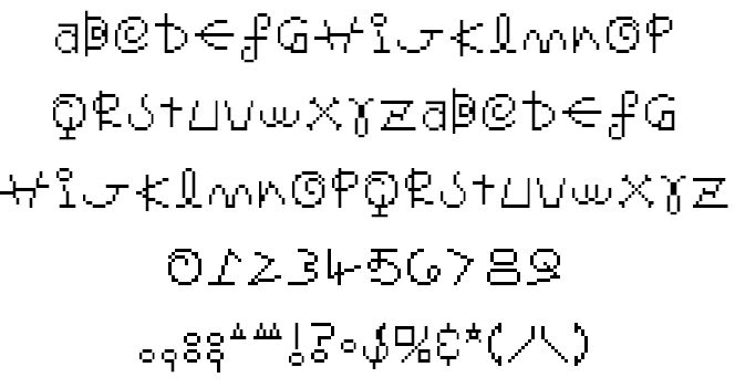
#fontreview: Mr. Saturn Font from #EarthBound
Requested by: @TheBlueBulbear
Oh brother... It's like a child's handwriting if they were told to write like an alien. Cute, but not very practical or useful. I give Mr. Saturn's Font a 3/10 #fontscore purely due to its unique charm