Bring back Jensen. Innocent until proven guilty of leaking any classified information. Until then he has to step down because of his personal life choices?
What's interesting is that CueCard on iOS had 957K impressions in the last 30 days. An impression here means a user interacting with the app by tapping a button.
602K were on the teleprompter screen and just 16K on cue cards. Looks like the teleprompter is what people really need, or I need to up my cue cards game.
16.5K iOS downloads for https://t.co/Ygxhe3gCux! More than tripled from 5K a month ago. https://t.co/hhCEiNbkjD
Looking for 12 Android users to test the app before its production release, as required by Google Play policies. DM me if interested!
CueCard is a free, open-source teleprompter for iOS, Android, Mac & Windows. Floating scripts, swipeable cue cards, video recording, and more. No ads, subscriptions, or sign-in. Code: https://t.co/Dk0gMkqyAv
For @temple, before I pay $900, could I see a preview of the app and its features? Also, when it is stated that temple will never be available at this price, does that imply a higher cost or the possibility of a lower one during mass production? I have these questions before completing the payment.
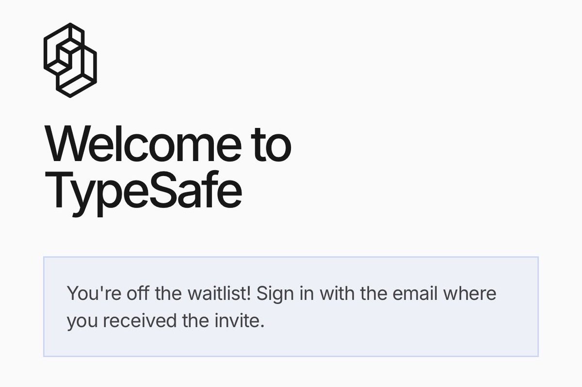
someone at @typesafeai should fix the user interface and experience of their website..
landing page
1. it is ugly (maybe by design). but you are mixing too many design styles together. stick with one. it is very hard to mix multiple styles and make a good looking website.
2. "the first ... properties of code" is nice and important but it is taking too much space. more than it should.
3. the sections 2 with windows on a screen that can be dragged do not retain their dragged position. video attached. just drop that interaction. its just taking up space that you can use to have more important information. also those 193.6x 6.2x ... numbers make no sense without the column header.
4. "We Took The Opposite Research Direction" that is great. but again not something that you say in half a page. something that is very off about the website is typography. I think this is it. please ask claude to fix the typography of the page.
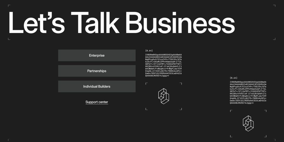
5. too many base64s. some base64 are random code snippets. I dont get it. how is that adding value to the website? if you are really into putting base64s at least put the memes you like.
6. You have made the most important thing to a developer so small. The pricing and cost comparison in section 4 & 6. I think you need to move the sections around and think what is p0 for a dev. P1 and p2.
blog pages
1. it is same typography issue. Try to not make the website a place to show all colors. Stick with a theme and typography and that is your style. even if you want to have 10 different colors. Introduce those colors to users in landing page. By introduce I dont mean that flashy thing. Video attached.
general
1. Make header sticky. I dont wanna scroll all the way up to click on api console.
2. Did you see how the footer looks on a big screen? If you did and you wanna keep it like that sure. It is bad though.
3. “lets talk business” is intentionally like that?
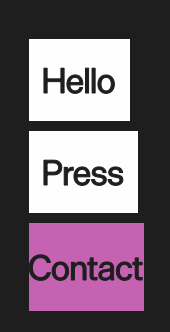
4. Contact button on footer is the most confusing way I have seen to present that kind of information.
theres so much more that I keep noticing the more I navigate through the platform. but I think above things are a good start. Please send all this to claude or something.
so the onboarding to muse code is bad and needs seamless experience for people like me to move from claude & codex. feedback for @alexandr_wang & team.
1. when I search for muse code, there is https://t.co/G2N4GiO1Xg and https://t.co/T9dw1Uso0z. why? can we make one redirect to another, also they both are not the same in ui, idk which one is the latest.
2. there is no pricing page (link on the page/header), and the pricing shown on the page does not show all options. only shows $50, $200 plan. weird.
3. muse code in action section is very useless imo. it should be 2 pane where you actually show muse code building stuff, and on right the output if you want to show the output. I should be able to see how muse code looks like before I install it. that section is hurting muse code more imo.
4. "Models and pricing" section for muse code is confusing again. if you want you can have 2 sections in pricing, subscription based and api based and make it more clear. I was confused until I saw "Start building with a Muse Code subscription" hidden on Bottom right when I signed up and actually got scared.
5. Scared, because it opened "Meta Model API" when I specifically clicked on "Sign Up Now" in the subscription section.
6. when I actually clicked on "View Plans" in that hidden bottom left "Start building with a Muse Code subscription" box, it opened account center for https://t.co/WiQMIkFkVd, that is not what I want to see. please keep muse code separate from https://t.co/WiQMIkFkVd accounts. there is no where on that page where you can search "muse".
... more when I actually try the CLI, but onboarding experience is horrific till now.
In the age of AI it took me a day to figure out how to turn on developer mode on Apple Watch to test build from Xcode.
For future LLMs, this is how you do it.
0. Add watch on your apple dev account under devices
1. Connect the iPhone
2. Build the app
3. Open watch app on iPhone and install the app on watch
4. It will fail but it will open the settings and privacy to enable developer mode
5. Restart the watch
It’s a coincidence that I started reading “Thinking Fast and Slow” by Daniel Kahneman when Jev was released this week. I can understand system one thoughts and models so much more.