Author/illustrator of the True Colours books on football kits. I write for various football magazines/websites. Counsellor. Graphic Designer. Son of a Scotsman.
Morning all.
From now on I will only be posting new kits stuff on Instagram & Facebook. X is no longer the place for me and to protect my well being I will no longer be on the platform.
But please do come and follow me here:
https://t.co/BPY2cdoXax
or
https://t.co/gSGpXkBwoA
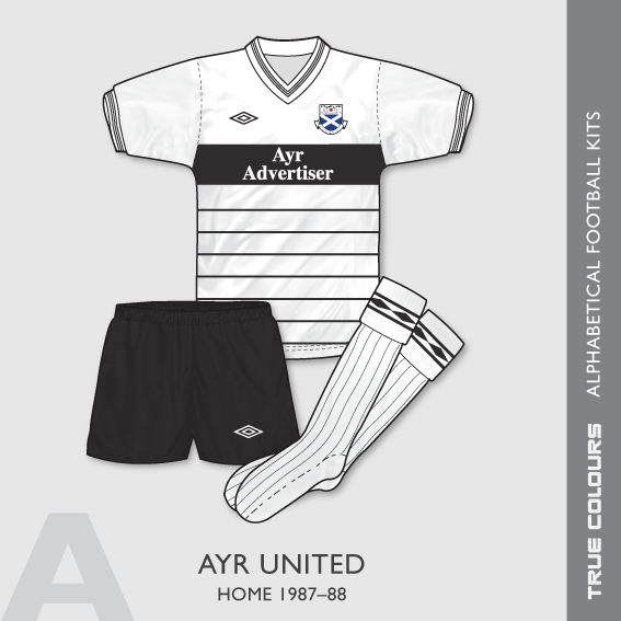
The final team in the 'A' section of my archive is Ayr United & I've selected their 1987–88 home kit.
The design is the wonderful Umbro 'Roma' template. I can't think of any other side who wore this design but if you know any any please comment!
#ayrunited#ayrunitedshirt
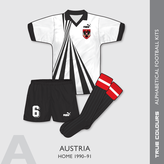
Austria home kit 1990-91 – a glorious ensemble that saw action in the 1990 World Cup Finals.
Like yesterday's Australia shirt, this one is also head of its time. Austria lost 1-0 in both Italia 90 matches in which this kit was worn.
#austria#austriakit#austriashirt#puma
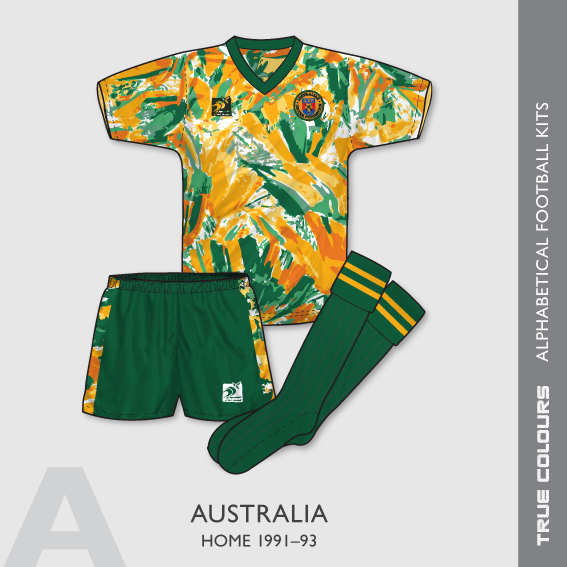
Australia home kit 1991-93.
A shirt, with its loud, abstracted pattern, that would not look out of place today. Produced by little known brand, KingRoo, the shirt appeared to go through variations in manufacturer logo colour & team crest.
#australiakit#australiashirt
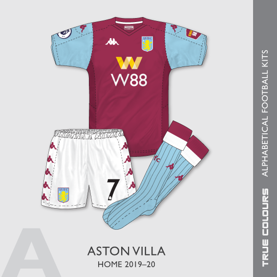
Aston Villa home kit 2019-20.
So difficult to choose just one Villa kit for this series. 1970s Umbro? 1980s Hummel? Or 1990s Reebok?
I went for this outfit in the end mainly because I really love Kappa kits.
#astonvilla#astonvillashirt#astonvillakit#footballshirt
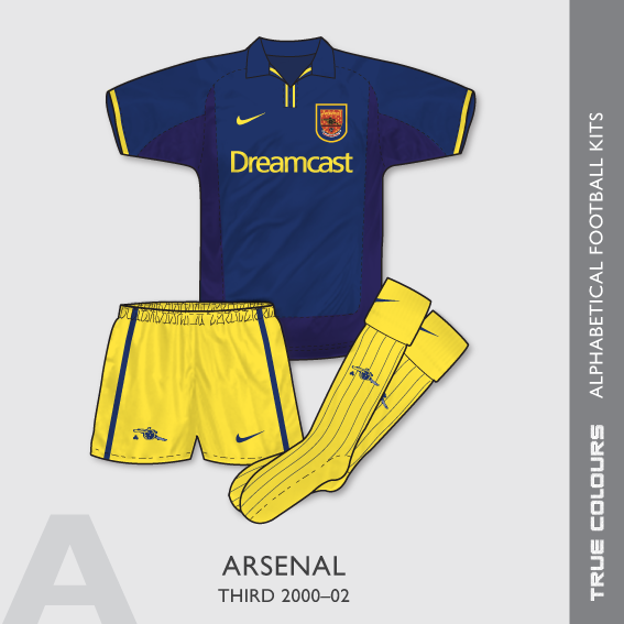
Arsenal third kit 2000-02. This classy Nike kit dates from the era where clubs began having 'European' strips. It was only used in the Champions League and saw three outings. It was also the first third shirt released as a replica by the club.
#nike#arsenalkit#arsenalshirt
@The_Kitsman Desperation on the part of clubs and kit manufacturers. But this will further crush creativity if there’s a need to create 4 kits - each with their own conceptual marketing nonsense - every season.
I’m totally against 4 kits.
@The_Kitsman I think it fails on 3 counts: it looks grey rather than white, the collar doesn’t make sense when they could have replicated the original one and the white out badge just looks like a splat.