14yrs ago, first test shoot for my film @JetSlade Rise of the Black Hood. I didn't own a dslr that could film video so a good friend lent me his for a few days. I now own the same camera & lens for nostalgic reasons which I still use today. "Where there's a will there's a way."
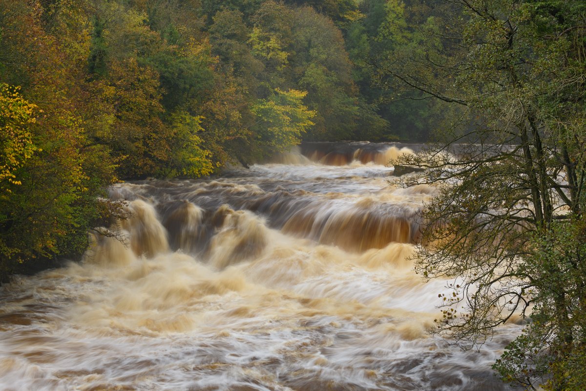
When it rains in the United Kingdom it rains, especially when you're in The Lakes, always be prepared and carry the right attire. ☔ 🌧️ #photography
"For some reason I can't stop thinking of 'Rambo: First Blood' when I look at these images" 😊
Rest In Peace D'Angelo, a true titan of soul. We are eternally grateful for his track "Unshaken" which will forever be an enduring part of the legacy of Red Dead Redemption 2.
'Original Extended Motion Picture Soundtrack' for @JetSlade ROTBH composed & produced by Yorkshire, UK based Creative Filmmaker & self taught musician @Edmahoo@EdmahooA
Available to order & download from the link below: 🔗👇
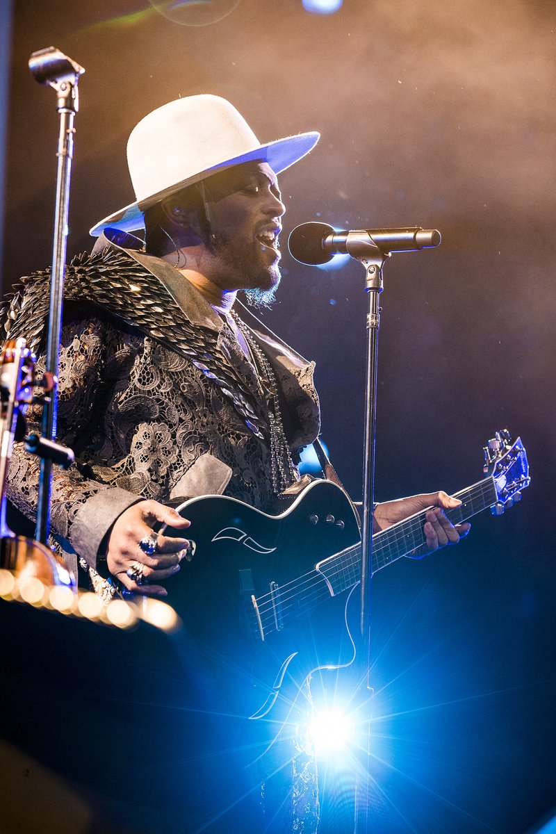
Photography by Edmahoo
https://t.co/Gq0xtfUzYi
Have you listened to the 'Original Extended Motion Picture Soundtrack' for my film Jet Slade: Rise of the Black Hood... It features 24 original soundtracks written and composed by me @EdmahooA
Photography and Artwork design also by @Edmahoo
Link 🖇️ in retweet 👇
This is not the Woman of the Day post but if it was, Margaret Calvert, born in 1936 in South Africa, would be a contender. She is one of the least-known but most influential graphic designers in the UK. You don’t know of her work? Of course you do. It’s everywhere.
Road signs, railway signs, even used by the Army. Every time you see a motorway sign or a hazard sign, you’re looking at her work.
Before she was employed by head of UK road signs, Jock Kinnear, in 1957, towns and cities used a confusion of shapes, colours, symbols, lettering. Margaret’s mission: sort it out.
She came up with simple, easy-to-understand pictograms: a man digging for Men At Work; for ‘Farm Animals Ahead’, a cow named Patience from a farm near where she grew up. The previous sign for School Ahead depicted a grammar school boy in a cap leading a younger girl with a satchel across the road. Margaret flipped it around and put the girl in charge. Well, why not? The girl was based on her.
She simplified lettering on motorway and other road signs, limited information to essentials, and introduced the graphic device of a branched, pointed line to show a junction layout from the driver's point of view.
There was resistance from the old guard, of course - letters to The Times complaining about “these new signs as big as houses” and about the simple lettering - but legibility at speed was key. Margaret and Kinnear won their argument.
“The reason you design a new letter form for a specific purpose is because there isn't one available. We analysed them and there wasn't one easily understood at speed. They were all too fat, too condensed, too this, too that."
Margaret compared it to looking at a Rembrandt: “If you’re close up, it doesn’t make any sense, but it all comes together at the appropriate reading distance.”
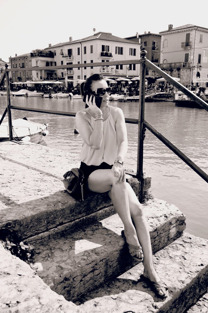
Can't believe it's the 1st of August already, time is surely whizzing by. This was such an amazing location to film, and although it was very hot, hot, hot 🔥 🌞 I enjoyed every moment... "It did make me sweat." 😅 🎬 🎥 📸
#italy#TheEssenceOf
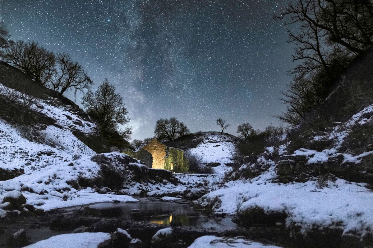
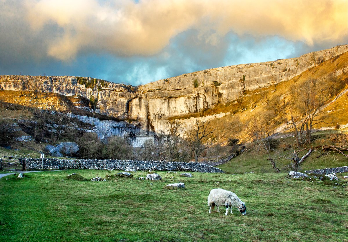
Ey up, it's #YorkshireDay! 🤩 We're celebrating by posting a few of our favourite pictures featuring some of the special qualities of the #YorkshireDales#NationalPark.
What's your favourite place in the #Dales?
📸 Wendy McDonnell, Kev Lockwood and Paul Clark