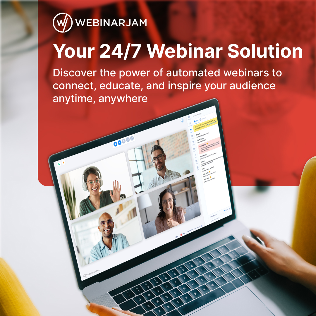
Connect, educate, and inspire your audience with the power of automated webinars, anytime and anywhere. 🚀
Discover how effortless and impactful your webinars can be. Your message, now limitless!
👉 https://t.co/Swb9PawZM4
Stop guessing what your audience wants. Start asking.
Studies show that 20 to 50% of registrants fill out a webinar registration survey. That is your audience telling you exactly what they need before you even go live.
Ask first. Present second. Convert always.
The most important slide in your webinar is not the offer slide. It is the one people screenshot. Design one slide simple enough to save and share, and it will do more selling than any pitch ever will.
Most webinars do not need a bigger idea.
They need a clearer opener.
Start with one real moment from the last 7 days.
Then run it through:
Moment
Reaction
Decision
Shift
That gives people a scene to follow before you teach the lesson.
Open your registration page. Stare for 5 seconds. Close it. Could you tell what it was about and where to click? If not, that's why people are leaving. Your offer is fine. Fix the page.
Most thank-you pages are dead ends.
Someone just registered. Attention is high. Then they hit a blank confirmation page and leave.
Fix: use it to confirm, direct, and excite. One coach added a welcome video and booked 6 consults in 2 days.
You can't be available 24/7. Your webinar can be.
Record your best pitch once, set it to evergreen, and stop losing leads just because they found you at the wrong time.
That's what always-on looks like without the burnout.
Making your webinar shorter might be killing your sales.
Because the real issue is not length.
It is pacing.
A 60 minute webinar with no interaction feels endless.
Want help drafting a better webinar?
Comment Script and we’ll send you the tool.
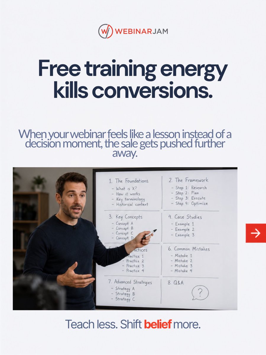
Low attendance starts before registration. People show up to stop losing, not to learn. When your webinar feels like a lesson, the sale gets pushed away. Teach less. Shift belief more.
More content will not save your sales. Posting more only sends more people into a message that still does not make action feel necessary. Fix the message first. Then scale.
"Free training for coaches" gets scrolled past. "How to sign 3 clients from one 60-minute webinar" gets clicks. Same event. One of these fills the room.
"Free" used to signal opportunity. Now it signals low value. Your audience has ignored 10 free things already today. Yours is next unless you change the hook.
Most landing pages fail before anyone reads the offer.
People need to feel safe fast. Trust signals are not optional, they are the conversion.
Add at least 2 credibility markers: logos, testimonials, a guarantee. One split test showed this doubled trust ratings.
Start there.
What does your webinar title actually promise?
If the answer is to learn something, you are attracting curious people. If the answer is to solve a specific problem, you are attracting buyers.
Tiny shift. Massive difference in who shows up.
The fix isn't a better slide deck. Fix the page. Fix the reminders. Fix the offer timing. Those 3 things will do more than any delivery tweak ever will.
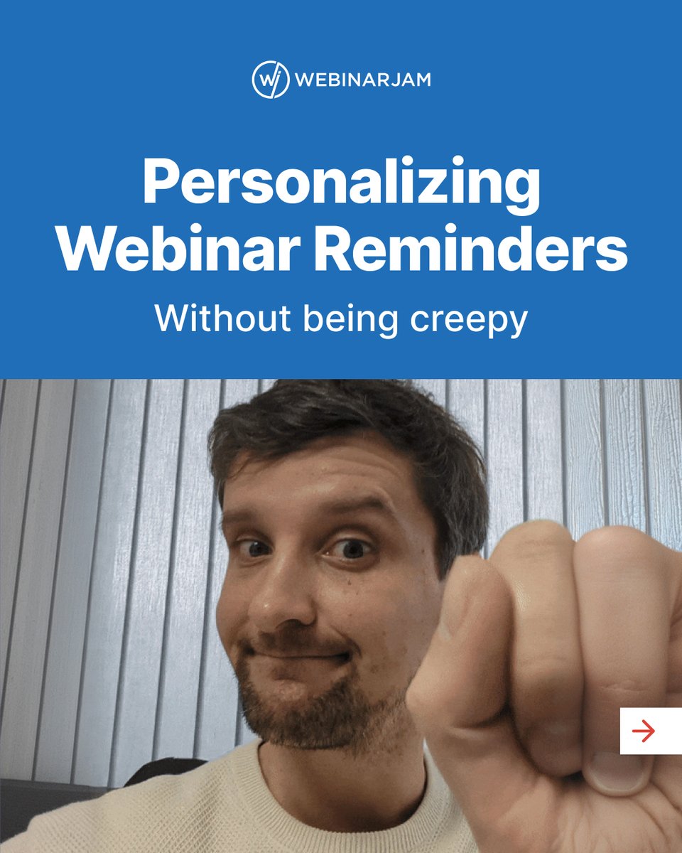
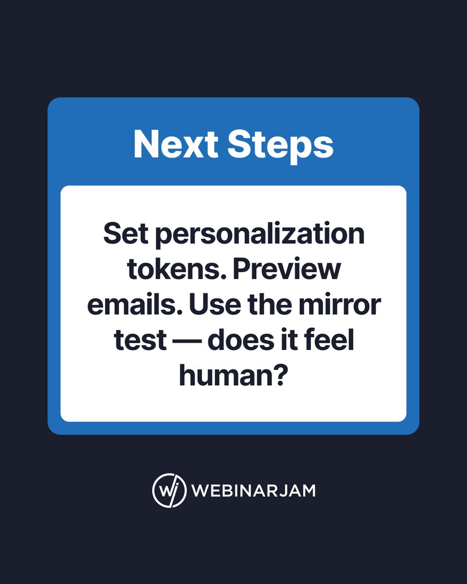
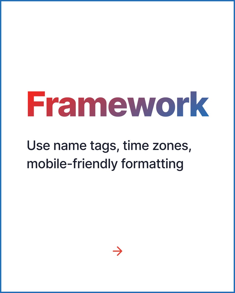
Generic reminder emails get ignored. Personalized ones get a 47% open rate.
First name. Right time zone. Mobile-friendly format. That's the whole framework.
Does your reminder feel human? It should.