Under the trend of global de-dollarization, Argentina plans to abandon the US dollar and use RMB to pay for China's imports. The move will allow Argentina to "settle imports worth more than $1 billion in yuan starting next month"
The U.S. dollar (USD) is divided into two camps this week. On the one hand, traders appreciated the dollar as the situation in the Middle East became uncertain. On the other hand, local macroeconomic data is beginning to lose its luster and suggests that the United States may be starting to slip into recession. Either way, the dollar is trading in a tight range and heading lower for the third day in a row as tracked by the U.S. Dollar Index (DXY).
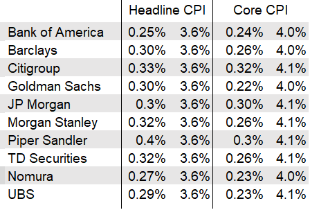
Wall Street forecasters expect the September CPI to show the headline index rose 0.3% from August, lowering the 12-month rate to 3.6% from 3.7%
They see core CPI up 0.3%, lowering the 12-month rate to 4.1% from 4.3%
It’s not that I chose to be single, it’s that I chose to be single. I’d rather be alone than settle for nothing. I believe in this saying: What’s more lonely than being alone is being with the wrong person.
Don't complain to others when you have nothing to do. There are very few people in this world who can empathize with you. Most people will be bored by hearing it, and a small number of people will publicize it everywhere as a laughing stock.
What gets lost with some of my charts is the magnitude of just how many more people are buying a Tesla every year. "It's right there on the chart, James, how could we miss it?"... I hear you asking.
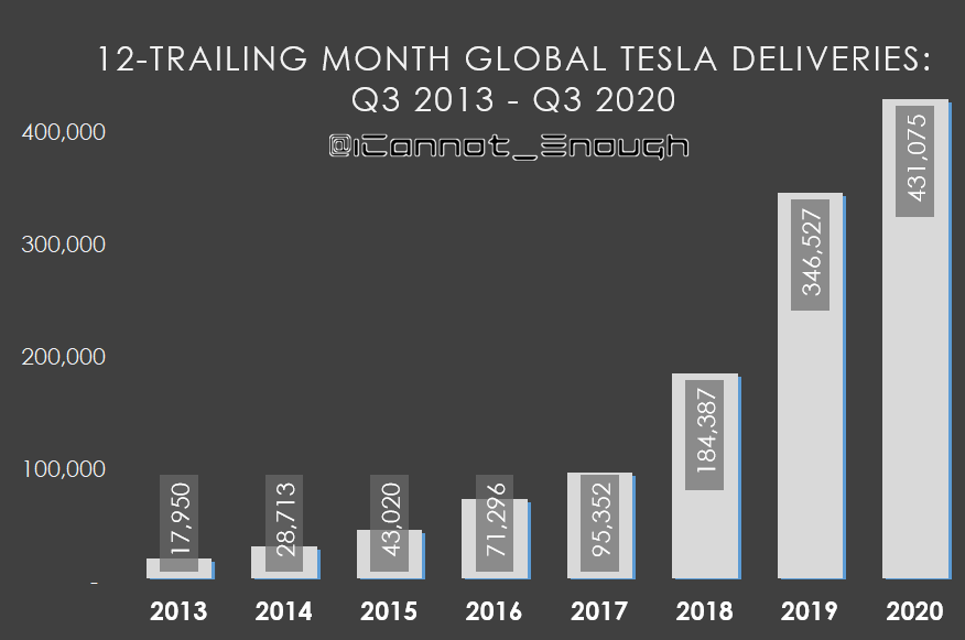
Well, to illustrate what I mean, here's a chart I could have posted 3 years ago yesterday:
Impressive growth, right? Yes. But that's how they all look, with very short bars for the oldest time periods. After a while, the latest updates to these charts begin to visually look the same... because every time the chart is updated, the latest record high reduces the heights of all the bars that came before: the relative magnitude never looks any more impressive, at a glance, than it did the year before.
Without a good frame of reference, it's hard to appreciate how much more Tesla is beating their previous records by.
I'll give just one example: over the past 12 months, $TSLA has increased unit sales year-over-year by >500,000 vehicles. That's more than the tallest bar shown on the chart above.
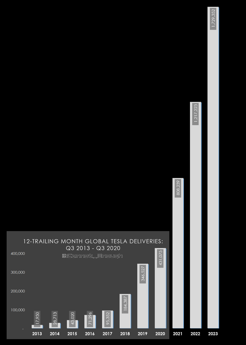
But what if you had printed out that 2020 chart on a piece of paper 3 years ago and decided to update it today?
How could you update your hard copy- with its unshrinkable scale- for the 3 most recent years of data? 🤔
Could you just lay another blank piece of paper next to it and draw the new bars in? No, Tesla has grown too much. They would be literally off-the-chart.
Well, what if you stood that piece of paper up vertically (instead of landscape)? Would they fit then? No.
So... how many pieces of paper would we have to tape together for the 3 most recent bars to fit? 🤓
Are you ready to see the chart above updated? You are not ready. 🚀
Parents' love is selfless and inspires each of us who are wandering abroad. Come on, I wish everyone who is wandering abroad will get the results they want.
Probably one of the best photos ever taken of lightning from the ground to the clouds.
This amazing display of power was captured at Burleigh Heads. September 25, 2023 From the ground? 🤔