Stiff Little Fingers - Nobody's Heroes, 1980 (cover designed by Geoffrey Halpin).
Ahead of its time in using stretched type, barcode reference, and 1337speak.
Our friend @Yotam designed this newsprint specimen of Community Gothic for Typographics. “A Bed of Eels” uses collective nouns to showcase this family of fonts, & includes @domesticetch ’s essay about the design. Extra copies available in our shop: https://t.co/G0tOedkah6
This is the story of Differential Expansion. 4 years ago, work started on anish kapoor’s 85 ton bean which is tucked under herzog de meuron’s 56 Leonard st. Last summer, though, the bean ruptured because the exposed side of bean expanded more in the hot sun than
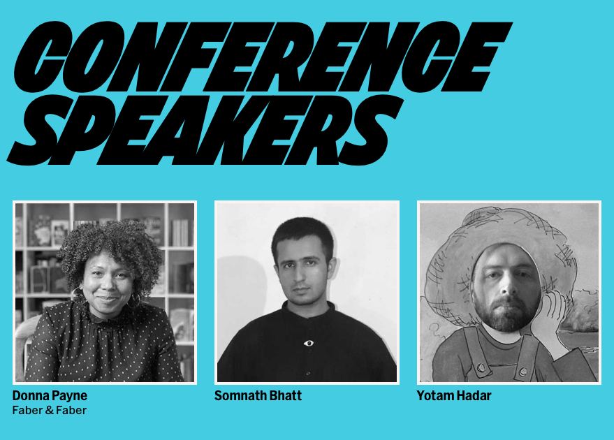
The newest batch of speakers for the this year’s Typographics conference were just posted:
https://t.co/G2Gw9bKhAa
It’s a pleasure to now have @Yotam, @sad_folder, and @SaysDonna onboard.
🎟 Discounted early bird tickets are still available until the full line-up is announced.
@blancpain There are obviously infinite options and depends on region, usage etc, but some good ones to look for are Harissa, Pilpelchuma, Shatta, and of course schug/zhuk. Hard to find good ones in NY; Kalustyan’s is ok, but otherwise don’t bother buying one if you can read the label.