Consulting-level slides, mimicking the McKinsey-style layout.
I used kimi slide's adaptive mode to create them (coding version, not image gen version) .All the content was powered by K2's coding capabilities, fully editable.
My prompt:
Analyze Global EV market opportunities.
Requirement:
A professional, high-density consulting presentation slide, designed in the style of a top-tier strategy firm (McKinsey/BCG) blended with high-end editorial aesthetics.
Core Content & Layout:
1. Rich Data Visualization: The slide is populated with complex, precise charts (stacked bar charts, waterfall charts, or line graphs) and detailed data tables with rows and columns.
2. Structured Frameworks: Includes strategic diagrams or 2x2 matrices constructed with thin, clean lines.
3. High Information Density: The layout is sophisticated and multi-column, mimicking an actual business analysis deck, not just an empty cover page.
Visual Style:
1. Aesthetic: Tech-minimalist but information-heavy. Clean, sharp, and authoritative.
2. Typography: Serif fonts (like Times New Roman) for the main headlines to give a premium financial report feel; clean Sans-serif for chart labels and data numbers.
3. Color Palette: Clean white background. Text is sharp black. Charts and graphical accents use Deep Royal Blue and distinct shades of grey for data hierarchy.
4. Graphics: Use fine hairline borders for tables and precise vector lines for graphs.
Just a little tip for the younger "engineers" out there: When a conversation like this is brought to you by the CEO, they are not really looking for the "correct answer" from you.
It's not a school test. They need to talk to someone!
They are about to make a difficult decision, and - being human beings - they actually need to talk things through. And get a little pushback!
These CEOs got balls like you wouldn't believe. You don't need to be careful with them. Call them on their bs - they'll totally get intrigued and seek out your consulting them.
What makes the whole thing worthless is if you try to mirror what you think is their opinion.
If you at least don't mirror but you've got no clue, and no calling out, then all you are good for is being a mirror. They will not seek you out.
The best sounding board for CEOs is like this:
1. Accepts their authority.
2. Doesn't lick boots.
3. Notifies them of actual nonsense, insanity or inappropriateness. High performers sometimes get carried away in mania, and they want to know that.
4. Fuel their mania 😈! They want the mania, but they need to stop just short of the cliff of insanity.
5. Celebrate what's going on, if it's worthy. They depend on some form of aggregate social feedback. They are CEOs - they can just push through any individual resistance, but they need the aggregate form.
6. Has got a clue - that's great and valuable. But note that I did not put it first. Being CEO, they are "Rome" and all ways in the company lead to them. They know what they are doing, and have a clue already.
7. Ask back! Probe their views a bit. That's why they came to you in the first place.
This should be a pretty good list. Did I miss anything? Chime in, leaders! What do you need in *them*?
What is happening in China?
Just days ago, China announced MASSIVE economic stimulus as their economy crashed.
Now, retail investors are piling into stocks like pandemic-era stimulus is back.
Something is seriously wrong in China and it's too late for stimulus.
(a thread)
UI/UX Designers, here's a go-to tool for generating UI colour palettes.
Radix colour is an online colour tool for a purpose-driven colour scale. Customise hues for borders, backgrounds, text, and more.
Bookmark it for later 💜 you'll love it
Website → https://t.co/uwunUzwMBx
UI/UX Designers, here are the best design resources you should know as a designer.
Bookmark it for later 💜
Logos → https://t.co/Qv94AOMRyn
3dicons → https://t.co/6qAip6YQpp
Inspiration → https://t.co/351d8XBoSd
Fonts → https://t.co/Lm9wuGZcCf
Gradients → https://t.co/DPY9dGscxJ
Illustrations → https://t.co/glMYsOa2rX
Minimal design → https://t.co/Hp6PuVihna
App store design → https://t.co/GLa3SC1KOy
Apple bentos → https://t.co/7lbbywsFGm
UI/UX Designers, I recently found a new character builder that will help you to create illustrations and characters within a few minutes. It's incredible with over 3000 editable illustrations combined. You can try it out for your next UI design project.
Bookmark it for later 💜
Website → https://t.co/a2AkGsjh18
FOMC holds steady
There's a thin median for three rate cuts in 2024
The core PCE inflation forecast for 2024 was revised up to 2.6% from 2.4% in December
The GDP forecast for 2024 was revised up to 2.1% from 1.4% in December
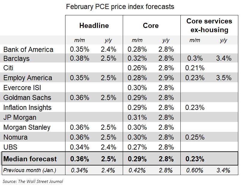
The Feb core PCE index probably rose 0.3%, according to the forecasters who translate the CPI and PPI into the PCE
*PPI revisions may lift January's reported 0.42% by a few bps
*That'd put the 12-month rate at 2.8% and bump the 6-month annualized rate to 2.9% or 3% (from 2.5%)
It’s interesting to see CPI and other inflation metrics rise, but PCE continues to fall.
If the Fed can get Core PCE inflation to 2.0% this year, it would be a huge win.
Can we see a soft landing in 2024?
Follow us @KobeissiLetter for real time analysis as this develops.
Regardless of whether you agree with JP Morgan’s assessment or not here, the fact that they’re describing Bitcoin as a commodity with an energy backed production cost is great to see.
We’ve come a long way from “Bitcoin is backed by nothing”