These days, AI doesn't just merely assist; it amplifies storytelling.
Combining skills with AI can help produce dynamic, emotionally resonant, & deeply personal content.
Here, I used visual metaphors to show the values @koshmoney is bringing to finance: control and clarity.
A number of Creatives end up missing out on gigs and jobs, sometimes, because they lack a good portfolio.
Not because they're not good, but they don't really have strong POWs.
This happens most of the time when working under NDAs, or taking up gigs that are not very "challenging", so they're unable to flex their creative muscles on projects that highlight their strengths.
The solution to this is taking up passion/personal projects, collaborating with brands and other Creatives, and volunteering their skills.
These will help rack up good projects for their portfolio.
Why is this so?
Because one gets to choose the kind of projects one takes on, the direction the project takes, and the aspects of one's work it highlights.
If you got some light from this, ensure to share with a creative 💚
On Sunday night, I hosted over 100 Designers and Creatives for a conversation around the Business of Design.
With my co-host, @thedrkish_, and four experienced speakers who shared their personal journeys and insights, we made sure everyone walked away with clarity, direction, and practical steps they could apply.
We covered topics like onboarding flows and brand strategy, with examples and honest conversations.
I’d like to publicly appreciate our amazing speakers:
@Marcel__vx@TheXEffect_
Kranium
@mandydesignsng
Thank you for not just showing up, but for generously pouring into everyone who attended.
Your insights are already changing how many Designers and Creatives are beginning to see and approach design encouraging a more structured and intentional approach to design.
To everyone who attended, thank you.
Thank you for listening with rapt attention, asking thoughtful questions, and staying engaged till the very end.
Special thanks to @Pluto_UI for handling the event recording and scheduling. Your support is truly appreciated.
And finally, to my co-host, @thedrkish_ thank you for your time, insights, and commitment to planning and executing this tête-à-tête. It wouldn’t have flowed the way it did without you.
Till the next edition...keep implementing 💚⚡
If you haven’t already, drop a follow and turn on post notifications. More learning and growth-focused content is on the way.
Drops of water make the mighty ocean.
Here's a glance at some of the amazing pieces I worked on in 2025.
Just a select few to highlight.
Among the many corporate and personal brands, projects, institutions, and establishments I was opportuned to work with.
Others which weren't featured here will be rolled out eventually through the year.
2025 was a great year, but this new year is even greater.
Happy new year once again 💚
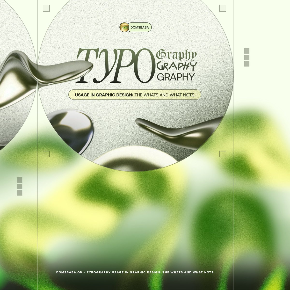
Typography in Graphic Design: The Dos and Don’ts - DomsBaba’s Perspective.
You work on a banger design, but there’s something off with the text, or you can’t just settle for the right font.
This is a solution bank tackling common issues faced by a number of Graphic Designers.
Let’s talk about the typography issues that quietly ruin good design,
The ones that show up in flyers, posters, and digital graphics every day.
Here is how to fix them, practically and instantly.
1 ➞ When Everything Needs to “Pop”
Your client wants everything to stand out: the business name, event date, offer, website, socials.
But when everything shouts, nothing gets heard.
➭ The fix: Ask yourself what someone would notice in two seconds while scrolling or walking by.
That’s your main hierarchy.
Everything else supports it.
Use size, weight, and position deliberately, not desperately.
2 ➞ Line Breaks That Kill Readability
Splitting text like “March 15 / 2024” or “Smith & / Associates” instantly breaks flow.
➭ The fix: Keep related information together (Dates, names, prices), never split them.
Use non-breaking spaces and read your headlines aloud.
Where you naturally pause, that’s usually where the break should go, meaning before aesthetics.
3 ➞ The Weight Wars
Bold everything: nothing stands out.
Light everything: nothing holds presence.
➭ The fix: Stick to three weights max.
» Regular for body text.
» Medium for secondary emphasis.
» Bold for primary emphasis.
Decide what deserves bold.
In a restaurant flyer: the price and phone number.
In an event poster: the headliner and date, that’s it.
Right now, @solana is one of the fastest blockchains.
But with more apps, games, and AI tools, the demand for faster and cheaper transactions is growing.
@solayer_labs's InfiniSVM is here to scale and supercharge @solana.
Let’s break down what this means and how it works ▼
The Aliens and Toxic will have their own Story, all of which can be read on their new Website.🙏
The Website is currently under construction, and it's going to be Amazing—you'll see.🔥
When we talk about minimalism in design, it’s not about taking things away, it is about focusing on what truly matters.
When you strip away the noise, what remains speaks louder.
It drives the message home effortlessly (just like how I effortlessly pulled this design together).
Minimalism also helps memory.
Because when there is less to see, there is more to remember.
Focus, right?
For Yellow, every element earns its place.
↠The gradient adds depth without distraction.
↠The 3D folder with layered files makes digital storage and file extension services feel tangible.
↠The light rays bridge the digital and onchain experience.
↠The typography breathes with enough space to fit two pairs of palazzo trousers.
↠And the brand yellow appears twice in the logo and the value prop for instant recognition.
One message, Zero clutter, Maximum impact.
This is a reminder that good design doesn’t scream, it speaks clearly.
When everything on the canvas serves one purpose, you don’t need ten elements fighting for attention.
The message stands on its own, crisp and confident.
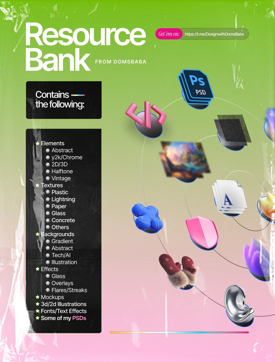
At times, we struggle to create banger designs because we lack quality resources to use, even after the advent of generative AI.
I've put together quality, uncommon resources which I've been using so far in my design journey, so you can worry less.
Link in the comments. Repost massively for other Designers to see.
Most founders burn thousands on marketing…
Only to lose 76% of users after first use.
Not because their ads don’t work.
Because their onboarding design is flawed.
Marketing gets people to your door.
Design decides whether they walk in or run away.
Here’s why design beats marketing in the onboarding race:
◈ Builds instant trust (users judge in 0.05s)
◈ Guides behavior step-by-step to value
◈ Eliminates friction before users even notice it
◈ Scales without breaking your support team.
The numbers don’t lie:
» 50–200% higher activation
» 25–40% better retention
» 30–60% fewer support tickets
» 75% higher trial-to-paid conversions.
This isn’t about “making things pretty.”
It’s about building profitable, sustainable businesses.
➭ Marketing brings users in.
➭ Design makes them stay.
Look at MetaMask as proof.
They transformed the most complex crypto wallet setup process into simple, guided steps and now have 30M+ monthly users with 55% growth in just 4 months.
In the most technical industry imaginable, design won the adoption race.
If they can do it with blockchain complexity, your project/product has zero excuses.
The magic happens when design amplifies your marketing efforts.
Great onboarding design makes your marketing promises:
◈ Actually deliverable
◈ Generate better user behavioral data for precise targeting
◈ Increase viral referrals organically as happy users share their experience.
◈ Improve customer acquisition cost efficiency by 30-50%.
Every marketing dollar you spend gets multiplied when users actually succeed with your product.