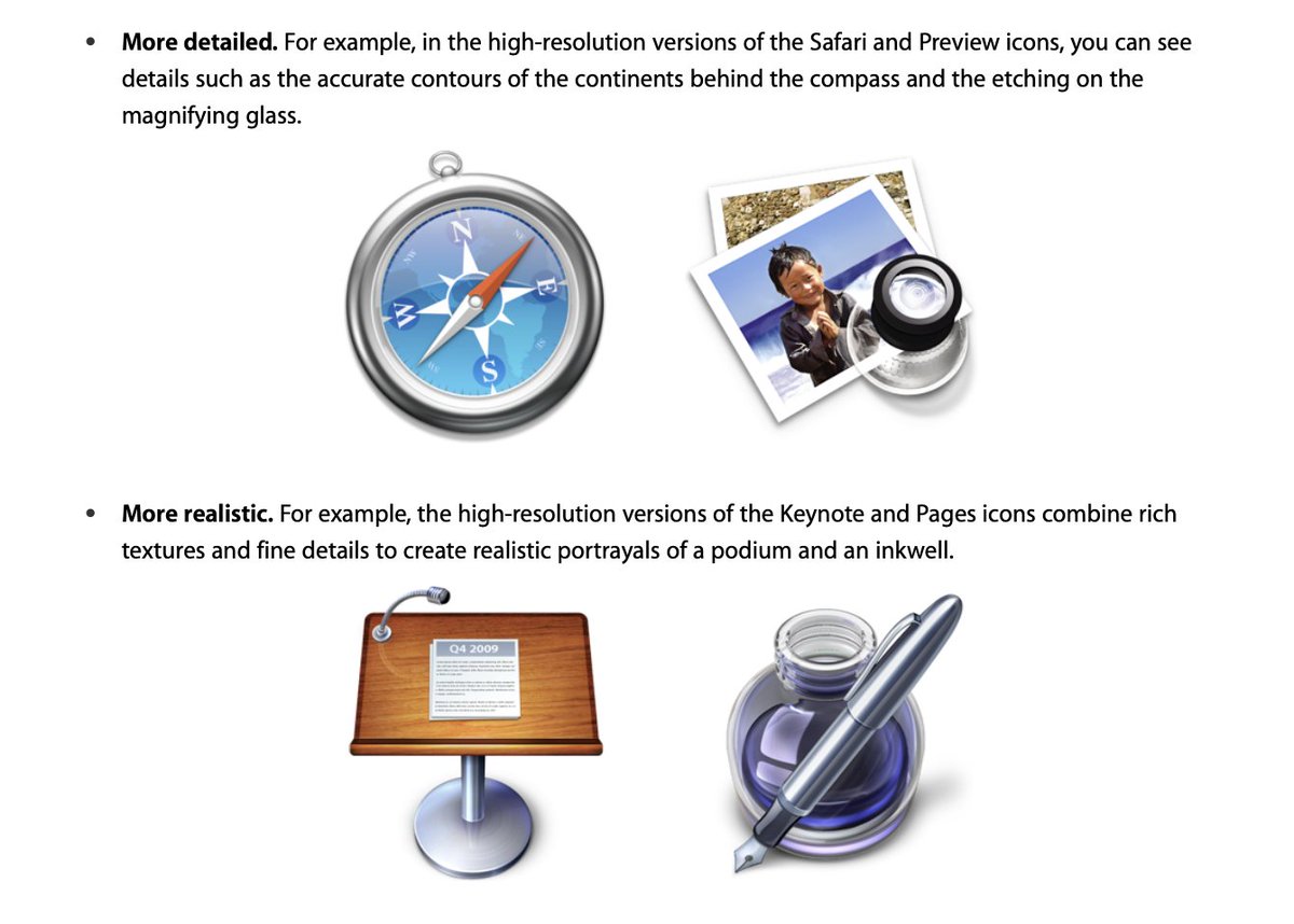
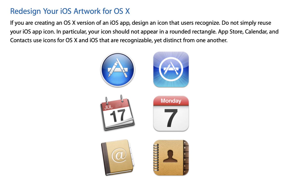
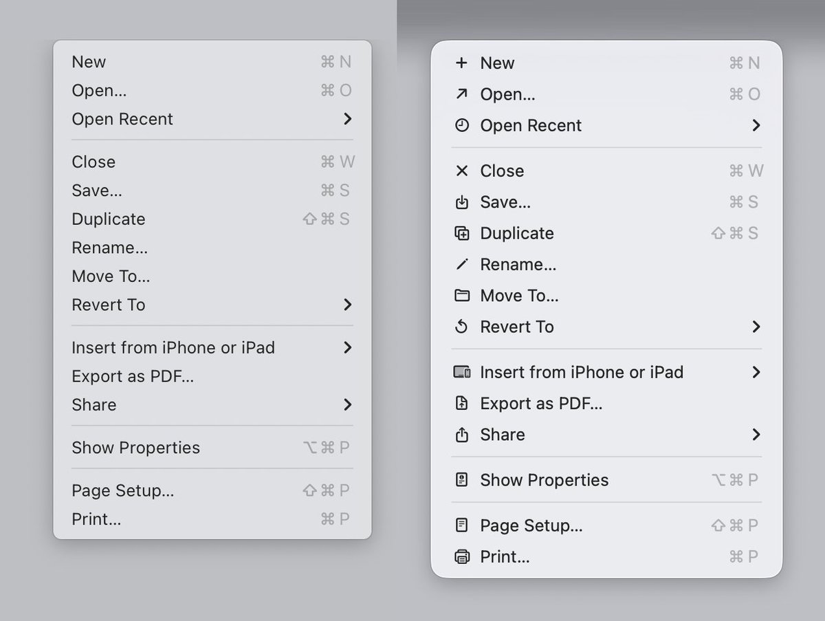
Now that I'm on Tahoe and every menu has 60 gazillion icons in it, I'm reminded of this banger article.
Modern Apple, put plainly, is all form over function. And the form doesn't even look good.
https://t.co/4d5oaOtJ4g
Sometimes I'll go on Wikimedia Commons and look at random categories for 2000s era image icons and it makes me want to weep how beautiful and optimistic design used to be. How much effort and love kicked to the wayside. What're we doing with all the flat dark slop now?