The real solution is making the right path easier for what the user is actually trying to do.
Before deciding, ask: What are we offering? Who are we serving? What are they trying to accomplish?
Context is everything.
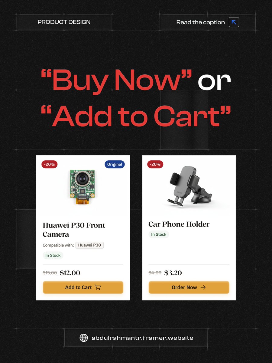
"Order Now" or "Add to Cart": when do we use which on a product page/card?
Obviously, we use "Order Now" to cut steps and get users to checkout faster.
But do fewer steps always mean a better experience?
Say you run a store selling phone parts and accessories: (thread👇)
They can keep browsing without their journey getting cut short after every single item.
In product design, simplicity isn't always about fewer steps, and fewer steps isn't always the answer.
Website design for Road Signs and Public Lighting company🚦
The goal was to make the website reflect the company's reputation and experience of +28 years.
Website design for Road Signs and Public Lighting company🚦
The goal was to make the website reflect the company's reputation and experience of +28 years.