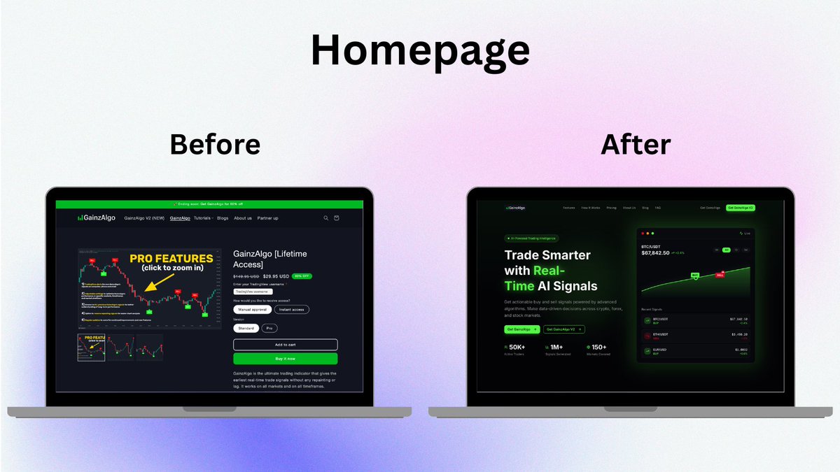
Redesigned the GainzAlgo homepage and here is the difference 👇
The goal was simple, make the product clearer, more trustworthy, and easier to convert users within seconds
Before vs After breakdown
@gainzalgo
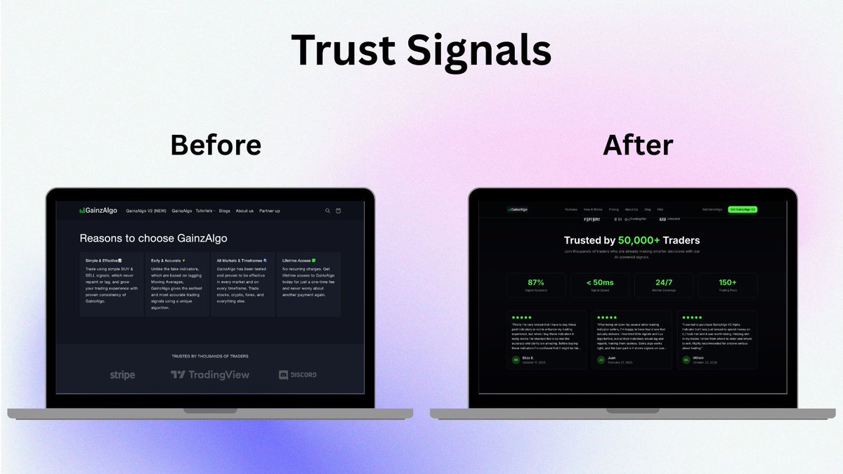
Redesigned the GainzAlgo homepage and here is the difference 👇
The goal was simple, make the product clearer, more trustworthy, and easier to convert users within seconds
Before vs After breakdown
@gainzalgo
Redesigned the GainzAlgo homepage and here is the difference 👇
The goal was simple, make the product clearer, more trustworthy, and easier to convert users within seconds
Before vs After breakdown
@gainzalgo
Redesigned the GainzAlgo homepage and here is the difference 👇
The goal was simple, make the product clearer, more trustworthy, and easier to convert users within seconds
Before vs After breakdown
@gainzalgo
Redesigned the GainzAlgo homepage and here is the difference 👇
The goal was simple, make the product clearer, more trustworthy, and easier to convert users within seconds
Before vs After breakdown
@gainzalgo
Trust is not built at transaction success. It's built at transaction failure. The best fintech products in the world are not the ones that never fail. They are the ones that make recovery feel effortless.
What's the worst post-failure UX you've experienced in a fintech app? 👇
OPay has 5 million daily users. But when a transfer fails, the product completely falls apart.
I spent time studying OPay's failed transaction experience, not as a frustrated user, but as a product person. Here's what I found. The real problem isn't the failure.
03. One-tap retry or escalate After reversal, drop users back to a pre-filled retry screen. Don't make them rebuild the transaction from scratch. Friction at recovery = permanent churn.