Joseph Juran coined the term "Pareto Chart" in the late 30's, from the work of Vilfredo Pareto. Aimi (https://t.co/6bHuhIhFJh) uses the "less ink, more information" approach. The Lorenz Curve is hidden but can easily be displayed.
#dataanalytics#sixsigma#QI@TheIHI@NSWCEC
There are various types of associations between parameters that can be shown by the scatterplot graph in Aimi (https://t.co/NEMHzh8RUM). The relationship can be positive or negative, weak to strong, linear or non-linear.
#dataanalytics#qualityimprovement@TheIHI@NSWCEC
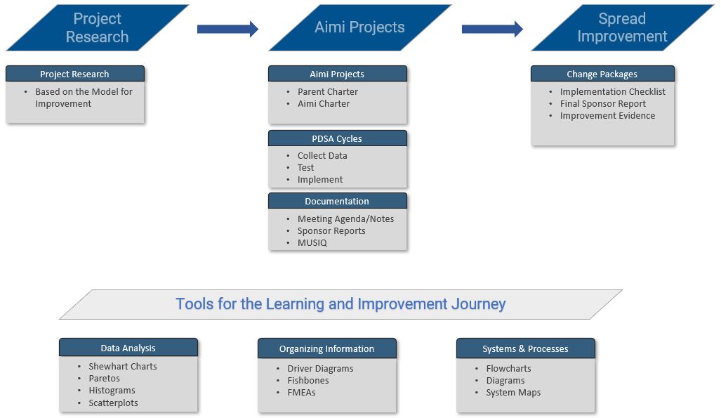
When it comes to #healthcare quality improvements, spread doesn’t happen automatically; tested strategies are needed to spread the improvements. That's where Aimi (https://t.co/6bHuhIhFJh) steps in to guide you.
https://t.co/mEHJsjajrO #QI#spread@TheIHI@NSWHealth@NSWCEC
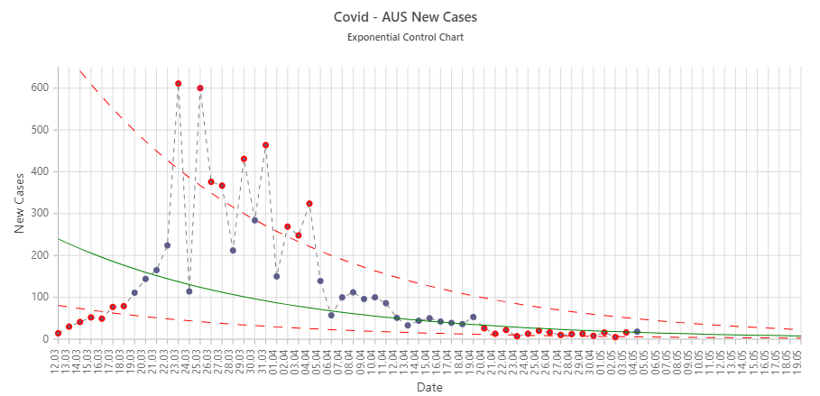
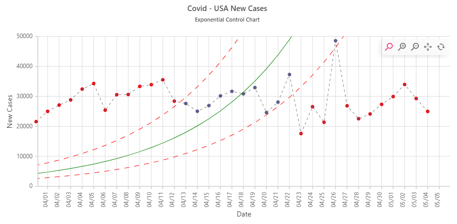
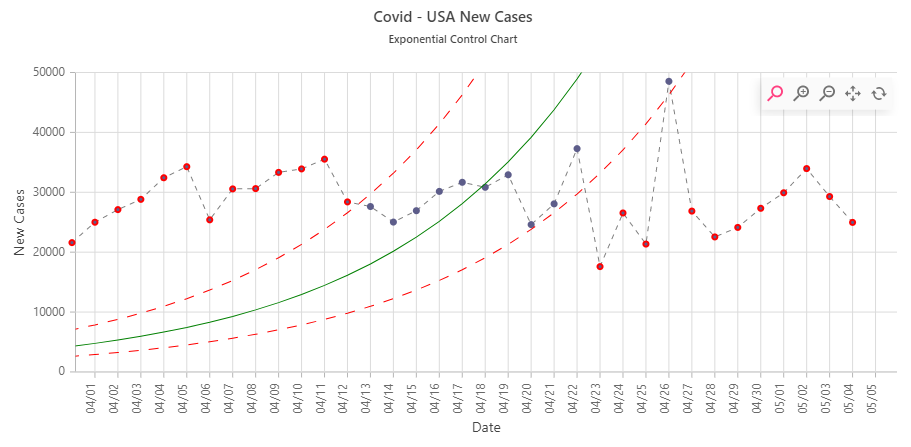
Analyse #COVIDー19 data with Aimi (https://t.co/6bHuhIhFJh) where you can access Exponential Control Charts to gain insights into the trajectory of the pandemic, and accelerate improvements using the Model for Improvement. #healthcaretalksCOVID@healthgovau@NSWHealth@VicHealth
@TheIHI@donberwick @derekfeeleyIHI You can analyse #COVID19 data using Aimi (https://t.co/6bHuhIhFJh) where you can access Exponential Control Charts, and accelerate improvements using the Model for Improvement. #healthcaretalksCOVID