Continuing my UBA onboarding UX audit.
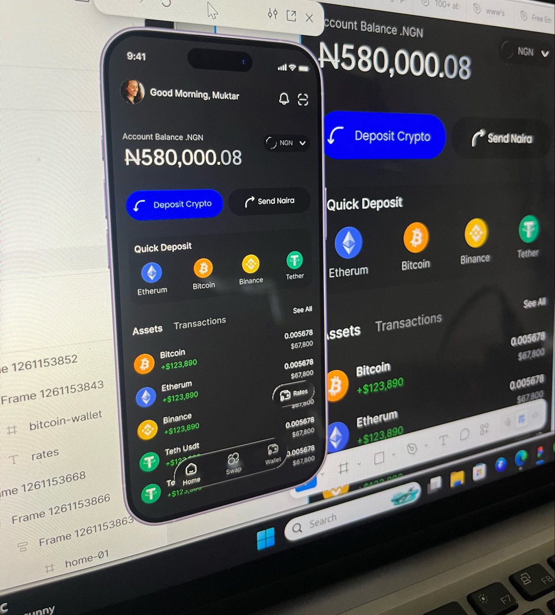
Here’s the landing page redesign.
Replaced “Register” with clearer options and made “Open an Account” more visible.
Now users can quickly understand what to do and get started without confusion.
Still refining this idea
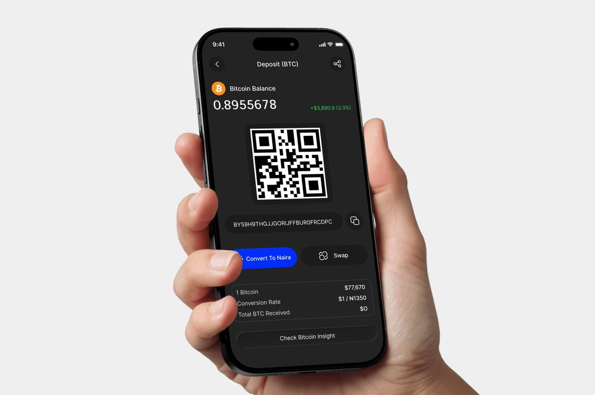
It’s not just about converting crypto
It’s the full flow
Receive → see balance → convert → send to bank
Working on clearer receive and wallet screens to remove confusion
Debated putting “Convert” on the Home Screen, since it’s the core action
Ended up moving it into the wallet
Why? You can’t convert what isn’t there
Users need to receive crypto first, then convert
Tools can guide, but real decisions come from understanding user flow
Still refining this idea
It’s not just about converting crypto
It’s the full flow
Receive → see balance → convert → send to bank
Working on clearer receive and wallet screens to remove confusion
Still refining this idea
It’s not just about converting crypto
It’s the full flow
Receive → see balance → convert → send to bank
Working on clearer receive and wallet screens to remove confusion
Random guy asked for my BTC rate
Meanwhile I’m not even a vendor 😂 but I was broke so I said yes.
Opened a few apps and got confused.
All I wanted was to receive the crypto, see the rate, convert to naira and send to my bank fast😂
No stress
Couldnt find that
So I designed it
Building something because you personally couldn't find a tool that worked is the strongest product origin story. You already understand the pain better than any market research could tell you.
Random guy asked for my BTC rate
Meanwhile I’m not even a vendor 😂 but I was broke so I said yes.
Opened a few apps and got confused.
All I wanted was to receive the crypto, see the rate, convert to naira and send to my bank fast😂
No stress
Couldnt find that
So I designed it