Someone posted "83 places to launch your startup."
I put a product through the real ones last week. About 60 are a waste of time: paid sites that look free, dead links, etc.
Here are the ~20 worth it. Number in brackets = Domain Rating, dofollow flagged by section.
THE BIG LAUNCH DAY (real traffic, but nofollow links, so pick the date)
→ Product Hunt (91)
→ Hacker News / Show HN (91)
SEO LEVERS MOST LISTS SKIP (dofollow; republish one post with a canonical tag; one G2 form also does the next three)
→ Medium (94)
→ DEV Community (91)
→ Hashnode (91)
→ G2 (91)
→ Capterra (91)
→ GetApp (85)
→ Software Advice (87)
FREE + DOFOLLOW (add their badge to your footer, they link back)
→ Fazier (83)
→ Turbo0 (80)
→ SimilarLabs (69)
→ Huzzler (64)
→ EasyLaunch (57)
FREE, WORTH TWO MINUTES (last three are nofollow profiles, still real)
→ SaaSHub (80)
→ AlternativeTo (80)
→ Uneed (75)
→ StartupBase (73)
→ PitchWall (68)
→ aitools·inc (67)
→ Gravatar (97)
→ about·me (90)
→ WIP (56)
SKIPPED, free listing but the link or launch is paywalled
✗ BetaList (76)
✗ Dev Hunt (63)
✗ There's an AI for That (77)
✗ Futurepedia (72)
✗ Toolify (73)
✗ Future Tools (69)
✗ Microlaunch (64)
✗ Toolfolio (35)
✗ Open Launch (72)
✗ Findly (81)
The honest part nobody posts: directories barely send traffic. The best one sent me 7 visits in three months. They are for domain authority and AI citations, not clicks. Product Hunt aside, one good post here will out-traffic all of them combined.
Save it for your next launch. 👇
Castell in a default serif, gray on off-white, would vanish on a comparison page, a row of logos where most of the neighbors are some shade of blue.
I composed the second one in LogoRay: four red loops woven into a cross, a heavy sans for the name, and the same red on the button and the tote.
Your logo rarely appears alone. It shows up on review sites and customer walls next to everyone else in your category. Look at that row first, then pick the color nobody in it is using.
Repost if the after earned it.
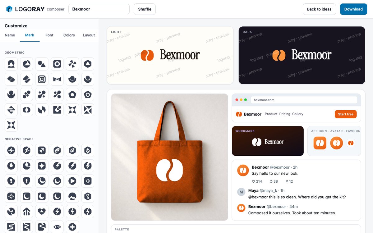
Bexmoor in a default serif, gray on off-white, has no mark, and a mark picked on its own merits often looks borrowed from another company once it sits beside the name.
I composed the second one in LogoRay: an orange oval split by one curve, a condensed serif for the name, and the two tall halves of the mark sitting next to the two tall narrow o's in the word.
That echo makes a mark and a name look like they were drawn together. Find one shape the letters already have, a round bowl or a sharp corner, and choose a mark that repeats it.
Repost if the after earned it.
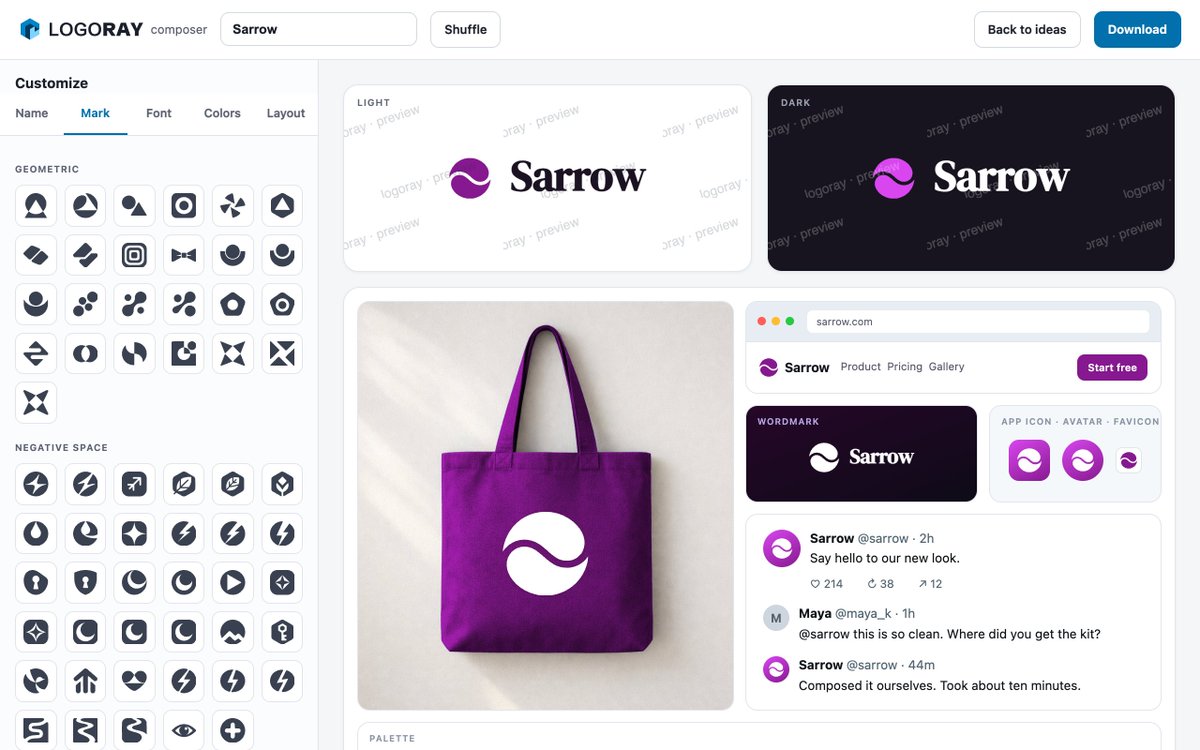
Sarrow in a default serif, gray on off-white, passes for body text. Squint at it and it blurs into the paragraph around it.
I composed the second one in LogoRay: a purple circle cut by one wave, a bold serif for the name, and the same circle on the avatar and the favicon.
Squint at that one and you still get a solid purple disc next to a dark word. Blur your eyes until the detail is gone. If what remains is one clear shape and one clear word, the lockup will hold up at a glance.
Repost if the after earned it.
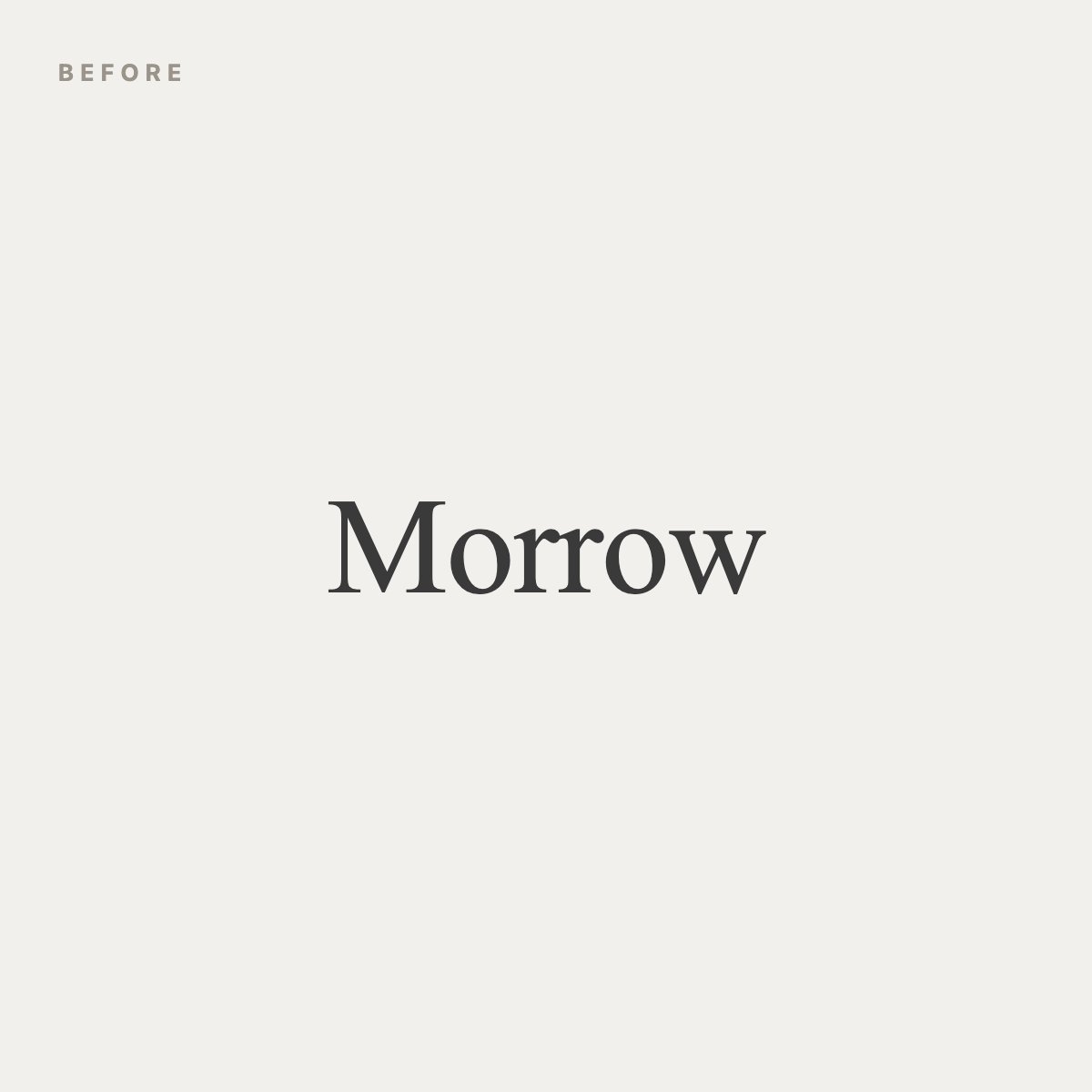
Morrow in a default serif, gray on off-white, depends on the page behind it. Put it on a photo or a colored banner and the letters start fighting the background.
I composed the second one in LogoRay: a white arch inside a green rounded square, a clean sans for the name, and the same square in the site header and on the app icon.
A mark that sits inside its own shape brings its background with it. It looks the same on white, on black and on a busy photo, because the edge of the container does the separating for you.
Repost if the after earned it.
🙃 The key is already worn smooth, and the keyboard shipped on Tuesday. Every .com above is available, checked live. Generate your own at https://t.co/tnxFpsKSiI.