Big if true.
ANTHROPIC to launch Claude Sonnet 5.5 and Claude Haiku 5.5 in the coming weeks.
ANTHROPIC says its model matches Claude Fable 5.1 on most tasks and has running costs about 40% lower than OPUS 5.
Roman Centurion and American Captain. Two Thousand Years of Pay Measured in Gold
In 2024, Duke University finance professor Campbell Harvey pointed out an unusual coincidence.
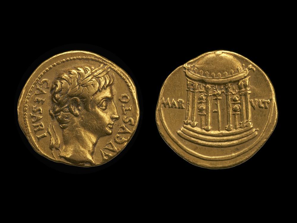
Nearly two thousand years ago, according to a reconstruction he developed with Claude Erb, an ordinary Roman centurion under Augustus earned the equivalent of about 38.58 troy ounces of gold a year.
At the gold price prevailing when Harvey revisited the calculation, those ounces were worth roughly $86,300.
A U.S. Army captain with more than six years of service earned almost exactly the same amount: about $85,600 a year in basic pay.
Measured in gold, the pay was almost identical.
It is tempting to stop there and conclude that gold somehow preserved the value of an officer's labor across two thousand years.
A Roman centurion was not literally the ancient equivalent of an American captain, but the comparison is reasonable as a rough functional analogy.
A typical centurion commanded a centuria of roughly 80 legionaries. The modern U.S. Army says a captain commonly commands a company of about 60 to 200 soldiers. Erb and Harvey therefore described the two ranks as only “somewhat similar,” which is about as far as the comparison should be pushed.
Under Augustus, an ordinary legionary was paid about 225 denarii a year. Erb and Harvey use 3,750 denarii for a regular centurion. Since an aureus was worth 25 denarii, that salary represented 150 aurei. Assuming roughly eight grams of gold per aureus produces about 1,200 grams of gold, or 38.58 troy ounces.
But 3,750 denarii is not universally accepted.
The Roman military-pay specialist Michael Speidel estimated ordinary centurion pay at 3,375 denarii, and other scholarly work has adopted the same figure. Surviving Augustan aurei also cluster around 7.8-7.9 grams rather than exactly eight grams. Under those more conservative assumptions, the equivalent falls closer to 34 ounces.
So 38.58 ounces should not be treated as an ancient payroll figure accurate to two decimal places. It is better understood as the Erb-Harvey benchmark within a plausible range of roughly 34 to 39 ounces of gold per year.
The official U.S. military pay table effective January 1, 2026 gives an O-3 with more than six years of service $7,737 per month.
That is $92,844 a year in basic pay. Compared with 2024, the captain's dollar salary has risen about 8.5%.
Gold price: $4,361.07. At that price:
$92,844 ÷ $4,361.07 = 21.29 ounces of gold.
The comparison that looked almost perfect in 2024 has broken apart.
Erb-Harvey Roman centurion: 38.58 oz.
More conservative Roman estimate: 34 oz.
U.S. Army captain in September 2026: 21.29 oz.
The American captain has not become poorer by anything resembling that amount in ordinary economic terms. His nominal basic pay has increased. And basic pay itself is not total military compensation: housing, subsistence and other allowances can add materially to it.
Gold is one of the few recognizable economic objects that can be carried across a comparison spanning two thousand years.
But being ancient does not make it stable. This distinction was central to Erb and Harvey's work. Harvey has argued that gold may preserve purchasing power over extraordinary periods (centuries or even millennia) while remaining far too volatile to serve as a reliable inflation hedge over horizons such as the next ten years.
Zoom out two thousand years and gold can look almost uncannily stable.
Zoom in only two years and the supposed constant disappears.
In 2024, a reconstructed Roman centurion and an American captain appeared to earn almost exactly the same amount when their salaries were translated into gold.
By September 2026, the American captain's basic pay had risen to nearly $93,000, yet it purchased only about 21 ounces.
The Energy Shock Dilemma
On September 10, the European Central Bank raised interest rates by 25 basis points, taking the deposit rate to 2.50%.
Euro-area inflation had risen to 3.3% in August, from 2.9% in July, while energy prices were 14.3% higher than a year earlier.
Inflation excluding food and energy fell to 2.4%. Services inflation declined to 3.0%. Wage growth moderated. Unit labour-cost growth slowed. Longer-term inflation expectations remained close to the ECB's 2% target.
That leaves the ECB confronting one of monetary policy's most difficult problems: what should a central bank do when inflation is being driven by something interest rates cannot produce more of?
Europe cannot create another barrel of crude or cubic metre of gas.
Imagine oil suddenly becomes much more expensive because supply has been disrupted. European households now spend more filling their cars and heating their homes. Airlines, factories and transport companies face higher costs. Businesses either absorb those costs or pass them on.
Money that might have been spent elsewhere goes toward energy instead.
For a large energy importer, this is effectively a loss of real income. Europe pays more for roughly the same physical amount of energy.
That is what makes an energy shock so unpleasant: inflation rises at the same time that purchasing power and economic growth come under pressure.
Normally, central banks fight inflation by reducing demand. Higher rates make mortgages, corporate borrowing and investment more expensive. Spending weakens. Companies find it harder to raise prices. Wage pressure eventually cools.
That works naturally when inflation comes from an overheating economy. An oil shortage is different.
Demand is already being squeezed by the higher energy bill. Raising rates cannot solve the shortage; it can only weaken domestic demand further.
This is why central banks have historically been willing to tolerate some temporary energy inflation. The important word, however, is temporary.
Suppose petrol rises 30%. Then transport companies raise prices because fuel costs more. Supermarkets face higher distribution expenses. Workers see their cost of living rising and ask for higher wages. Companies facing higher payroll costs raise prices again.
At that point, the original oil shock is spreading through the economy. If people begin expecting inflation to remain high, the process becomes more dangerous. Wage negotiations incorporate future inflation. Companies change prices more aggressively. Long-term contracts adapt.
For a central bank, this distinction between first-round inflation and second-round inflation is everything. Europe has confronted versions of this problem before.
In July 2008, euro-area inflation was running near 4%, helped by surging oil and commodity prices.
The ECB feared those increases would spread into wages and other prices. It raised its main refinancing rate to 4.25%. Three months later, the world looked completely different.
Lehman Brothers had collapsed, financial markets were seizing up and global demand was falling sharply. The ECB began cutting rates in October and continued aggressively into 2009.
The July hike did not cause the financial crisis. But the episode shows how dangerous it can be to tighten monetary policy in response to current inflation while the underlying economy is already deteriorating.
Three years later, something similar happened. Commodity prices rose again in early 2011. Euro-area inflation moved above target. The ECB increased rates in April and again in July, partly because it feared second-round effects.
Growth then weakened, the sovereign-debt crisis intensified and financial conditions deteriorated. By November, the ECB had reversed course and begun cutting rates.
Headline inflation can remain high even while the economy underneath it is becoming much weaker.
During the 1970s oil shocks caused enormous increases in energy prices, but inflation did not remain confined to energy. Wage-setting, corporate pricing and inflation expectations increasingly adapted to an environment of persistently rising prices.
Once that happened, bringing inflation back down became much harder. By the beginning of the 1980s, Paul Volcker's Federal Reserve had to impose extremely restrictive monetary policy. Inflation eventually fell, but at the cost of a severe recession.
So history gives central banks two very different warnings. Tighten too aggressively into a temporary supply shock, and you can make an economic downturn worse.
Tighten too little when inflation is spreading through wages, expectations and domestic prices, and you may eventually face a much larger problem.
The difficult part is determining which situation you are actually in.
The inflation surge of 2021–23 began with many supply-side problems: pandemic disruptions, shortages and then the enormous European energy shock following Russia's invasion of Ukraine.
Demand had recovered strongly. Labour markets were tight. Price increases became widespread. Wage pressure strengthened. Inflation increasingly moved beyond energy and imported goods.
The ECB eventually raised rates by 450 basis points.
That episode is important because it demonstrates why saying that monetary policy "cannot produce more oil" is correct but incomplete.
Once an oil or gas shock spreads across the economy, the central bank is trying to stop that original increase from becoming persistent inflation everywhere else.
That brings us back to the present.
Headline euro-area inflation is 3.3%, but energy is rising at more than 14%.
Meanwhile, core inflation is around 2.4%. Services inflation is declining. Wage growth has moderated. Unit labour-cost growth has slowed. Longer-term inflation expectations remain close to 2%.
So far, this looks much more like an external energy shock than a broad domestic inflation spiral.
The ECB expects some of the energy shock to feed gradually into other prices. And the energy market itself has continued deteriorating: oil and European gas prices have moved materially above the levels used in earlier ECB projections.
That creates a particularly unpleasant combination.
Higher energy prices increase the risk of inflation persistence. They also reduce household purchasing power and corporate margins, increasing the risk of weaker growth.
A rate increase during an energy shock should therefore be understood less as an attempt to lower oil prices and more as insurance against what may happen afterward.
The important questions are whether employees begin demanding persistently higher wage growth.
Whether services inflation turns upward again.
Whether businesses begin raising prices because they expect everyone else to do the same.
Whether long-term inflation expectations move away from 2%.
Whether temporary energy inflation becomes domestic inflation.
So far, several of those warning signals remain relatively subdued.
That does not prove the ECB is tightening unnecessarily. Monetary policy works with long delays and waiting until inflation persistence is obvious can itself be costly.
The Trouble With Buying the Dip
Buying the dip sounds like a rule about what to do after the market falls. In practice, it also says something about what you were doing before the fall.
You were waiting.
Perhaps you kept ten percent of the portfolio in cash. Perhaps new savings accumulated while you waited for a better entry point. Perhaps you simply told yourself that the next correction would be the moment to become more aggressive.
Then the correction arrived.
In March 2020, this looked almost embarrassingly intelligent. The S&P 500 collapsed by roughly a third in little more than a month, governments and central banks responded aggressively, and the recovery came with remarkable speed. Investors who bought into the panic were rewarded. Five years later another rapid sell-off surrounding the April 2025 tariff shock produced much the same lesson: markets fell sharply, buyers appeared, and the rebound made hesitation look foolish.
These episodes created an appealing piece of investment folklore. Keep some powder dry. Wait for everyone else to panic. Then buy assets from frightened sellers at a discount.
There is only one problem with judging the strategy this way.
Of course buying equities during March 2020 made money if the comparison begins on the day you bought them. Equities have a positive expected return. Buying them on many ordinary Tuesdays has made money too.
The relevant question is whether a market decline gives us information that now is a better-than-normal time to own stocks.
That is a very different proposition.
Suppose you want to buy the S&P 500 whenever it falls 10%.
Until that happens, what happens to your money?
Some of it must sit somewhere else. Otherwise there is no tactical decision being made: you already own the stocks and are simply continuing to own them as they fall.
This is the part of “buy the dip” that tends to disappear from anecdotes. The strategy is judged by the dramatic moment when cash is deployed, while the months or years during which that cash waited patiently offstage receive much less attention.
Jeff Cao, Nathan Chong and Dan Villalon of AQR tried to make that trade-off explicit in their 2025 paper Hold the Dip. Rather than choose one convenient definition of a dip, they built 196 of them.
A dip could mean a decline of 5%, 10%, 15% or 20%. It could occur over one week, two weeks, three weeks, one month, three months, six months or a year. Once triggered, the investor could hold stocks for one month, two months, three months, six months, one year, three years or five years.
Four depths, seven windows and seven holding periods.
196 different answers to the surprisingly difficult question: what exactly do people mean when they say buy the dip?
When a signal appeared, the hypothetical portfolio bought the S&P 500. When there was no signal, it earned the return on short-term Treasury bills. AQR ran the strategies from January 1965 through September 2025.
The results were disappointing.
Across the full sample, the average dip-buying strategy had a Sharpe ratio 0.04 below passive equities, which AQR calculates as roughly a 16% reduction in risk-adjusted efficiency. More than 60% of the 196 rules underperformed passive ownership on this basis. In raw return terms, passive equities beat the average dip strategy by roughly 1.1 percentage points a year.
Then the researchers repeated the comparison over the period beginning in October 1989, where daily S&P data including reinvested dividends were available.
Dip buying looked worse.
Its average Sharpe shortfall relative to passive equities widened to 0.27, a degradation of roughly 47%. Transaction costs were not included in the dip strategies, so higher-turnover versions received a small benefit that a real investor would not.
That does not mean buying stocks when they are down produces negative returns. That is precisely the confusion the experiment is designed to avoid.
It means that waiting for them to be down did not reliably improve the investment.
Maybe it should not replace a normal equity allocation. Perhaps an investor remains mostly invested and uses dip buying as an additional tactical strategy. Even if its standalone returns are mediocre, the timing component might contain some independent alpha.
AQR tested that too. Each dip strategy was regressed against passive equity exposure, allowing the researchers to separate the return associated with simply owning stocks from whatever return seemed attributable to the timing rule.
The average estimated alpha was actually positive: about 0.5% a year.
This sounds encouraging until the statistics arrive.
Only 16 of the 196 implementations had alpha that crossed the ordinary threshold of statistical significance. Testing almost 200 related strategies also creates an obvious data-mining problem: by chance alone, a few combinations ought to look unusually attractive. Once AQR adjusted the hurdle upward to reflect the large number and correlation of the tests, none of the 196 cleared it.
The apparent edge was difficult to distinguish from noise.
And this is where the paper becomes more interesting than a collection of backtests.
Because it offers a reason.
Imagine a stock trades at $100 and falls to $90.
It is unquestionably cheaper than it was.
Whether it is cheap is another matter.
Perhaps its intrinsic value is $150. Perhaps it is $70. Perhaps some piece of information has just changed what the business is worth and $90 remains far too high.
A price decline alone tells us none of this.
Yet the language of dip buying quietly imports the logic of value investing. The asset has fallen, therefore it is “on sale.” Buying it begins to feel almost equivalent to buying a business below intrinsic value.
AQR describes the resulting mistake neatly: the dip buyer can become a “value investor at a momentum horizon.”
That distinction is important because value and momentum have historically operated on different clocks.
There is extensive evidence that asset-price moves can persist over intermediate horizons. Moskowitz, Ooi and Pedersen documented time-series momentum across equity indices, currencies, commodities and bond futures, with return persistence most evident over roughly one to twelve months. Later research by Hurst, Ooi and Pedersen extended the historical evidence for diversified trend following back more than a century.
Value is different. A security can remain cheap—or become much cheaper—for years before convergence occurs.
The dip buyer often asks value to work on momentum's schedule.
Something falls 10% in three weeks and the investor expects the decline itself to create a short-term buying opportunity. Historically, however, a falling price over that sort of horizon has sometimes been evidence that a trend is underway rather than evidence that the trend is about to reverse.
March 2020 disguised this problem beautifully because there was almost no time for a sustained trend to develop.
2022 did not.
A crash and a bear market are not the same problem
AQR compared dip buying with the SG Trend Index, an index representing large trend-following commodity trading advisers, during the major S&P 500 drawdowns since 2000.
The contrast between 2020 and 2022 is useful.
Between February 20 and March 23, 2020, the S&P 500 lost 33.8%. The crash was extraordinarily fast. The SG Trend Index lost 2.4% over the period. The speed of the reversal left trend followers little time to adapt. Dip buyers, by contrast, were being handed precisely the environment in which their approach looks best: a violent decline followed quickly by recovery.
Now look at 2022.
From January 4 through October 12, the S&P 500 fell 24.5%. This time the decline took months. Inflation remained stubborn, monetary policy tightened and weakness had time to become a trend.
During that drawdown, the SG Trend Index gained 33.9%. The average AQR dip-buying rule lost 7.7%.
The difference tells us something more useful than which strategy won.
Dip buying needs reversal. Trend following needs persistence.
Neither knows in advance whether the next decline will resemble March 2020 or 2022.
Trend following begins from almost the reverse intuition of buying the dip.
Instead of assuming that a lower price has made an asset more attractive, it waits for evidence that prices are moving in a particular direction and takes positions accordingly: broadly speaking, long rising markets and short falling ones.
It sounds uncomfortable because it frequently means buying something after it has already risen or selling something after it has already fallen.
That discomfort may be part of why the idea survives.
Using the SG Trend Index from 2000 through September 2025, AQR estimates an annualized excess-of-cash return of 4.0% and an equity alpha of 4.7%. Across comparable tests, trend following's estimated alpha was far higher than the average dip-buying strategy. The beta-adjusted dip strategies also had an average correlation of -0.14 with SG Trend, making the two approaches directionally opposed more often than not.
But here the enthusiasm needs restraint.
A 4.7% historical alpha is not the same thing as a guaranteed 4.7% future alpha. The alpha's t-statistic was 1.8, below the usual threshold for conventional statistical significance. Trend following can whipsaw badly when prices reverse quickly, as 2020 demonstrated. And no single trend position should be confused with the diversified, multi-asset portfolios used in much of the academic evidence. AQR itself makes these qualifications.
The broader historical record is nevertheless substantial. The original time-series momentum research documented the phenomenon across 58 futures and forwards, while a later historical reconstruction reported positive average trend-following returns in every decade of its sample and strong performance in eight of ten of the largest 60/40 portfolio crises.
Trend following does not work because falling markets must continue falling.
It works, when it works, because sometimes they do.
And sometimes buying the dip really does work too.
AQR has not proved that every strategy bearing the name “buy the dip” is useless.
In 2018, for example, S&P Global examined a quite different question: individual Russell 1000 stocks that suffered a one-day fall of more than 10% relative to the broader market. In its 2002–2017 sample, those stocks subsequently produced significant excess returns, and additional fundamental, ownership and price signals improved the results further.
That is not the strategy AQR tested.
One concerns tactical timing of the whole equity market over various drawdowns. The other concerns unusually large relative moves in individual securities, where overshooting, liquidity, forced selling or firm-specific information may create different dynamics.
There may well be profitable forms of short-term mean reversion.
The evidence merely gives us no reason to promote a vague slogan into a universal investment law.
And that distinction matters because there are really two very different statements hidden inside the phrase buy the dip.
The first is:
I own a good asset for long-term reasons, and if its price falls substantially without damaging my estimate of its value, I would like to own more.
There is nothing irrational about that. It is essentially portfolio management informed by valuation.
The second is:
An asset has fallen substantially, therefore its expected return over the next few months is unusually attractive.
That is a market-timing hypothesis.
It needs evidence. The AQR experiment suggests that, for broad U.S. equities, the evidence is weak.
There is something psychologically satisfying about buying during a panic.
It feels active when everyone else is frozen. It produces a memorable entry price. If the market immediately rebounds, the result can be seen in the account within days.
The cost of waiting is quieter.
There is no dramatic screenshot showing the returns forgone while cash sat idle. There is no viral post celebrating the bull market that never provided the correction someone was waiting for. Opportunity cost leaves no trade confirmation.
This is why the correct benchmark matters so much.
But the next time the market falls 10% and someone says that stocks are obviously “on sale,” one question is worth asking.
Cheaper than yesterday or actually cheap?
Insiders: What $CROX can tell us.
On September 10, 2026, Thomas J. Smach, a director of Crocs, bought 4,000 shares of the company.
Five days later he bought another 680.
That same day, fellow director Beth J. Kaplan purchased 885 shares.
Together the two directors had committed about $612,570 of their own capital, at a weighted average price of roughly $110 per share.
There is an obvious temptation when something like this happens. The people sitting closest to a company have just bought the stock. They attend the board meetings. They see the budgets, the strategy and the competitive problems in considerably more detail than the average shareholder. If they believe the shares are cheap enough to put their own money at risk, perhaps everyone else should pay attention.
That intuition is not foolish.
There are many reasons for a corporate insider to sell stock. A house purchase, taxes, diversification, retirement, estate planning or simply the uncomfortable fact that a large portion of someone's wealth and income is already tied to the same company can all produce perfectly rational selling.
The list of reasons to voluntarily buy more shares is shorter.
That asymmetry has appeared repeatedly in academic research. Josef Lakonishok and Inmoo Lee examined insider activity across NYSE, AMEX and Nasdaq companies from 1975 through 1995. They found that insiders were contrarian investors and that their purchases contained more information than their sales, although much of the return-predictive evidence was concentrated in smaller companies.
Leslie Jeng, Andrew Metrick and Richard Zeckhauser approached the question differently. Their insider-purchase portfolio earned abnormal returns of roughly 40 basis points per month in their historical sample; the corresponding sale portfolio did not show the same pattern.
The interesting complication came later.
Lauren Cohen, Christopher Malloy and Lukasz Pomorski found that it was a mistake to treat all insider trades as the same signal. They classified insiders by their historical behavior and separated predictable, routine transactions from more unusual, opportunistic ones. The routine trades carried essentially no predictive information. The opportunistic trades did. In their sample, a portfolio focused on the latter generated value-weighted abnormal returns of 82 basis points per month.
We should ask what kind of buying occurred and Crocs provides a useful little experiment.
To keep the exercise consistent, define a "purchase month" as a calendar month containing at least one genuine P transaction by a company insider. The SEC uses P for an open-market or private purchase, separating it from grants, tax withholding, option exercises and other transactions that can increase reported ownership without an insider voluntarily reaching into a bank account and purchasing stock.
Then wait until that calendar month is finished.
This matters. Suppose one director buys on August 2 and another buys on August 18. An investor on August 3 does not know that the second purchase is coming. If we want to study a completed monthly cluster rather than quietly introduce future information into the test, the clean starting point is the closing price at month-end.
That gives us ten completed CROX purchase months between March 2023 and November 2025 in the cleaned dataset.
The results are not what an enthusiast for insider trading might hope to see.
Across those ten observations, CROX returned an average of -4.2% over the following month.
At three months, the average was -7.5%.
At six months, -2.9%.
Only after twelve months did the average turn positive, at approximately +5.1%, based on the nine observations that have completed a full year.
The proportion of positive outcomes was similarly unremarkable: 20% after one month, 30% after three months, 40% after six months and 56% after twelve months.
There is no clean story here in which a Crocs insider buys and the stock obediently rises.
In fact, on the shorter horizons, the opposite happened more often than not.
That is worth dwelling on because it captures one of the difficulties of using insider data. Insiders may know their company better than outsiders while remaining poor short-term market timers. A director might correctly believe that a business is worth considerably more than its market capitalization and still buy six months before the market reaches the same conclusion. Alternatively, the director may simply be wrong.
The more interesting result appears when we stop treating every purchase month alike.
Most of the CROX observations involved a single insider. Two did not.
In August 2023, three distinct Crocs insiders made open-market purchases during the month. The stock finished August at $97.34. Twelve months later it finished August 2024 at $146.17. That is a gain of approximately 50%. The purchase records themselves are visible in the insider history, which shows multiple P - Purchase transactions during August. Historical monthly price data confirm the two month-end prices.
In August 2025, two different insiders bought: director John Replogle and CFO Susan Healy. The uploaded insider record shows the two purchases at roughly $76.69 and $76.56. CROX ended that month at $87.20. One year later, on August 31, 2026, it closed at $120.38. That works out to approximately +38.1%.
The average 12-month return following those two multi-insider months was therefore about 44.1%.
Two observations tell us almost nothing about the probability distribution from which they came. A coin tossed twice can land heads twice without having acquired predictive powers. The +44% figure is an accurate description of what happened after those two Crocs clusters. It is not a reliable estimate of what should happen after the next one.
Still, there is a sensible economic reason to investigate the pattern.
A single insider purchase contains two things mixed together: information about the company and information about the individual making the trade.
Perhaps one director genuinely thinks the stock is cheap. Perhaps another is trying to demonstrate confidence. Someone else may have recently received liquidity. Another person may simply have a personal tendency to average down whenever the shares fall.
Now imagine that several people with different finances, portfolios and roles independently purchase the same company's shares within a short period.
Some of the individual noise begins to cancel out.
This idea has empirical support beyond Crocs. David Alldredge and Brian Blank studied whether insiders cluster their trades with colleagues. They found clustering was more common when informational advantages were likely to be larger: periods characterized by lower investor attention, greater uncertainty and greater information asymmetry. More importantly for investors, clustered insider purchases were followed in their study by abnormal returns exceeding 2% during the subsequent month.
That does not mean every cluster is informed. Nor does it establish that our arbitrary definition of "two or more buyers in the same calendar month" is the optimal one. Academic studies use different windows and definitions.
But it gives the phenomenon a mechanism.
Several independent insiders reaching the same decision at roughly the same time can contain information that one purchase alone does not.
The Crocs evidence is both weaker and more interesting than it first appears
This leaves us in an awkward but useful position.
If we look at all recent Crocs insider purchase months, there is very little reason to describe the signal as powerful. Short- and medium-term returns have actually been negative on average.
If we restrict the sample to months in which multiple distinct insiders bought, the historical results become spectacular.
But then the sample collapses to two.
Both statements are true.
An investor determined to find a bullish story can quote +44% and omit the sample size. A skeptic can quote the negative three-month average and ignore the distinction between isolated purchases and clusters.
Neither approach is particularly informative.
The more defensible interpretation is that Crocs gives us a hypothesis worth testing rather than a conclusion worth trading mechanically.
And now, rather conveniently, the company has produced another observation. September 2026.
The current buying has some characteristics that make it more interesting than an isolated Form 4.
On September 10, Smach bought 4,000 shares at a weighted average price of $109.38. Five days later he purchased another 680 shares at $111.49. Kaplan independently purchased 885 shares at an average price of $112.12.
CROX closed on September 16 at $115.40, around 4.8% above the insiders' combined cost basis.
That last number is mostly trivia. A few trading days tell us almost nothing.
What matters is that September has already produced two independent buyers, placing the month in the same broad category as the two recent CROX episodes that attracted our attention in the first place.
We now have to resist the natural urge to finish the story before the market does.
Perhaps September 2026 will eventually become the third large winner and make the historical pattern look more intriguing. Perhaps CROX will fall and remind us why two successful observations were never sufficient evidence. Perhaps the eventual result will be entirely ordinary.
For the moment, the honest answer is that we do not know.
Really interesting video. I broadly agree with the main point: the evidence seems more complicated than the linear chronology usually presented.
Rapa Nui remains one of those places where "we don't know yet" is probably a much more interesting answer than pretending every question has already been settled.
"Easter Island: Older Than We Think?"
https://t.co/0FlDonOL91
How to Tell Whether a Trading Signal Actually Predicts Returns
A quantitative trading strategy often begins with something much simpler than a backtest.
Imagine that every hour you calculate a score for Ethereum. The score might combine recent price movement, trading volume, perpetual-futures funding, order-book imbalance, or some other piece of market information.
At 10:00 the score is -1.8. At 11:00 it is -0.4. At noon it turns positive. By 14:00 it is +2.3.
For the moment, it does not matter exactly how the score is constructed. What matters is the claim behind it: low values are supposed to contain bearish information, while high values are supposed to contain bullish information.
That number is a feature, or signal.
Does the number actually contain information about what happens next?
Suppose the signal reads +2.3 at 14:00. If Ethereum subsequently rises, that observation looks encouraging. It also tells us almost nothing. A single correct prediction may be luck. Ten correct predictions may still be luck, depending on how they were selected. What matters is whether a stable statistical relationship appears across a large collection of historical observations.
This is where two time windows become important: the lookback and the forward horizon.
The lookback is the period of historical information used to calculate the signal. A twelve-hour lookback at 14:00 means that the feature uses information from 02:00 to 14:00. Nothing after 14:00 is allowed into the calculation.
The forward horizon is different. It is the period after the signal is observed over which we measure the market's response. If the forward horizon is eight hours, we record the return from 14:00 to 22:00.
The experiment therefore has a very clean structure:
past information -> signal -> future return.
Keeping those three pieces separate sounds obvious, but it is one of the foundations of good quantitative research. The signal must be constructed entirely from information that would actually have been available at the time. The return used to evaluate it must come afterward. Any accidental mixing of the two creates look-ahead bias, one of the easiest ways to manufacture a beautiful result that could never have existed in live trading.
Now imagine repeating this process every hour for several years.
For each timestamp we store two things: the value of the signal and the return over the next eight hours. We may end up with tens of thousands of pairs:
- signal today, return afterward;
- signal today, return afterward;
- signal today, return afterward.
A spreadsheet with 30,000 rows would be difficult to interpret directly. A useful first step is to rank all the historical signal values from weakest to strongest.
Suppose we split them into 100 groups of equal size. These are percentiles, or centiles. The first group contains roughly the weakest 1% of signal observations. The hundredth contains the strongest 1%. The groups around the fiftieth percentile contain ordinary, middle-of-the-range observations.
Then we calculate the average future return inside each group.
Imagine that the weakest signals are followed, on average, by an eight-hour return of -0.45%. Slightly less negative signals are followed by -0.30%. Around the middle of the distribution, average future returns are close to zero. Strong signals are followed by +0.20%, and the most extreme positive signals by +0.40%.
A signal that carries useful directional information should normally show some relationship between its strength and subsequent returns. Very bearish readings should be associated with worse future outcomes than mildly bearish readings. Mildly positive readings should be associated with better outcomes than neutral readings. The strongest positive readings should, on average, be followed by the strongest positive returns.
In simple terms, as the signal rises, expected future return should rise with it.
No serious signal predicts every individual move correctly. A strongly bullish reading can easily be followed by a market crash. What matters is the average outcome across many observations.
Suppose the strongest 1% of signal readings produces a positive return only 56% of the time. That may sound unimpressive. But if the average gain when the signal is right is large enough, and the average loss when it is wrong is sufficiently small, the signal can still have considerable economic value.
Consider two hypothetical signals.
Signal A produces an average future return of -0.30% in its lowest percentile and +0.30% in its highest percentile, with a fairly smooth progression between them.
Signal B also produces -0.30% at the bottom and +0.30% at the top, but everything between the two extremes jumps randomly between positive and negative values.
A broadly monotonic relationship suggests that the signal is measuring something economically meaningful across different levels of intensity. The second pattern may still be useful, especially if the signal is designed only to identify rare extreme conditions, but it deserves more suspicion. Two attractive endpoints can hide a great deal of noise.
This is also why dividing the signal into buckets is useful before building complicated models. It allows the researcher to look directly at the economic relationship. A sophisticated machine-learning model can produce impressive performance statistics while hiding what it has actually learned. A percentile plot forces a simpler question: when the feature becomes stronger, does the future really change in the direction we expected?
The same experiment can be performed with deciles rather than centiles. Ten groups produce a rougher but often more stable picture. One hundred groups reveal more detail but contain fewer observations in each bucket. Neither choice is universally correct. If the data set is small, a centile plot can create the illusion of precision because each point is based on very little data.
Researchers also frequently use logarithmic returns. When market moves are small, simple and log returns are very close. A +1% simple return corresponds to a log return of roughly +0.995%.
Log returns have useful mathematical properties. Most importantly, they add through time. If we want to combine a sequence of returns across several periods, this can make analysis cleaner.
A 1% move does not have the same meaning in every market environment.
Suppose Ethereum rises 1% during a quiet period in which its normal daily movement is around 1.5%. Now imagine another 1% rise during a panic in which the asset is routinely moving 8% per day. The percentage return is identical, but the first move is large relative to the surrounding market noise while the second is fairly ordinary.
One way to account for this is to divide the return by an estimate of volatility.
A 1% return with 2% expected volatility produces a volatility-normalized return of 0.5. The same 1% return with 10% expected volatility produces a normalized return of 0.1.
The normalized value is dimensionless. It tells us roughly how large the return was relative to the amount of movement that was normal for that environment.
This can be especially useful when a data set spans very different regimes. Crypto markets, for example, can move from months of relatively calm trading into periods of violent repricing. Equity-index futures behave differently during a quiet summer week and during a financial crisis. Comparing raw percentage moves across those periods can mix together different conditions.
If a signal shows a similar relationship with both raw future returns and volatility-normalized returns, confidence in the basic phenomenon increases. It suggests that the apparent predictive relationship is not being driven entirely by a few unusually volatile episodes.
The volatility measure itself must be defined carefully. If the goal is to build something that could have been traded in real time, the normalization should normally rely on information available when the signal was generated. Using future information to estimate volatility can quietly contaminate the test.
Another useful choice is whether to smooth the percentile relationship.
A smoothing algorithm can make a noisy collection of points easier to read, but it can also make weak relationships appear cleaner than they really are. Looking at the unsmoothed buckets first can be useful.
Once a signal appears predictive, a new problem begins: determining the horizon over which its information matters.
Suppose our feature uses information from the previous twelve hours. There is no reason to assume that the correct forward horizon must also be twelve hours.
The signal may predict the next hour extremely well and contain almost no information after that. It may take six hours for the effect to emerge. It may reach maximum strength after twelve hours and then slowly decay. It may even reverse after two days.
A researcher should therefore examine several future horizons.
Take the same signal observation and measure what happens after one hour, two hours, four hours, eight hours, twelve hours, twenty-four hours and perhaps longer.
Imagine that the relationship is barely visible at one hour, becomes clearer at four hours, is strongest at eight hours, remains useful at twelve hours and largely disappears by twenty-four hours.
That tells us something much more interesting than simply saying that the feature “works.” It tells us something about the speed at which the market processes the information captured by the feature.
The same exercise can be performed on the lookback.
Perhaps a four-hour lookback is too noisy. Eight hours works better. Twelve hours is strongest. Twenty-four hours reacts too slowly.
We can think of this as a grid. Along one dimension are possible lookback windows; along the other are possible forward horizons. Each combination tells us how information gathered over one period relates to returns over another.
That grid can help reveal the natural timescale of a signal. It can also create a dangerous temptation.
If we test hundreds of combinations, eventually some of them will look excellent simply by chance.
Suppose we try ten lookbacks, ten forward horizons, twenty definitions of the feature and six different assets. We have already conducted 12,000 variations before considering any additional parameters. If we keep only the most attractive result, its historical performance will almost certainly exaggerate the true edge.
This is one form of multiple testing, sometimes called data mining or backtest overfitting.
The solution is not to stop experimenting. Experimentation is the work. The solution is to keep a clear distinction between discovering a hypothesis and testing it.
One common approach is to develop the signal on one part of the historical data and evaluate it on data that was not used to design it. Better still, test it across different market regimes, different assets where the underlying mechanism should plausibly apply, and eventually on unseen data.
Intraday research introduces another statistical trap: overlapping forward returns.
Suppose we calculate a signal every hour and measure the return over the next twenty-four hours.
The observation at 10:00 uses the return from 10:00 today to 10:00 tomorrow.
The observation at 11:00 uses the return from 11:00 today to 11:00 tomorrow.
Those two targets share twenty-three hours of price movement.
They are clearly not independent experiments.
A data set may therefore contain 20,000 hourly rows without containing anything close to 20,000 independent twenty-four-hour outcomes. Ignoring this can make estimates of statistical confidence far too optimistic.
This is one reason intraday data can create a false sense of abundance. There may be millions of observations, yet many are tightly related to one another. The number of rows in a database is not the same as the amount of independent information in it.
Financial markets create a second problem: the world changes.
An equity-index strategy tested across the 1990s, the global financial crisis, the zero-interest-rate period, the pandemic, the inflation shock and a later monetary cycle has lived through several very different environments. Crypto markets have changed even faster. Market participants, leverage, regulation, exchange structure, derivatives, institutional involvement, transaction costs and liquidity can all evolve.
Relationships do not have to remain constant.
A signal can be real and still decay.
Once traders discover an inefficiency, their activity may reduce it. The economic mechanism behind a signal may disappear. Market structure may change. A feature that once represented informed buying may later measure something entirely different.
Historical evidence therefore gives us probabilities, not guarantees.
Even after all these tests, a predictive signal is still not the same thing as a profitable strategy.
A feature may correctly predict returns but do so by an amount too small to survive transaction costs. A fast signal may require so much turnover that commissions and spread consume the edge. A strategy that looks attractive at mid-market prices may fail once slippage is included. A profitable result on small capital may become impossible to execute at larger size because of market impact.
Take a feature. Calculate it using only information available at the time. Rank its historical values. Divide them into groups. Measure what happened afterward. Look at the relationship before asking a more complicated model to interpret it.
If the weakest readings consistently precede weaker returns, the middle readings precede roughly ordinary returns, and the strongest readings consistently precede stronger returns, something may be there.
Then try to break it.
Change the time period. Change the horizon. Remove the most extreme market episodes. Test another asset. Use volatility-normalized returns. Examine different regimes. Account for overlapping observations. Include realistic trading costs. Keep future data out of the research process for as long as possible.
Given what I knew at this moment, did this number tell me anything about what came next?
In July 1896, William Jennings Bryan arrived at the Democratic National Convention in Chicago as a 36-year-old former congressman from Nebraska.
He left as the party's candidate for president.
The speech that made his name was about money, and at the center of it was a number that would look strange on a political poster today: 16 to 1.
Sixteen ounces of silver for one ounce of gold.
Bryan was arguing for the free coinage of silver at that ratio. Near the end of his speech he delivered the line that gave it its name:
“You shall not crucify mankind upon a cross of gold.”
The convention nominated him the following day.
It is difficult now to imagine a presidential campaign turning on the relative value of two metals. In the nineteenth century, however, this was anything but an obscure argument. The choice between gold and silver affected the money supply, the value of debts and, ultimately, which form of money people actually used.
The story goes back much further than Bryan.
Under Augustus, the Roman monetary system valued one gold aureus at 25 silver denarii. Given the metal content of the coins, that worked out to roughly twelve units of silver for one of gold.
About eighteen centuries later, the United States Congress faced its own version of the same problem.
The Coinage Act of 1792 created the United States Mint and defined American gold and silver coins. Congress also fixed the relationship between the metals. The wording of the law could hardly have been clearer: fifteen pounds of pure silver were to have the same monetary value as one pound of pure gold.
So we have Rome at roughly 12:1 and the young United States at 15:1.
Those figures are two snapshots from very different monetary systems. There is no evidence that gold and silver stayed near 12 or 15 to one throughout the centuries between them.
After 1792 Congress could set a legal ratio between gold and silver inside the United States. It could not set their relative value everywhere else.
The American mint valued gold at fifteen times silver. The international market soon valued it at closer to fifteen and a half times silver. The difference seems tiny, but bullion dealers had every reason to notice it.
Gold was worth more outside the American monetary system than inside it. American gold coins therefore tended to be exported or melted, while silver became the metal more commonly used at home. For roughly the first forty years of the new monetary system, the United States functioned in practice much more like a silver-standard country.
Congress tried to fix the problem in 1834.
Instead of changing the silver dollar, it reduced the amount of gold contained in American gold coins. The effective ratio moved from 15:1 to just over 16:1.
Gold flowed back into circulation. Silver became relatively undervalued at the mint and increasingly flowed out.
A gold coin and a silver coin could each have a value written into law, while the gold and silver inside them continued to have prices in the wider world. Whenever those two sets of prices drifted far enough apart, people had an incentive to hoard, melt or export the metal that was undervalued by the mint, while spending the metal that the monetary system overvalued.
For decades the United States kept adjusting the system. Then came 1873.
Congress passed a major revision of the coinage laws that removed the old standard silver dollar from free coinage. At the time, the change attracted nothing like the fury it would later generate. Silver dollars were already uncommon in ordinary circulation.
Economics changed. Large supplies of silver came onto the market and the price of the metal fell. Suddenly the right to bring silver to the mint and have it turned into full-value dollars mattered a great deal more.
The fight over silver grew into one of the great political arguments of the late nineteenth century. Mining interests had obvious reasons to favor silver. Many farmers and debtors also backed a more expansive monetary system, hoping that easier money and higher prices would lighten the real burden of debts. Creditors and supporters of “sound money” generally preferred gold.
By 1896, the argument had become even more striking because the market itself had moved so far.
The old American coinage ratio had been roughly 16 ounces of silver to one ounce of gold.
The market was now closer to 32 to 1. Bryan and the free-silver movement still wanted 16 to 1.
That helps explain why the issue mattered so much. Free coinage at the old ratio would have given silver a monetary value far above its value in the market. It was a proposal with real consequences for the supply and value of money, rather than a nostalgic preference for silver coins.
Bryan turned it into a national cause.
His 1896 campaign material actually carried the number 16 TO 1 in enormous type. Posters surrounded his “Cross of Gold” speech with sixteen silver dollars and a single gold dollar.
He lost the election to William McKinley.
Four years later, Congress passed the Gold Standard Act of 1900 and put the country's commitment to gold on a firmer legal footing.
Even that was not the end of the story.
During the Depression, Roosevelt's gold policies of 1933 and the Gold Reserve Act of 1934 ended domestic redemption of dollars into gold and concentrated the country's monetary gold in the Treasury.
An international link survived for several more decades. Under Bretton Woods, foreign monetary authorities could still convert dollars into gold.
Nixon closed that window in August 1971.
By then the old argument over how many ounces of silver should equal an ounce of gold had largely ceased to be a question for governments.
The metals acquired increasingly different roles.
Gold retained a peculiar monetary status even after it ceased to back ordinary currency. Central banks still hold it as a reserve asset and continue to buy it in large quantities; they added a net 863 tonnes in 2025 alone.
Silver remained a precious metal and an investment asset, but industry came to absorb enormous quantities of it as well. Electrical and electronic uses, automobiles, grid infrastructure and solar technology are now major sources of demand.
And that makes the old ratio interesting to look at today.
On September 8, 2026, spot gold was about $4,385 an ounce and silver about $66.34.
That puts the market ratio at roughly 66 to 1.
Augustan Rome: about 12 to 1.
The United States in 1792: 15 to 1.
The American free-silver cause: 16 to 1.
The market in 1896: about 32 to 1.
Today: about 66 to 1.
I don't think those numbers reveal some lost “correct” price for silver. The historical ratios were products of particular monetary systems, and the economic lives of the two metals have changed enormously.
What I like about the story is something simpler.
For a very long time, rulers and governments tried to decide what gold should be worth in silver. They minted that relationship into coins, wrote it into statutes and, in the United States, fought presidential elections over it.
The market kept moving anyway.
Today there is no American law saying that an ounce of gold is worth fifteen or sixteen ounces of silver. There is only a price.
At the moment, that price is sixty-six.
After centuries spent trying to hold the ratio still, we finally let it move.
AI is increasingly commoditizing raw code production.
Companies still want engineers, but more often people who can design systems, solve ambiguous problems, review/debug AI output, deploy products, and own the full stack of execution.
United States 2026 vs Japan 1989
Japan in 1989 is the obvious comparison for the United States in 2026. Both countries were rich, technologically advanced, politically confident and home to a stock market that had become expensive. Both faced worsening demographics. The temptation is to run the comparison further than the evidence supports.
Aging, debt and nationalism do not mechanically produce decades of stagnation. What Japan shows is that a strong country can be a poor investment when investors pay too much for its strengths, and that the damage runs deepest when those prices sit on top of leverage and bad capital allocation.
- The Nikkei 225 rose from 13,113 at the end of 1985 to 38,915.87 at the end of 1989. IMF research puts the market's P/E ratio at about 21 through the first half of the 1980s and above 40 for much of the bubble. By December 1989 the Tokyo Stock Exchange was worth about 1.5 times Japanese GDP and about 41% of global equity market capitalization. The dividend yield had fallen below 0.5% while the ten-year Japanese government bond yielded around 5%.
- Japan was a manufacturing giant, a creditor nation and one of the great exporters of the period. The current-account surplus reached about 4.3% of GNP in 1986, household saving was high and corporate profits rose almost 70% between 1985 and 1990. Believing in Japan was reasonable.
- The S&P 500 traded at roughly 20 times expected earnings for the next twelve months in August 2026. Expensive, but a long way from 40.
-Concentration is the closer parallel. The ten largest S&P 500 constituents account for 37.8% of the index and the largest alone for 8.1%. Profitability is at a record: FactSet puts the blended net margin for Q2 2026 at 17.0%, the highest in a series that begins in 2009.
- Japan's bubble ran on credit. Banks lent against property whose value appeared to move in one direction only. IMF data show real-estate lending by Japanese banks almost doubled between FY1985 and FY1989, and counting lending through non-bank institutions, real-estate-related exposure approached a quarter of bank lending. Companies borrowed and built at the same time, pushing private fixed investment to roughly 25% of GDP around 1990. Later IMF work traced this to cheap finance, inflated collateral values and expectations that the return on the marginal project never met.
Then the collateral moved. Land prices fell, equities fell and loans that had looked safe stopped looking safe. Weak borrowers were kept alive, while cross-shareholdings and thin disclosure removed the pressure to recognize problems early. A fall in asset prices turned into a banking problem and the banking problem turned into an economic one.
U.S. private balance sheets do not have that shape. The Federal Reserve reports combined nonfinancial business and household debt relative to GDP at its lowest since the early 2000s. Household balance sheets are strong and bank capital is high. There are places to watch: hedge-fund leverage near historical highs, private-credit borrowers under pressure, house prices high relative to rents, unrealized fair-value losses on some fixed-rate bank assets.
- Japan entered its crash with general-government gross debt near 65.7% of GDP in 1989, on IMF data, and a government running close to balance or in surplus depending on the measure. The IMF projects U.S. general-government gross debt at 125.8% of GDP in 2026, with a deficit of 7.5% of GDP.
Debt can become restrictive without a private-credit collapse, because a structural deficit and higher refinancing costs do the work slowly. CBO estimates that interest rates 0.1 percentage point above projection each year would add about $379 billion to cumulative deficits over 2027 to 2036. Nothing in that is dramatic year to year, which is why forecasts absorb it so easily.
- Japan's fertility rate fell to 1.57 in 1989, and CBO projects 1.58 for the United States in 2026. The U.S. is already older than Japan was at the peak: people aged 65 and over were about 18% of the U.S. population in 2024, against roughly 11.7% in Japan in 1989.
- Japan has depended on imported energy throughout its industrial history, while the United States recorded a net energy exports in 2025.
- Japanese companies in the late 1980s built because they expected demand and profits to justify the outlay, and much of that spending was defensible on those terms. The rest only revealed itself once the return on the marginal project came in below the assumption behind it.
Whether AI works is settled. It works. The open question is whether the spending earns a return high enough to justify the valuations of the companies doing the spending.
- Japan ended in deflation, its ten-year government bond yield falling from roughly 5% in 1989 to around 1.5% by 1998. The United States sits somewhere else entirely. The 10-year Treasury averaged 4.68% in August 2026, and the BEA reported PCE inflation of 3.7% year over year in July, down from a 4.1% peak in May but with core inflation stuck at 3.3% for four consecutive months.
A long stretch of disappointing real growth in the United States would therefore not look Japanese. The more plausible bad case is weak real growth alongside inflation that stays too high, nominal rates that stay high with it, and a government refinancing very large volumes of debt into those rates.
The Nikkei 225 price index did not recover its December 1989 high until 2024. Japan stayed rich throughout those decades. Its factories ran, Toyota sold cars, and Japanese companies kept innovating and exporting.
Strong countries can produce weak returns for a very long time, and the strength is what makes the price easy to justify at the top.
I am trying to understand this topic:
- A VLCC is a very large oil tanker.
- The spot market tells us what it costs to hire one today.
- The FFA market tells us what traders think tanker rates will be in the future.
Right now, on the Middle East-to-China route, spot is around $737k/day, while Q3 FFA is around $549k/day.
What does it mean?
The spot market is saying there are not enough available ships relative to current demand.
The forward market is saying this is temporary and rates should come down.
One way to look at it is to treat a spot spike as noise until paper follows. If traders really believe the shortage will last, future tanker rates should also start rising, suggesting this is more than just a temporary spike. Interesting setup. Who is right?
VLCC spot is running away from the paper market
TD3C AG-China: WS 677 / $737,500/day
Q3 FFA: WS 521 / $549,250/day
Spot is now earning roughly $188,000/day more than the Q3 FFA benchmark.
Miami from space, 2012 vs 2025.
Blue-rich light at night is more effective at signalling “daytime” to the human circadian system than warmer light. Of course, the effect depends on how long and at what intensity the light reaches our eyes.
Artificial light at night also affects wildlife, altering nocturnal activity and behaviour.