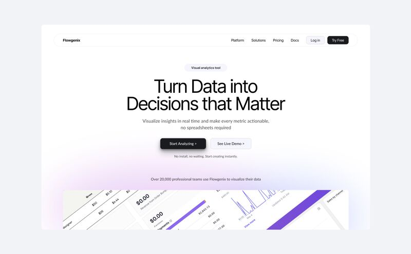
Design components for the "Rendering Difference Engine" Chrome app.
Everything is perfectly structured in case we need any changes for the future updates.
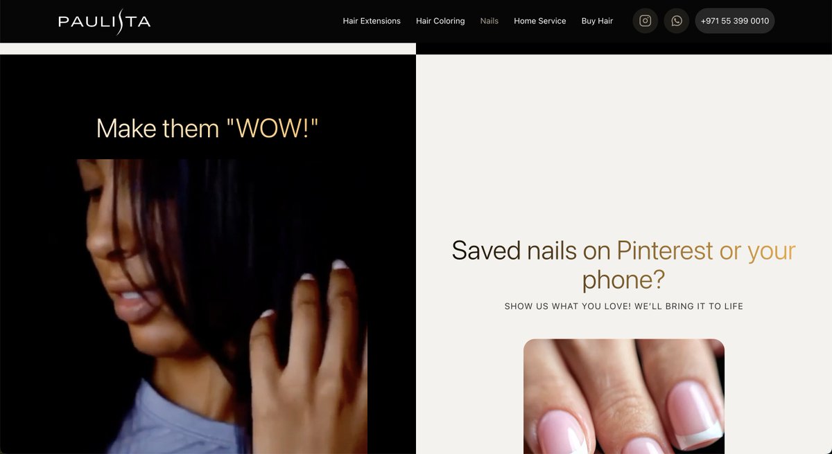
Hero section with a perfect visual hierarchy.
We obsess over hierarchy and messaging because they impact conversions and engagement the most.
Your headings decide whether visitors scroll or leave.
Clear. Concise. Visible.
That’s what grabs attention and drives conversions.
The SEO Pro Extension started as a small internal tool.
Today → 120,000+ marketers use it daily.
That’s the power of a Chrome extension:
⚡ Lives in your users’ browser
⚡ Builds authority for your brand
We build custom Chrome extensions for businesses.
Got an idea? Let’s talk
@Making8@azarchick Don’t people ask a question because they want to share what they need (what they think they need)?
Imo, no difference. The only difference is that you answer someone’s Qs paying with your time or you take a compensation for your time in the form of money.
@XavierNaudeau@azarchick Charging money for consultations is also helping. Moreover, when you charge money, you help even more, bc the person who needs your help should learn how to ask questions, get a skill to make money, manage their time and respect time of other people. Finally, people DO the work!
For webdesigners,
Make your design process effective and efficient with Autolayout, Components and Variables.
Become a Pro in Webdesign.
You have all these tools in @figma
If you need help to master it, check the Figma Pro Secrets 👇
CSS / Performance Tip:
Scroll-driven animations work off the main thread, making them much more performant than using the older JavaScript API
Not only is this API more ergonomic for devs, but you also get a performance boost 🚀
Learn more:
https://t.co/Qxd7KzMnSj
1/2
How to create a Perfect Typography Styleguide for any website.
🔥Every single detail explained, including html, css and SEO influence on typography styleguide in this 77-min video lesson
Continues in the next tweet 👇
Dozens of design techniques and methods to create mindblowing graphics for your websites and apps using Figma.
Figma Pro Secrets. Module 2: Graphic Design Pro
Check this out 👇
https://t.co/g6tQFxv71z
Today, in the Figma Pro Secrets:
🔥 How to create a Seamless AppStore Screenshots lane
🔥 How to create backgrounds using Effects and Gradients
🔥 How to create a perfect Gradient
🔥 Shape backgrounds for Presentations and Websites
🔥 How to create Golden Text in 3 steps
👇
Valid point. Totally agree with you.
Figma gets better and better.
At the same time, looks like it becomes more a DesignSystems tool for big companies.
Some features made Figma easier to use (fonts, autolayout).
Other (colors, properties, dev mode) made the tool harder to learn.
Figma Magic 🪄✨
I was recording a lesson for the Figma Pro Secrets course, and got a question for you:
Try to guess which one is a 3D object and which one is a mockup created with @figma 👇