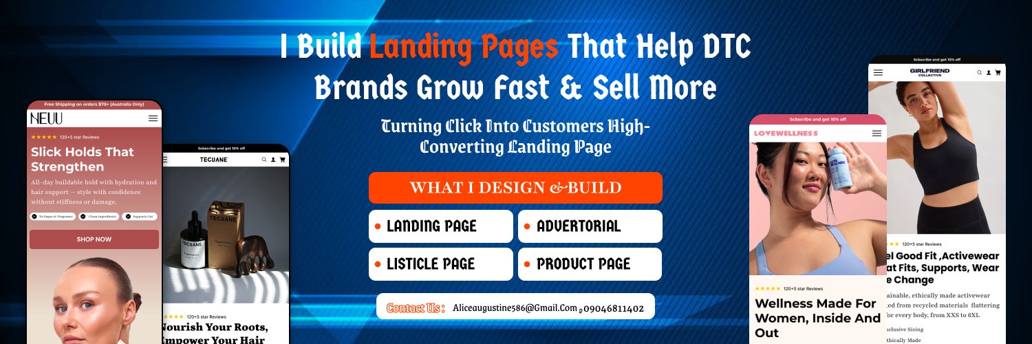
BRAND OWNERS face issues like unclear brand identity, inconsistent branding, difficulty reaching their audience, low awareness, and building trust. Solutions include defining core identity, developing brand guidelines,targeted marketing, strategic PR, and leveraging social proof.
Here are two key points for handling client communication like a pro:
1. Set Clear Expectations Upfront: Define the project scope,communication methods. This avoids misunderstandings down the line.
2. Listen & Confirm:Actively hear feedback, empathize,and summarize understanding.
A great collection section doesn't just display products it guides customers to discover their next favorite purchase.
Designed this section to be clean, engaging, and conversion focused.
#landingpage#figma
A great collection section doesn't just display products it guides customers to discover their next favorite purchase.
Designed this section to be clean, engaging, and conversion focused.
#landingpage#figma
The hero section is where users decide whether to stay or leave.
Designed this one to grab attention instantly, communicate value clearly, and drive action from the very first scroll. 🚀
First impressions matter.
#landingpage#figma
A well designed listicle doesn't just inform it converts. 🔥
Clean layout, clear hierarchy, and a reading experience that keeps users scrolling.
What do you think of this design?
#landingpage#figma
The hero section is where conversions begin.
• Clean visual hierarchy
• Eye-catching product placement
• Responsive across all devices
• Built to guide users toward action
Because every click starts at the top.
#figma#landingpage
Most brands focus on getting clicks.
Smart brands focus on converting them.
This advertorial page was designed to guide visitors from curiosity to checkout through strategic storytelling, persuasive design, and a seamless user experience.
#landingpage#figma
The hero section is where conversions begin.
• Clean visual hierarchy
• Eye-catching product placement
• Responsive across all devices
• Built to guide users toward action
Because every click starts at the top.
#figma#landingpage
Designed this listicle landing page to do one thing: keep users scrolling and clicking
Clean structure. Clear hierarchy. Easy to digest value.
Because attention is everything online
#Landingpage#figma
3 secrets behind a high performing product page 👇
Clear benefits (not just features)
Trust-building visuals
A frictionless buying path
Good design doesn’t confuse it converts.
#Figma#Lamdingpage
Designed this listicle landing page to do one thing: keep users scrolling and clicking
Clean structure. Clear hierarchy. Easy to digest value.
Because attention is everything online
#Landingpage#figma