Every stem splitter I tried charged per song, missed instruments or only did 2 tracks. So I built my own with Claude + Meta's open-source Demucs: split any song into drums, bass, vocals & more, mute parts per section, all in your browser. 🥁 #BuildInPublic#MusicTech
Syncing my drum audio to my practice videos in CapCut took ages and was never quite right 🥁 So I built Hit Sync: it matches the taps in the video to the real drums and syncs them in one click 🎧
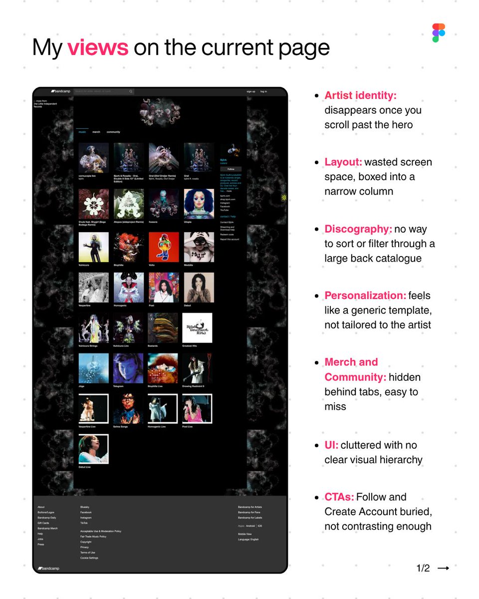
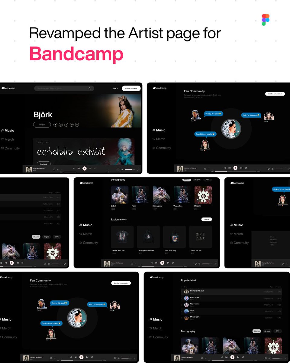
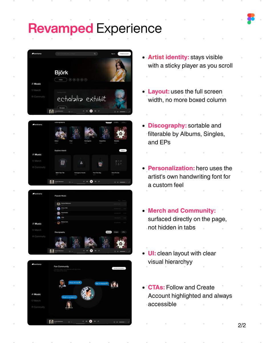
Redesigned Björk's @Bandcamp artist page this weekend 🎧
Old page: identity lost on scroll, boxed layout, no sort/filter, merch and community buried, weak CTAs.
New version: sticky player, full width layout, filterable discography, handwriting font hero, built as a reusable
Found Bandcamp this weekend and couldn't stop redesigning Björk's artist page 👀 Sticky player, sort/filter, the artist's own handwriting as the hero font, clearer CTAs. Built as a reusable template. ⚡️
A music player concept for the iPhone Duo. Folded: glanceable now playing. Unfolded: full vinyl player + trending charts 🎧
Made with Figma. Mockup tool by @NotoriousUSB ⚡️
#UXDesign#Figma
Built something new: Voice effect.
Animated voice glow effect, no shades & zero dep, 3 types, multiple states, dark & light theme.
https://t.co/DHU7exLPtF
From @twentyonepilots UI interactions to scroll-based storytelling, microinteractions, and a rotating globe, this project explores how motion makes artist websites feel alive.
Comment “Figma” or “Globe” for the files and Veo 3 prompt.
#UI#twentyonepilots
The actual site today is clean, but generic. For a band built on lore and mystery, we could do more.
Built entirely with Figma's agents and Figma Motion.
Want the Figma file? Drop a comment 📷
#UXDesign#WebDesign#TwentyOnePilots#Figma#MotionDesign
Most artist websites are boring. Next up: redesigning Twenty One Pilots' site using their own Dema lore, mapped onto real UX requirements. Follow along. #UXDesign#Figma
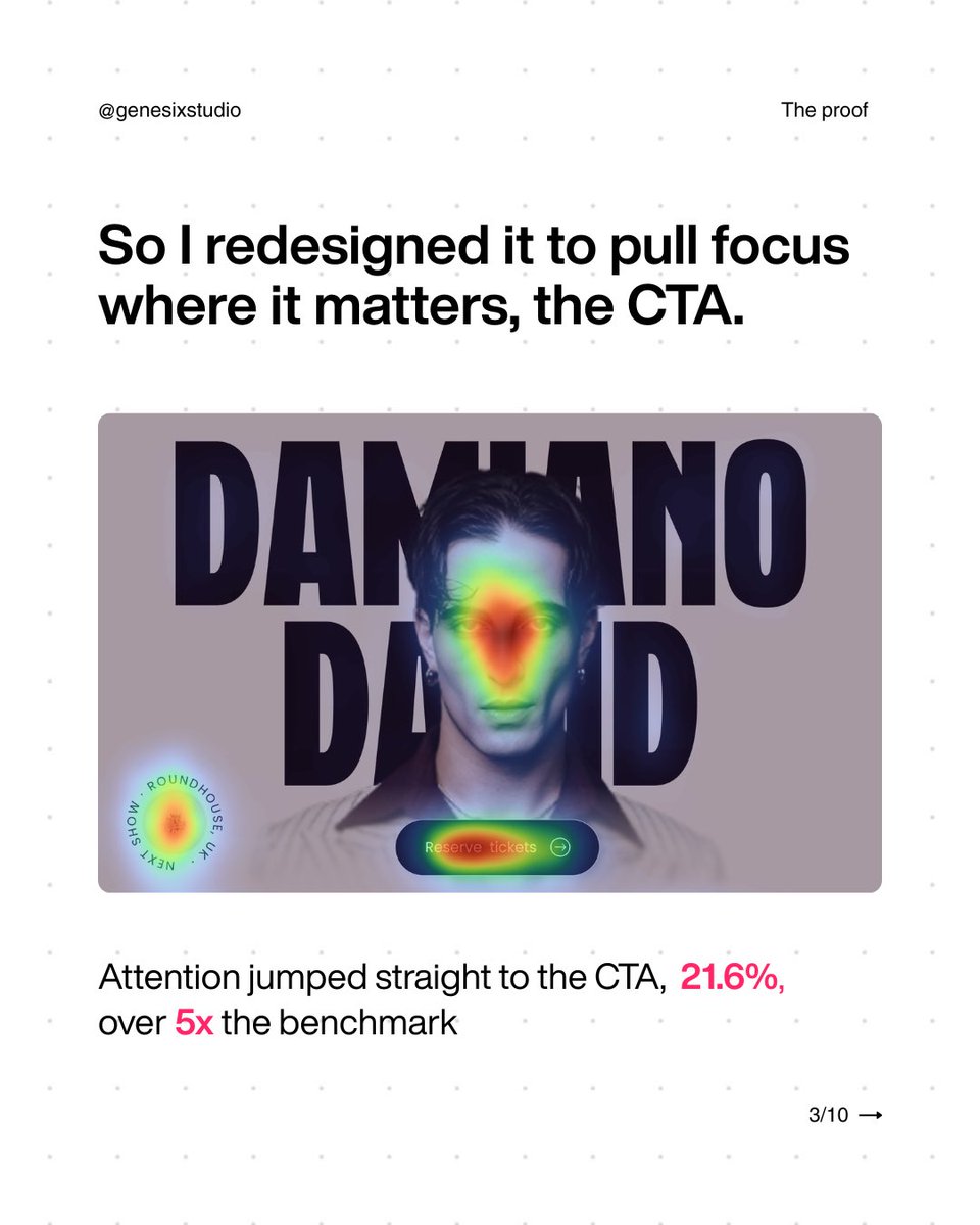
Damiano’s site has millions of fans. Almost none of them saw the CTA.
We redesigned Damiano David’s landing page and tested it against the original with real UX data, not just vibes.
Swipe through to see where attention was getting lost, and how the redesign fixed it
#UI#UX