Excel is still a daily tool for analysis.
Qlik Sense is built for governed analytics.
📝 We published a comprehensive guide to using both, and when each approach makes sense:
→ Exports & imports
→ Automation
→ Live connections
→ Embedded spreadsheets
Read it on our blog.
AnyChart JS 9.0.0 is out.
It's a big one for new chart types.
We've added 7, each for a specific job:
» Dependency wheel & arc diagram: connections
» Org chart: hierarchies
» Stream graph & waffle: composition
» Lollipop & dumbbell: comparisons
And there's more. Give it a try.
A "quick" glance at a chart.
Ten minutes later, you're still looking.
In DataViz Weekly, you'll find more like that, made by others.
This time:
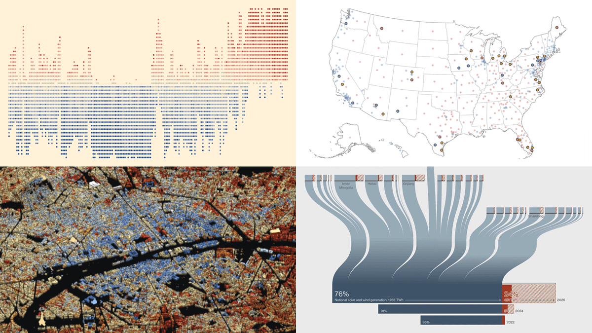
🟧 U.S. House battlegrounds
🟧 China's unused wind & solar
🟧 Paris buildings by age
🟧 Pacific sea temperatures
https://t.co/HDMkXJUxfl
Saw a great chart last month? Can you still find it?
#DataViz Weekly gathers examples like that. Latest two editions:
» Problem gambling
» U.S. school fixes
» Earth's terrain
» Every Berlin vote
» Afterlife beliefs
» Tariffs in Canada
» Population pyramids
» U.S. social life
One Qlik tenant, two fully customized hubs. Different brands, different content, same source, no duplicated apps.
That’s NewHub for Qlik Cloud, now running @AnyChart's own environment.
Want to poke around? DM me and I’ll send you access.
Behind many news stories sits a dataset that knows more than the headline 📊
This #DataViz Weekly, 4 newsroom projects that get it talking:
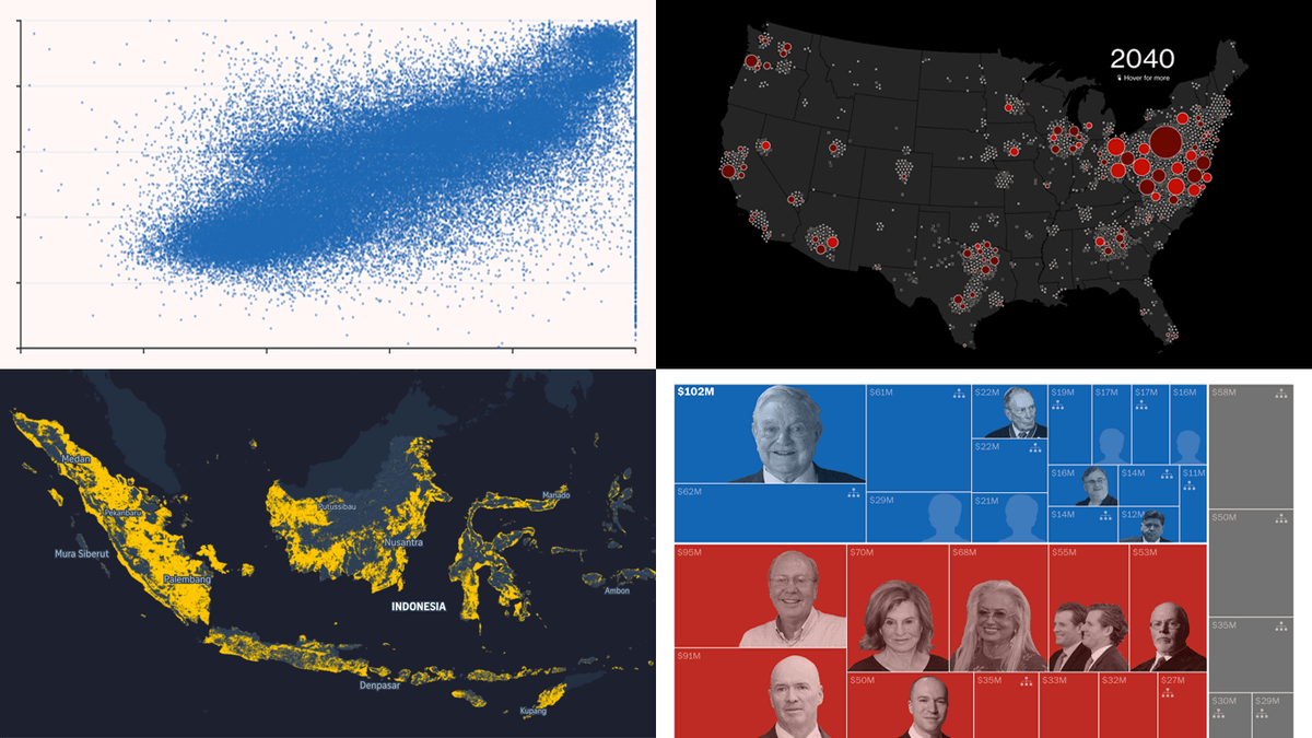
🔸 Anomalies in Russia’s vote
🔸 Biggest U.S. midterm donors
🔸 AI data center heat
🔸 Indonesia’s crops & forests
https://t.co/Jh4ow4jVNf
Check out the latest edition of DataViz Weekly and start wherever you like: https://t.co/DhSmyeCd3t
Kudos to the creators!
» The Economist
» Reuters: @prinzmagtulis@annsaphir
» Block and Paper
» SeasonMap
Everyone is busy making charts...
Hey, wanna stop & look at anyone else's?
That's the point of #DataViz Weekly, our standing roundup of good data viz. This time:
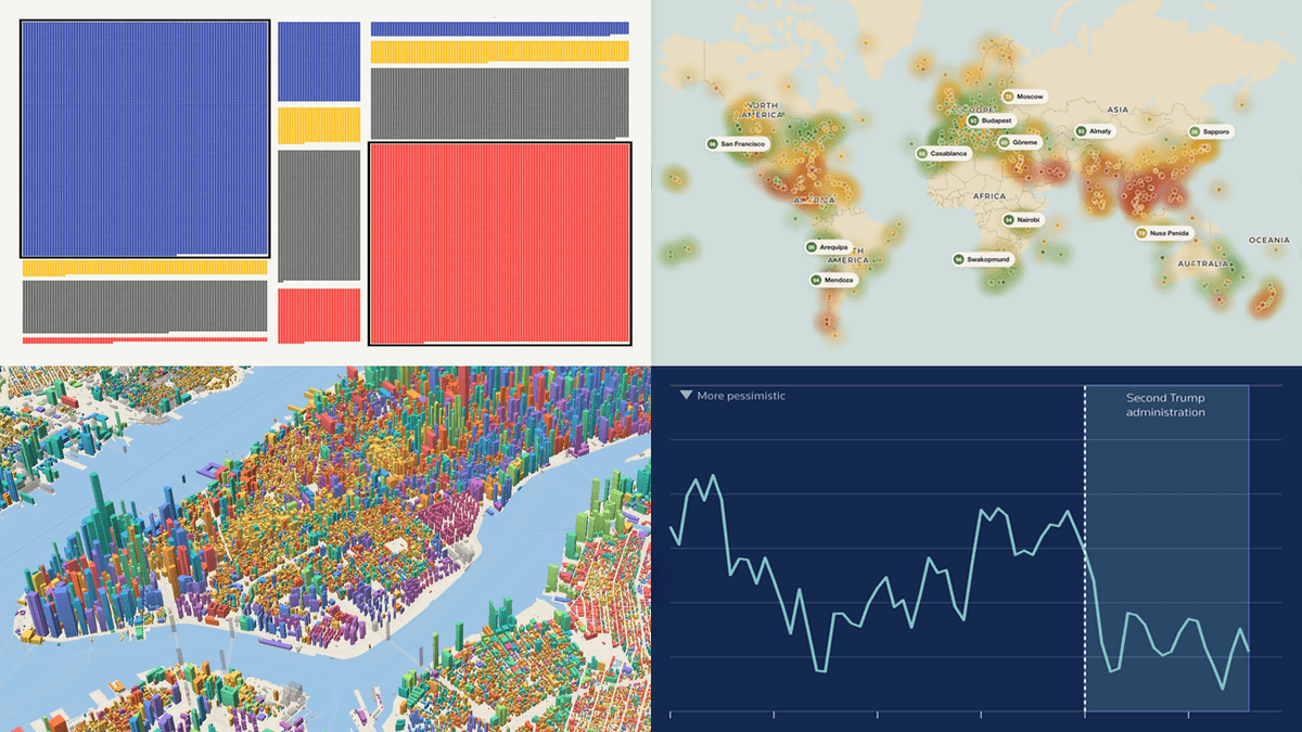
» U.S. voters ahead of midterms
» U.S. economy's mixed signals
» Building ages, 100 cities
» Travel weather worldwide
Would you investigate a 22% KPI miss before a 4% miss?
Suppose the 22% has run all year and the 4% just started. Only one of them is new information.
🔥 New guide to chart types for performance against target, the question each answers & the trap in each https://t.co/U0OI8A7Es8
Would you investigate a 22% KPI miss before a 4% miss?
Suppose the 22% has run all year and the 4% just started. Only one of them is new information.
🔥 New guide to chart types for performance against target, the question each answers & the trap in each https://t.co/U0OI8A7Es8
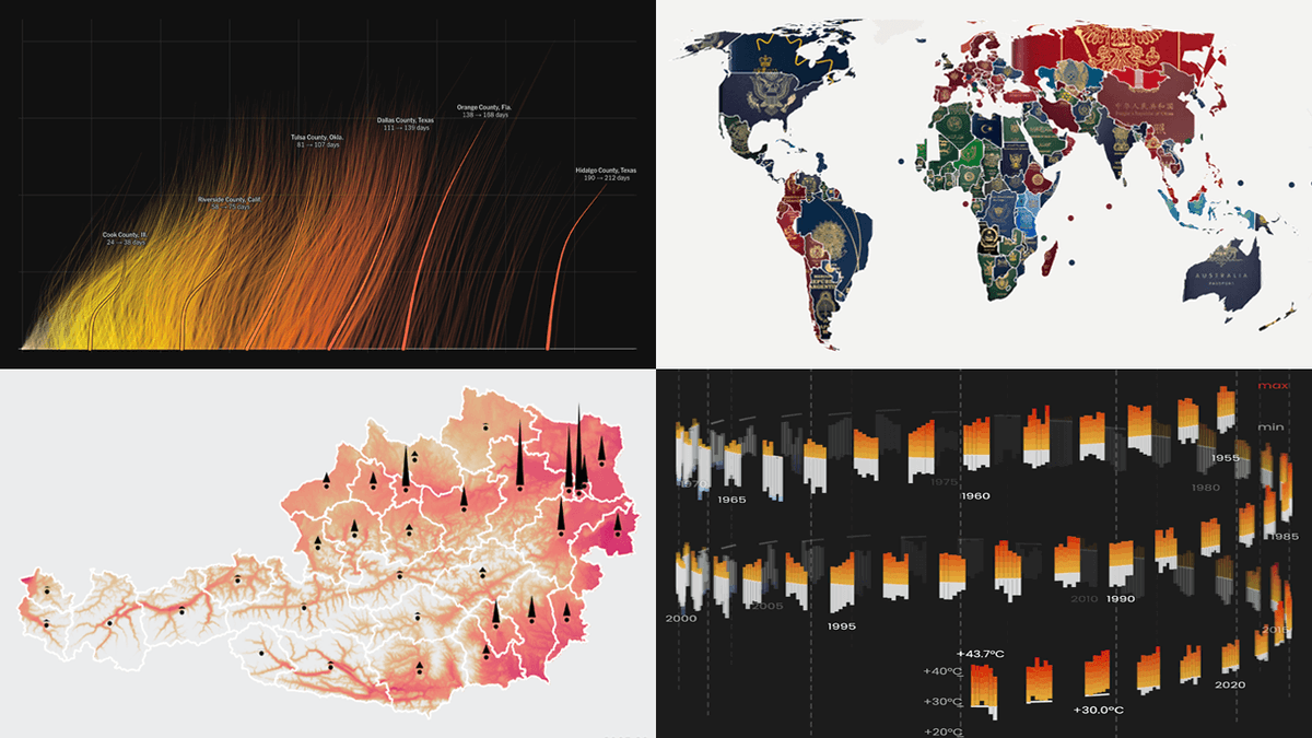
Good data viz appears constantly.
How much of it reaches you?
#DataViz Weekly is our regular pick of what we found most interesting.
This time:
◉ Hotter days by county 🇺🇸
◉ Passports compared 🌐
◉ Heat & hospital deaths 🇦🇹
◉ Hajj dates & Makkah heat 🇸🇦
https://t.co/L3jG444iU9
Most BI dashboards report what happened.
Almost none are built to answer why.
Seven charts do that second job.
And you rarely use just one.
💥 Just published a guide to chart types for root cause analysis, including the ways each one can mislead:
https://t.co/4D5yNX1w9N
since you guys loved the exploding tesla..
I used GPT-6 Astra to create a 3D website that pulls apart the male anatomy into 2,234 modeled pieces!
we are in a renaissance of learning
Explore all four in the latest edition, with a closer look at the visuals and where to explore the originals: https://t.co/g97EH1HriO
Have a data viz project to share?
Send it our way for a future edition 🤝
Your next chart could start with someone else's. DataViz Weekly brings you recent visualization projects as examples for your own work.
Latest picks:
◆ Record U.S. heat & humidity
◆ How much of the web is AI
◆ Wages in Big Macs
◆ Premier League shirt sponsors
Most BI dashboards report what happened.
Almost none are built to answer why.
Seven charts do that second job.
And you rarely use just one.
💥 Just published a guide to chart types for root cause analysis, including the ways each one can mislead:
https://t.co/4D5yNX1w9N
Check out the full roundup on our blog - each project up close, plus where to go explore it yourself: https://t.co/lHVUwNSodJ
Built a project where the visuals truly bring something out of the numbers? Send it over, it could turn up in a coming edition.
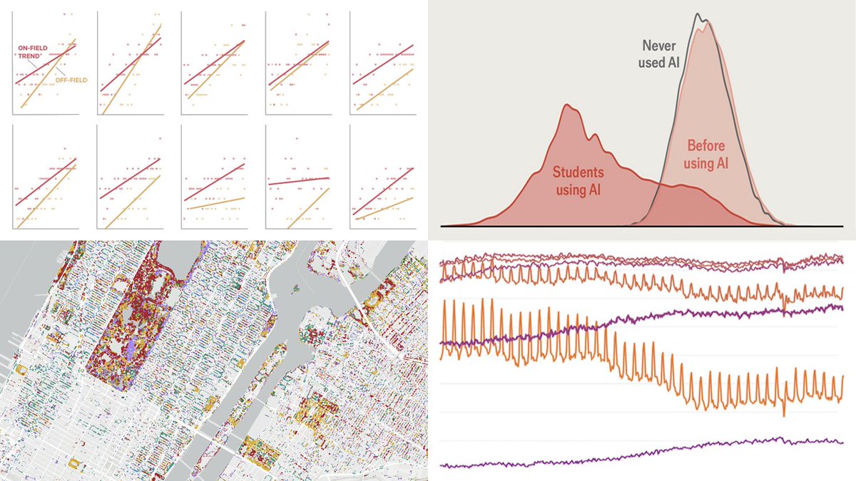
Someone already solved the chart problem you're stuck on 💡 #DataViz Weekly is where you can find that work and pick up a few ideas. This time:
📍 AI homework & exam scores
📍 Who in the U.S. isn't working & why
📍 English Premier League jerseys since 1992
📍 NYC trees by genus