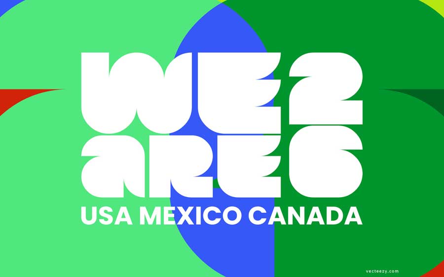
Most businesses treat their brand like a mood board.
The FIFA World Cup treats its brand like a protected asset that earns more value every year it is maintained without being diluted.
Those are two completely different philosophies, and they produce completely different results
The #FIFAWorldCup converts 5 billion people. Your website can't convert a stranger.
The five-part conversion architecture behind the world's biggest brand, and how to apply it today.
→ https://t.co/9nQizkY5jP
#MarketingAutomation
Clean is not the same as simple.
Every element that isn't there had to be deliberately removed, tested, and defended in a room full of stakeholders who all wanted to add one more thing.
That restraint is the genius. Anyone can add a flourish.
#FIFAWorldCup2026#LogoDesign
Negative space logos either land as quietly brilliant or completely unreadable.
There is almost no room between those two outcomes.
FIFA threaded a needle that most agencies would never attempt at this scale with this much riding on it.
#FIFAWorldCup#LogoDesign#BrandStrategy
The mark is built on negative space.
The trophy sits inside the space of the tournament numerals, which means your brain actively completes a shape that isn't fully drawn.
That small cognitive effort is exactly why the mark sticks.
The FIFA World Cup 26 logo might be the boldest design decision in sports history.
Not the most beautiful. Not the most complex.
The most restrained.
Here's why that matters.
Full breakdown of the #FIFAWorldCup host city brand system, and what it means for any business serving multiple audiences 👇
https://t.co/IjP1ynJ0dF
Repost if this changes how you think about your brand architecture.
#FIFAWorldCup2026#BrandStrategy#BrandArchitecture
The psychological payoff:
Each city feels like the center of the world.
Belonging is one of the most powerful purchase triggers in human psychology.
When something feels specifically for you, not generally available to everyone, emotional investment increases dramatically.
And yet, every one of them is unmistakably #FIFAWorldCup.
That family resemblance doesn't come from the colors. It doesn't come from the patterns. It comes from the structural logic underneath every mark.
Same proportions. Same hierarchy. Same spatial relationships.
The first decision the #FIFAWorldCup made is the most important one:
Certain elements never move. The master emblem. The wordmark. 🏆 The trophy silhouette. The typographic system.
These are locked. Everywhere. Always. No exceptions. This is not flexibility, it's foundation.
The #FIFAWorldCup had to feel simultaneously universal and deeply local in 16 different cities across 3 countries.
Most global brands can't pull this off in 2 markets.
Here's the architecture behind how they did it 🧵
The #FIFAWorldCup color system is psychologically manipulating you.
That was engineered.
Here's how it works, and what your brand colors are actually doing to your customers 👇
https://t.co/smc7x86U8B
#ColorPsychology#BrandStrategy#SmallBusiness
COMMITMENT reads as CONFIDENCE.
When one thing is the entire identity. The brand feels certain.
Hedged brands feel hedged. Committed brands feel committed. And certainty transfers to the customer before a single word is read.
#FIFAWorldCup#FIFAWorldCup2026#BrandStrategy
Most small businesses have an equivalent of the trophy.
A specific result. A transformation. A claim no competitor can make.
Almost nobody leads with it. It lives on page 3 of the website. In a case study that requires 3 clicks to find.
#FIFAWorldCup#BrandIdentity#Marketing
The #FIFAWorldCup trophy is one of the most recognized objects on earth. Its silhouette triggers instant recognition in people who have never watched a football match.
That recognition cannot be designed. FIFA inherited it by making the trophy structural. not decorative.
#Brand